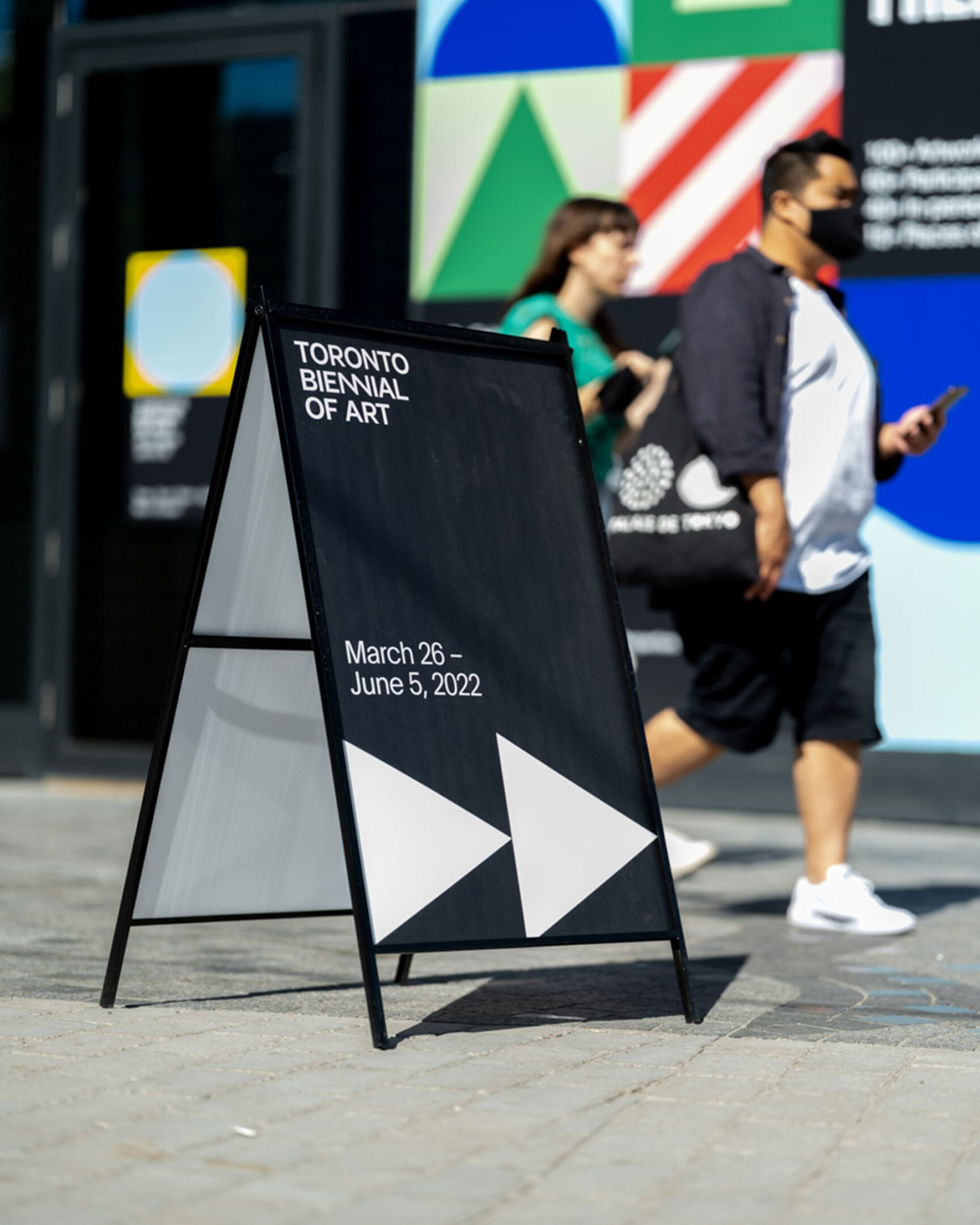
Toronto Biennial of Art
Building a visual identity, communications toolkit and wayfinding strategy for Toronto’s first-ever biennial of contemporary art.


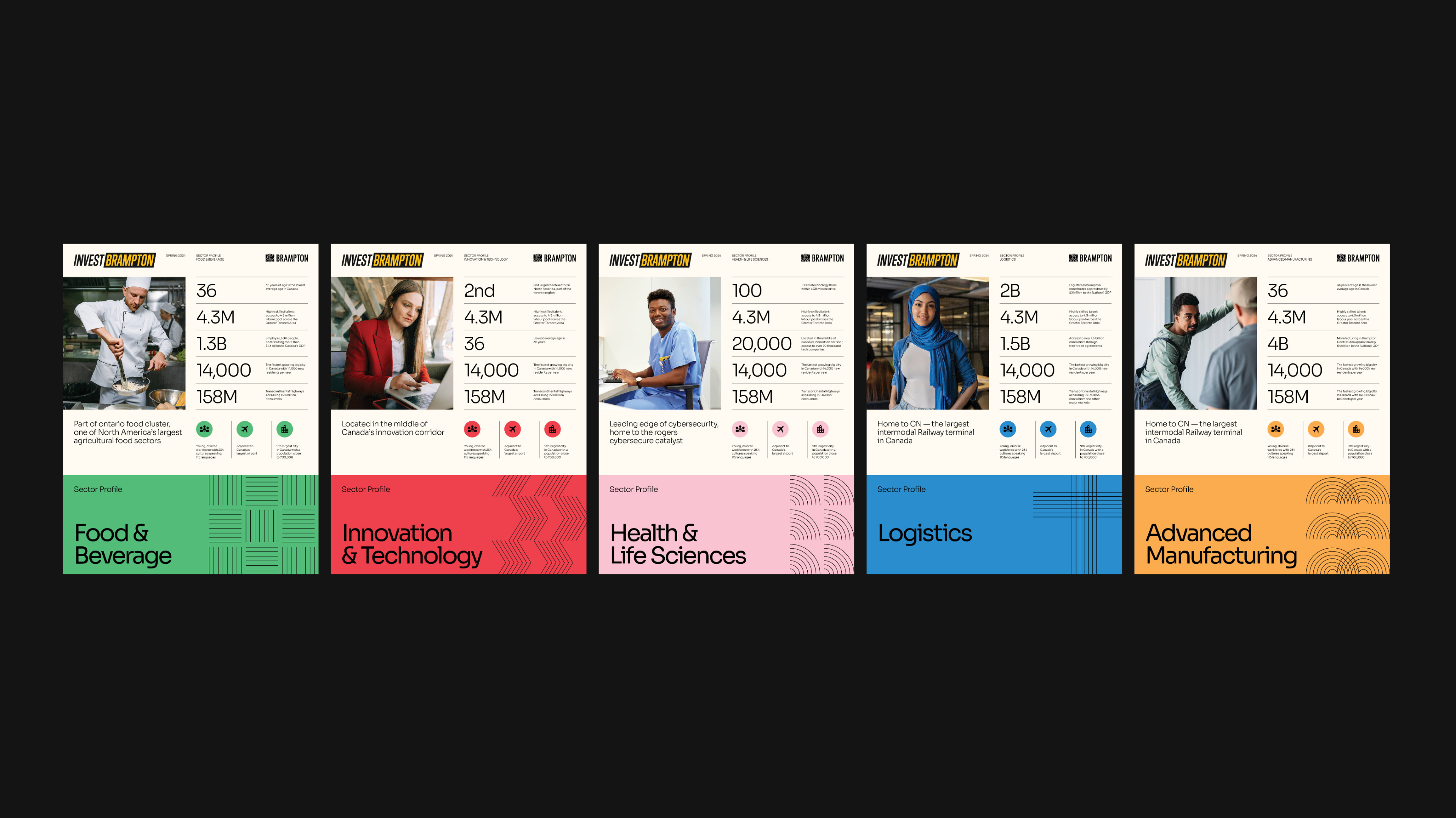
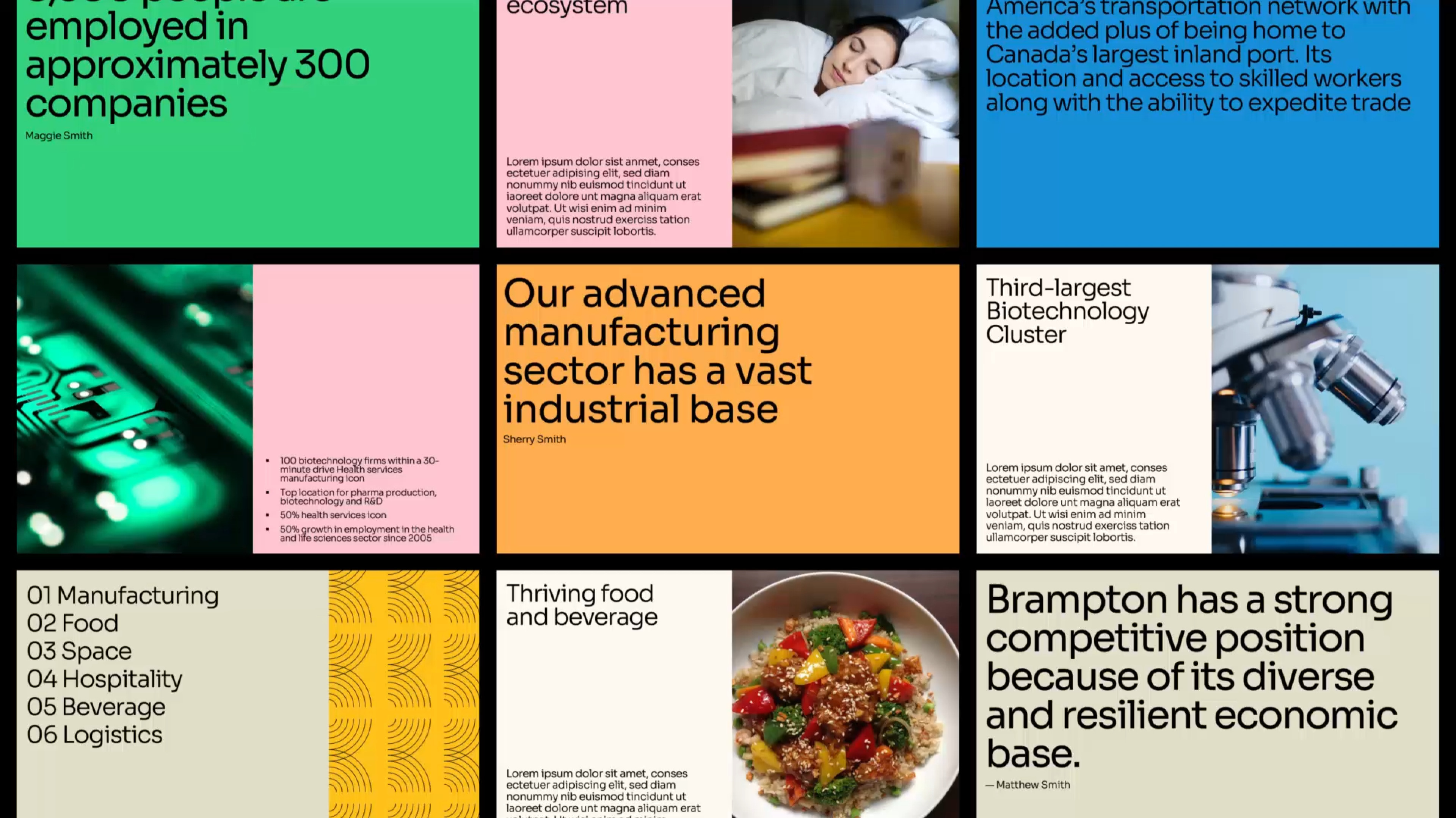
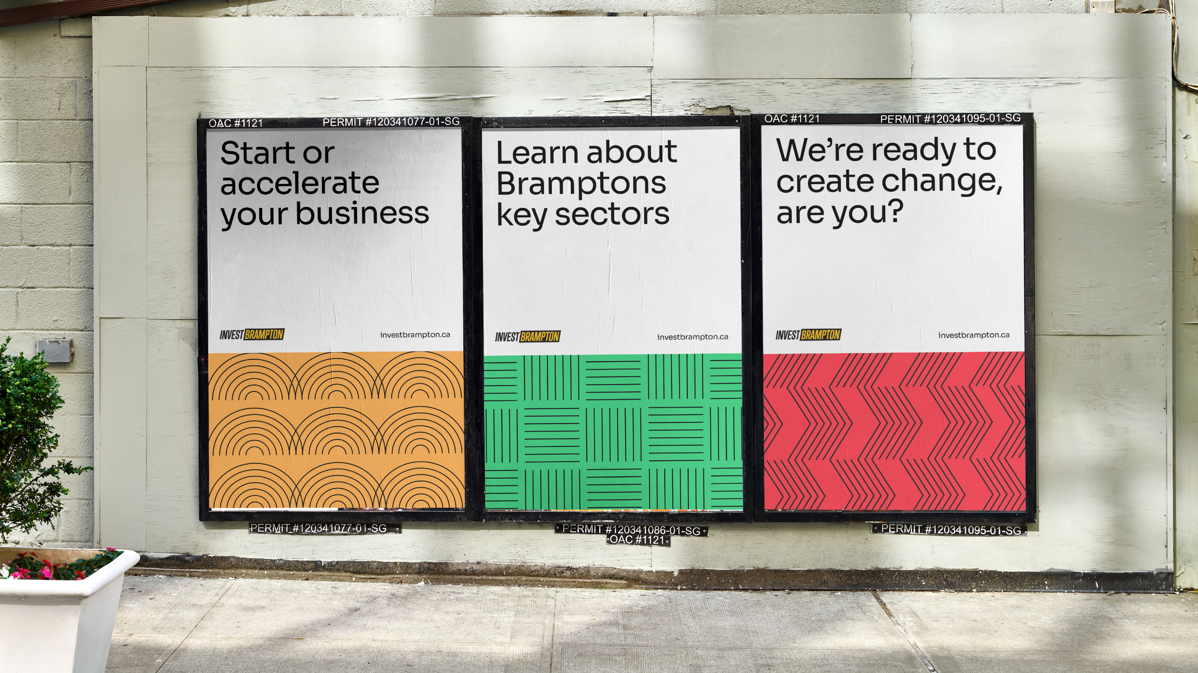
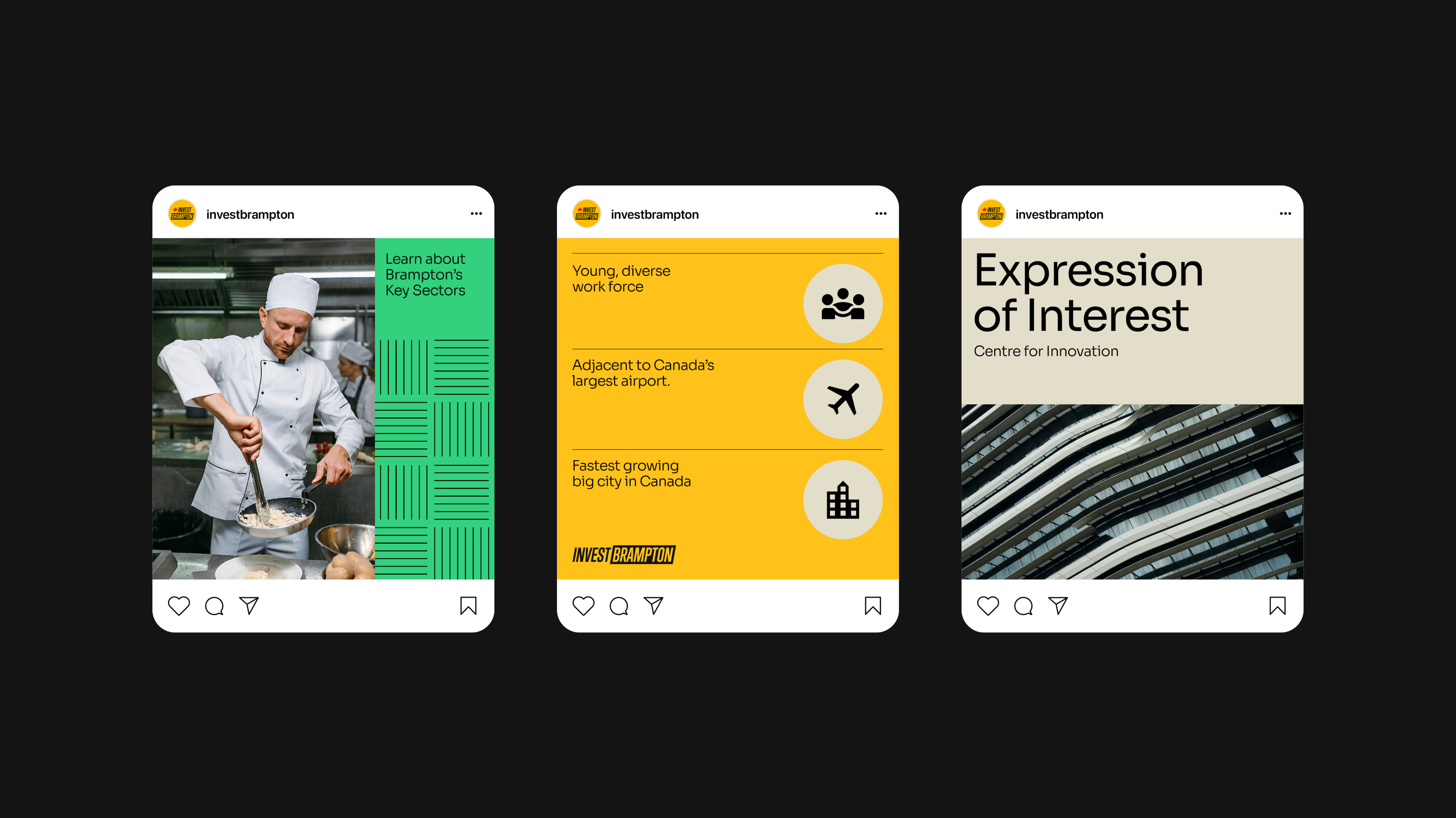
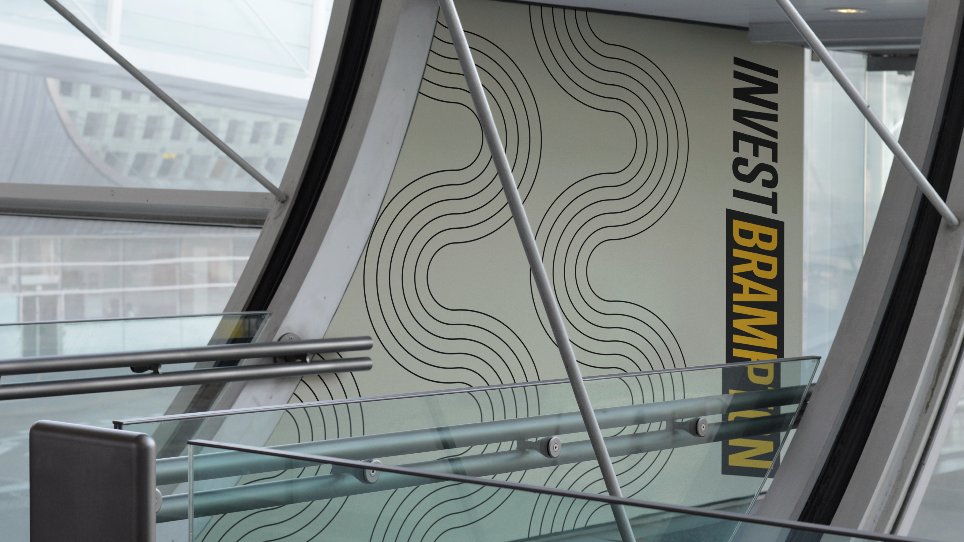
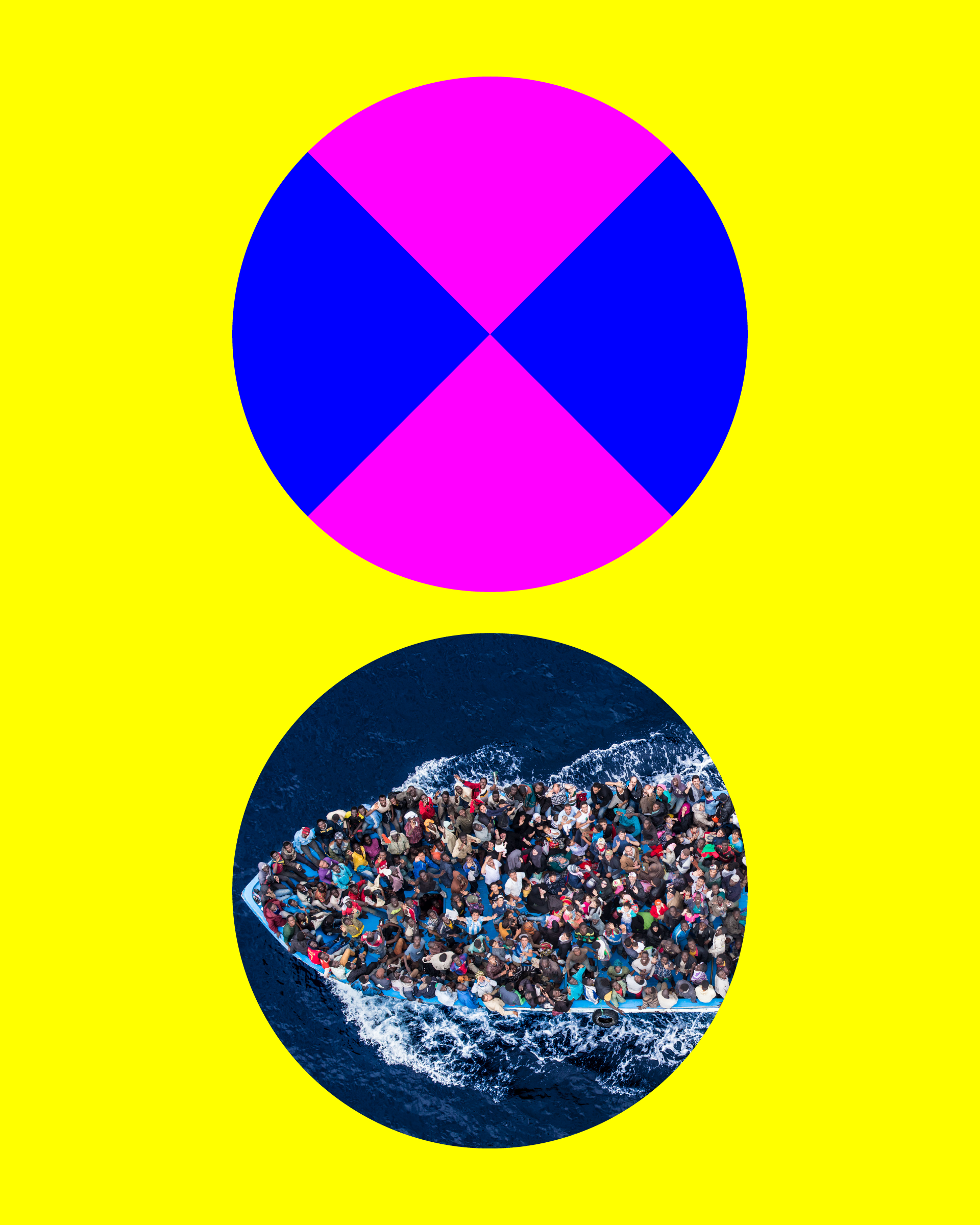
In 2019, prior to launching the inaugural Biennial to the public, TBA came to Puncture to define its visual identity. A key feature of the Biennial is that all of its exhibition sites are located near waterways that are significant to Toronto: Lake Ontario, the Humber River, Don River, and more. We came up with a vibrant brand that is inspired by nautical flags and symbols, these appear in the bold graphic devices we created.
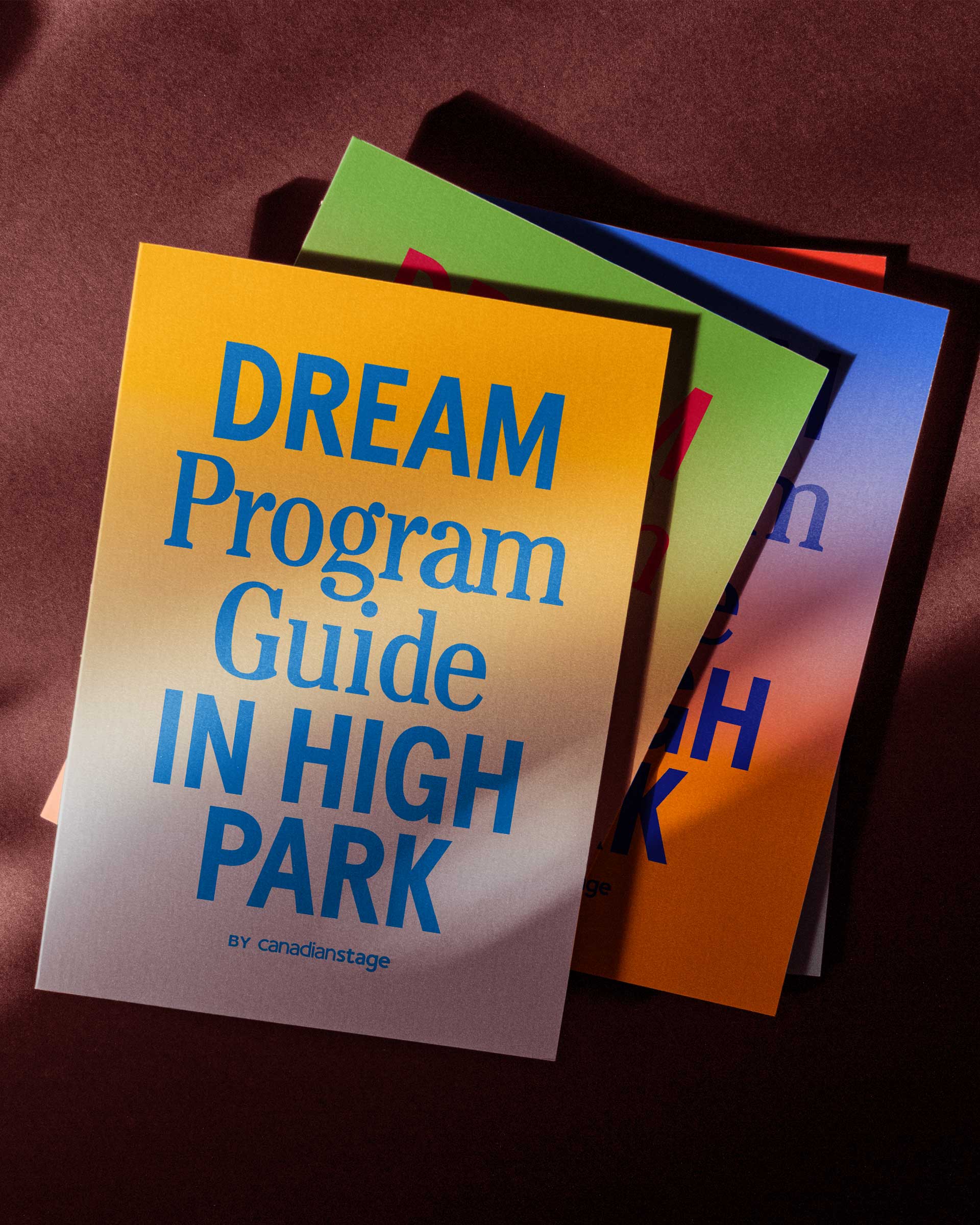
The system is bolstered by artwork treatments, a celebratory and accessible colour palette, and a custom wordmark to bring the importance of public and free art to the city’s consciousness. In addition to visual identity, we helped simplify the Biennial’s communication platform and got it to its most distilled form, “72 days of Free Art”.


Industry
Arts & Culture
Service
Branding
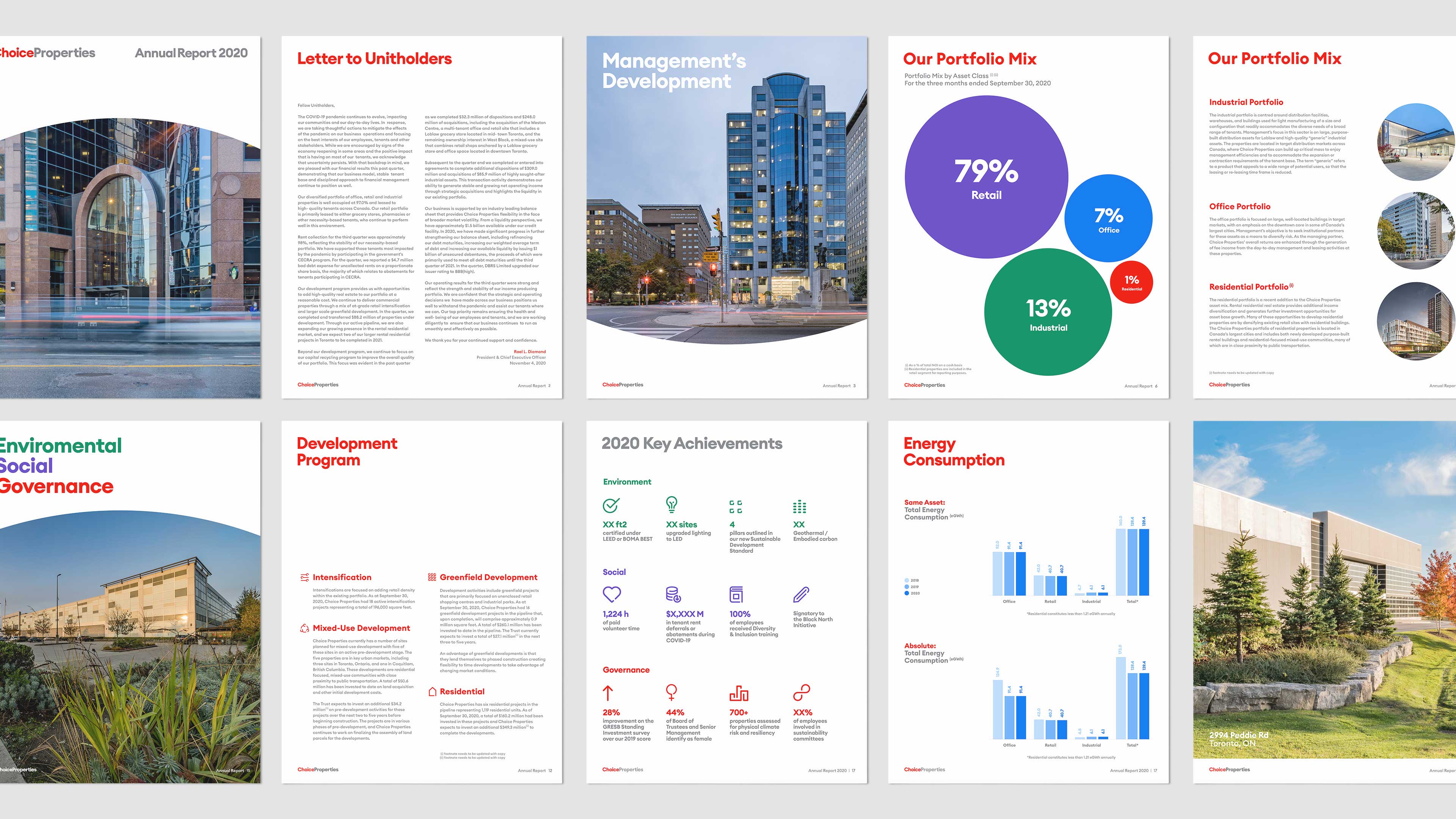
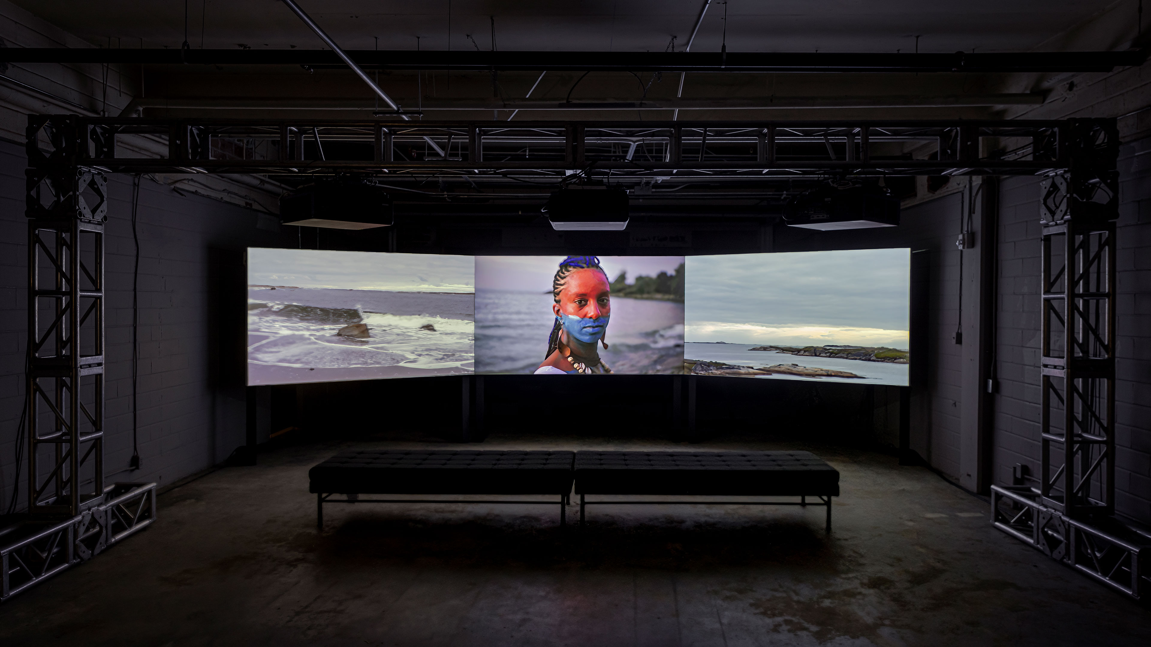
The Toronto Biennial of Art’s (TBA) mission is to make contemporary art accessible to everyone. For 10 weeks every two years, local, national, and international Biennial artists transform Toronto and its partner regions with free exhibitions, performances, and learning opportunities.
Since the inaugural year, we have worked with TBA on all aspects of their marketing materials including communications, digital production, graphic design, video production, motion graphic design, and environmental and experiential design.
View more projects