plazaPOPS
A brand evolution designed to support plazaPOPS’ next phase as a city-wide public space incubator.
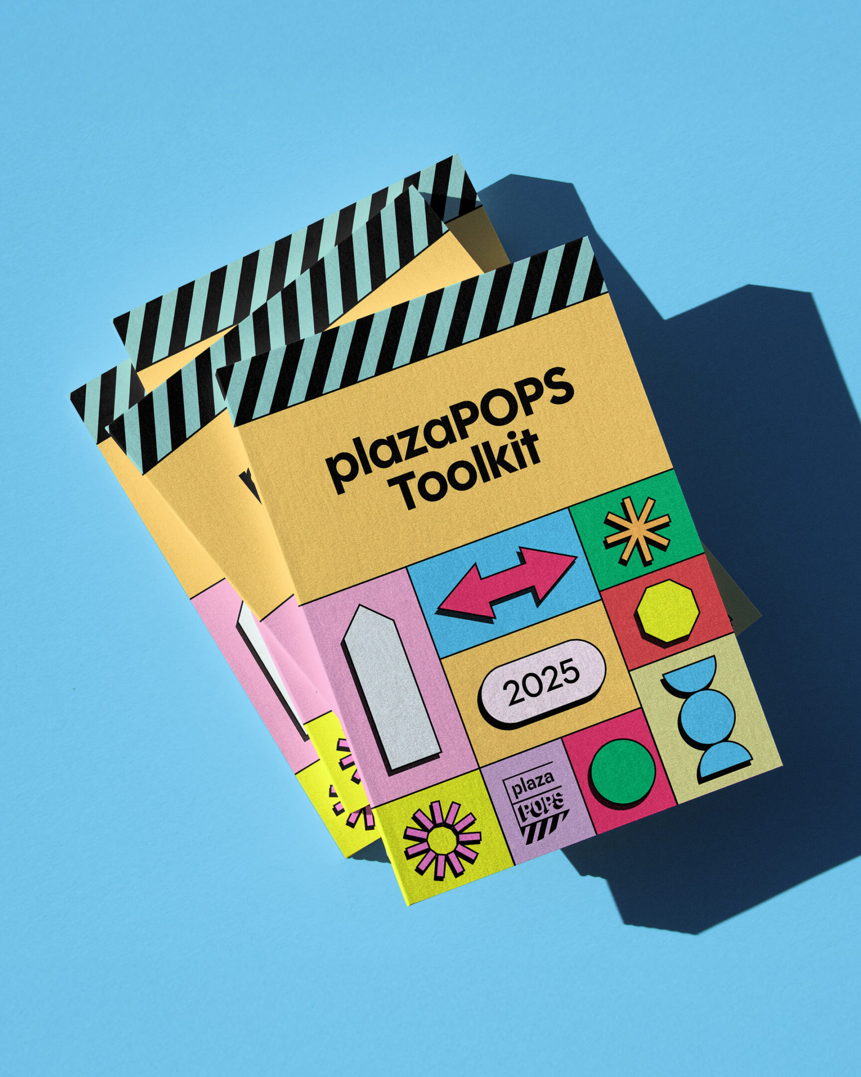
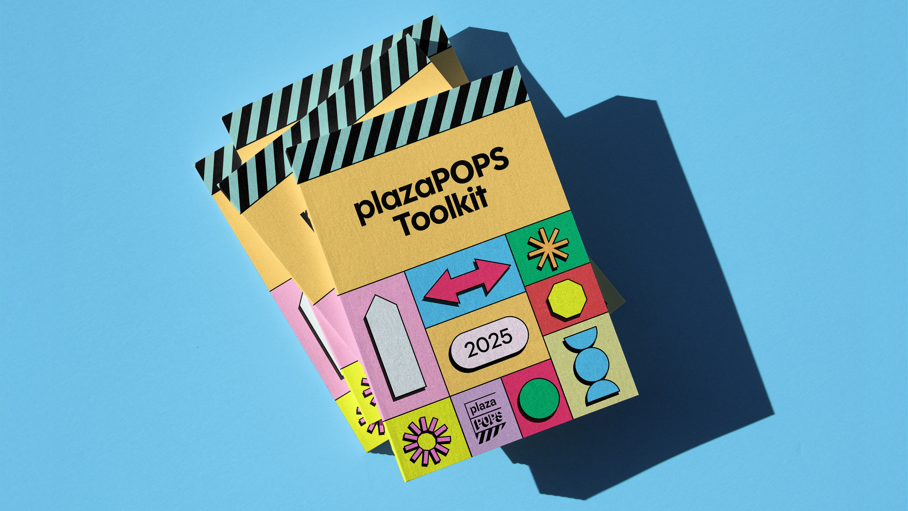
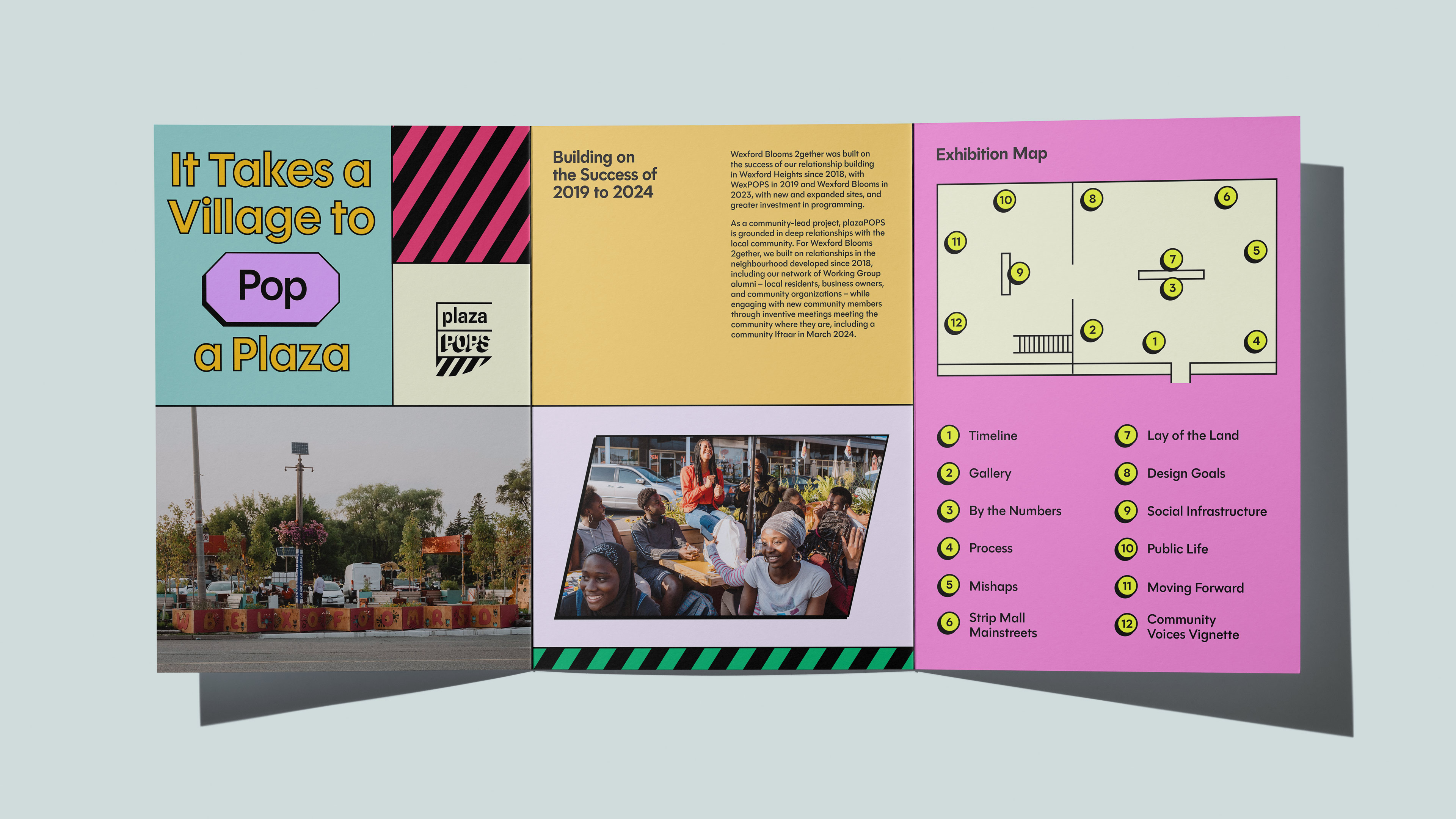
Drawing inspiration from the bold grids and modularity of pylon signage, this refreshed new system nods to the commercial streetscapes where plazaPOPS operates. A flexible grid, bold typography, and accessible colour palette balances playful expression with clarity for complex information, forming the backbone of plazaPOPS’ toolkit, research report, and exhibition.


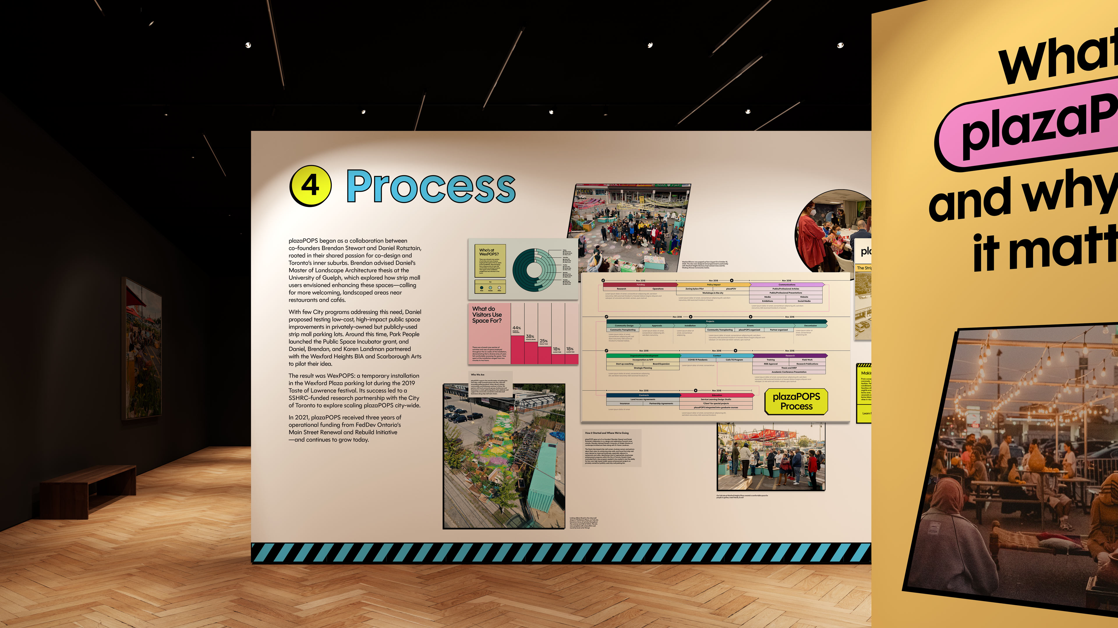


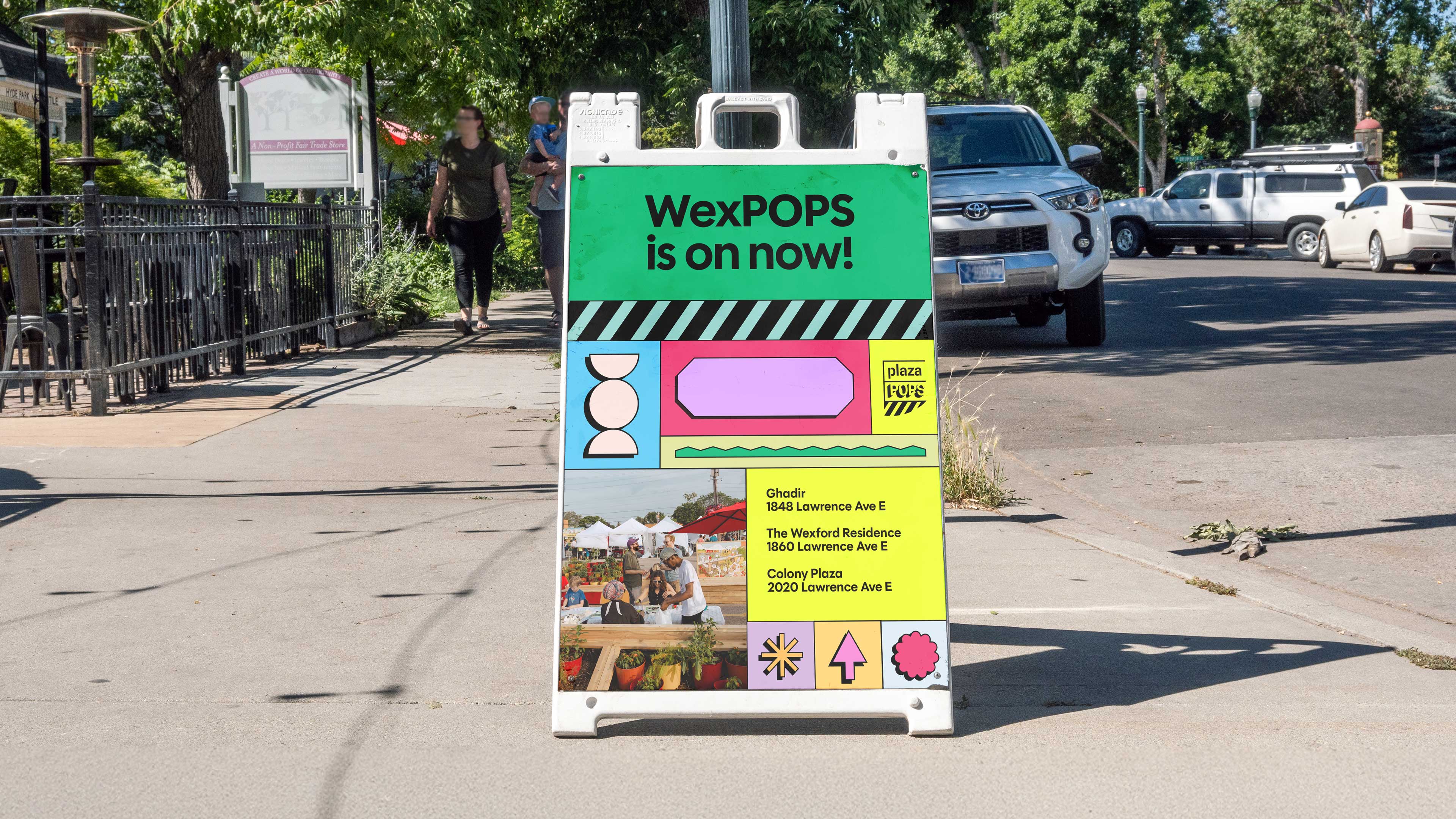
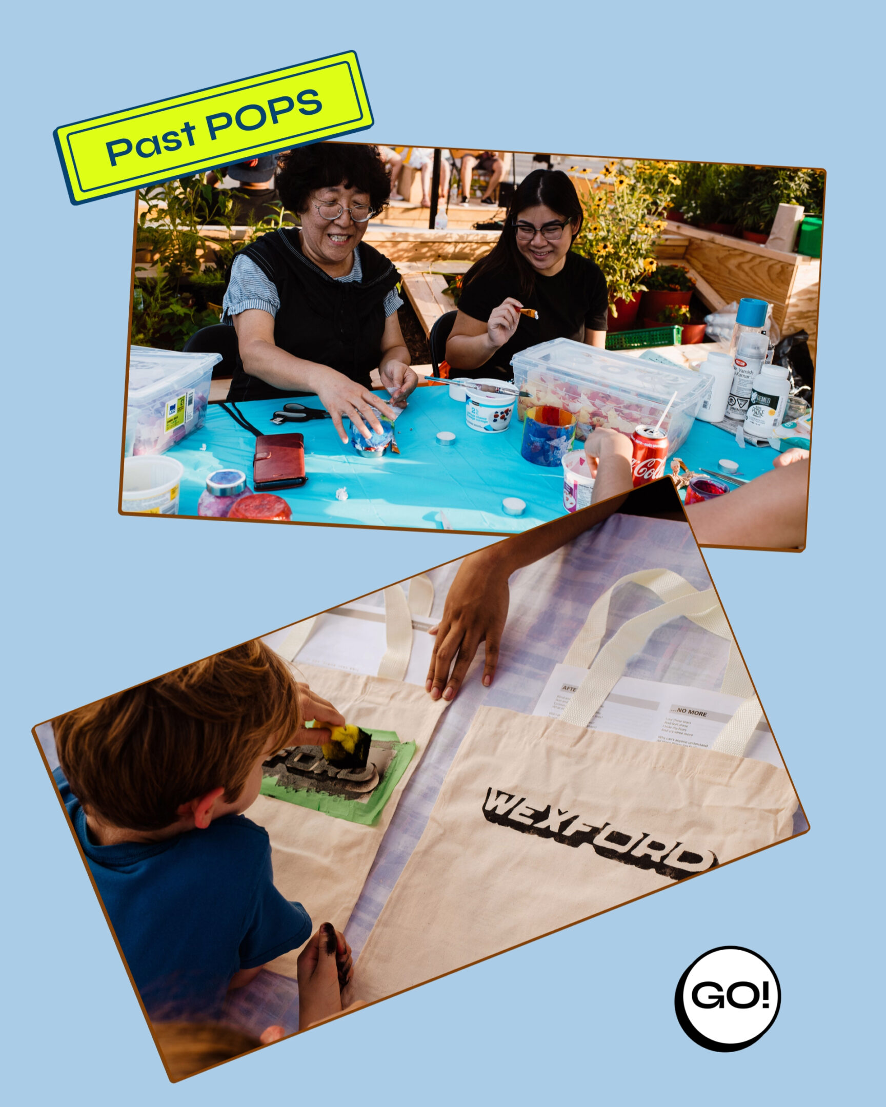
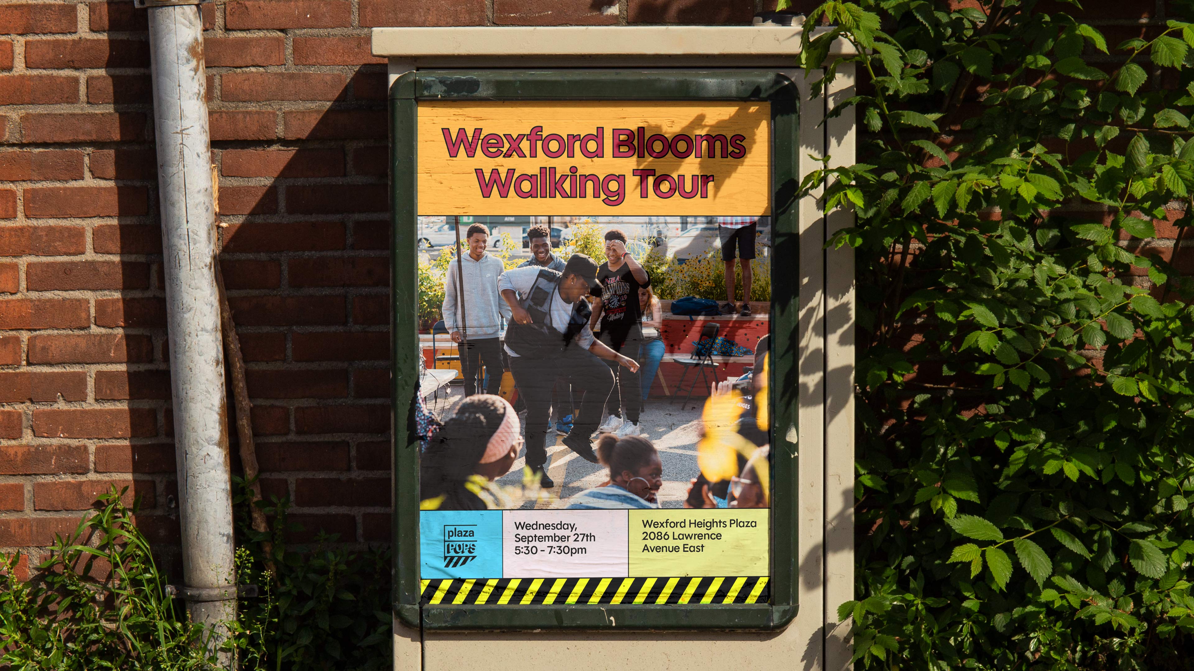
plazaPOPS is a community-led initiative that has been transforming strip mall parking lots into vibrant, accesible public spaces across the GTA since their pilot, WexPOPS, in 2019. As the organization enters this new phase as a city-wide incubator model, we were brought on to evolve the brand and build a cohesive visual system for a suite of reflective and future-facing outputs.
Working within an existing identity, we developed a refreshed visual language that balances approachability with clarity across a toolkit, research report, and exhibition which highlights plazaPOPS’ methods and impact for new partners, funders, and the public. Emphasis was placed on creating a flexible visual system and reusable templates that could adapt to standardized data visualizations and map-based graphics to enable clear storytelling and easy scalability for future projects.
View more projects