Shorefast
A brand reposition and visual identity redesign of an organization dedicated to unleashing the power of place.

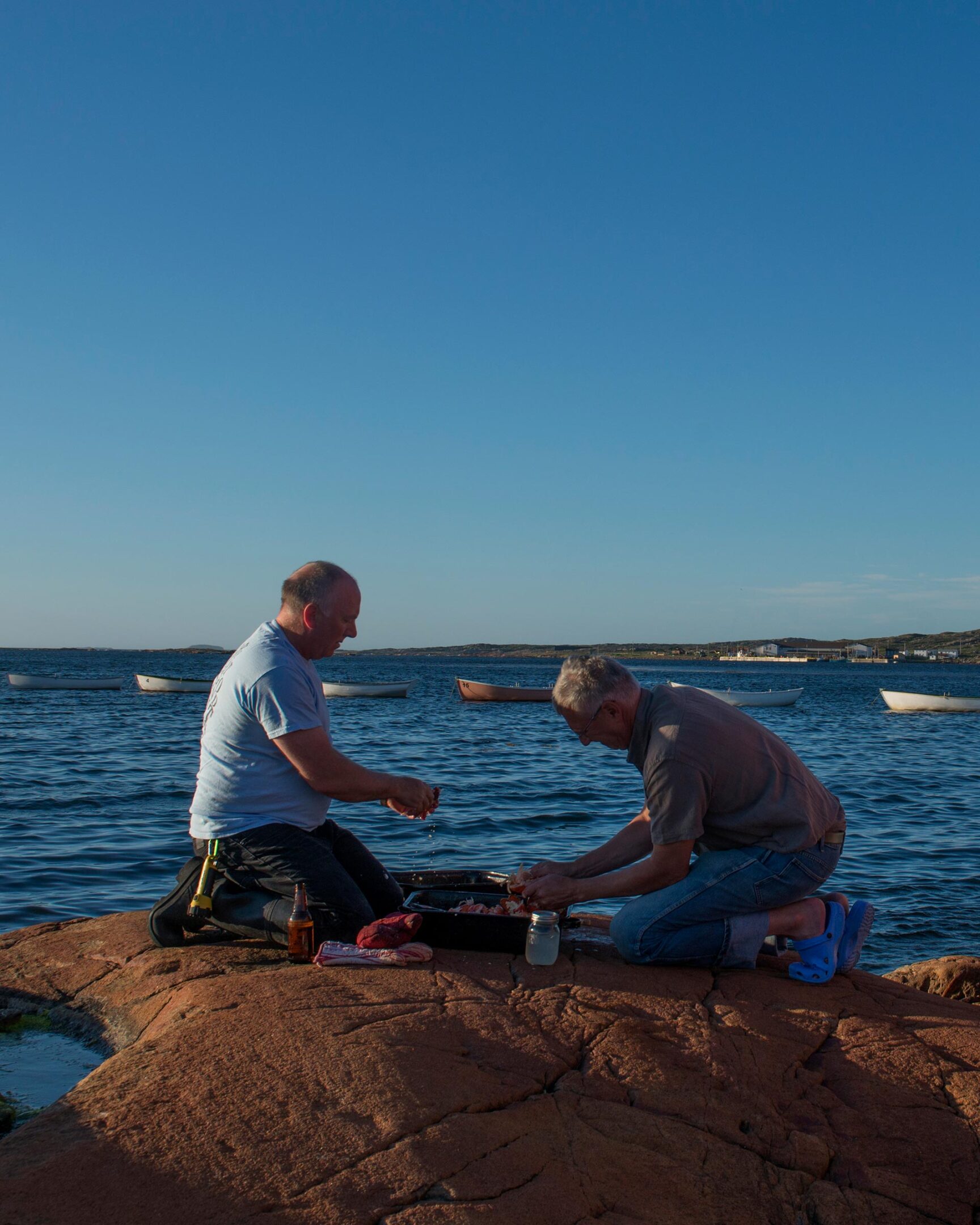
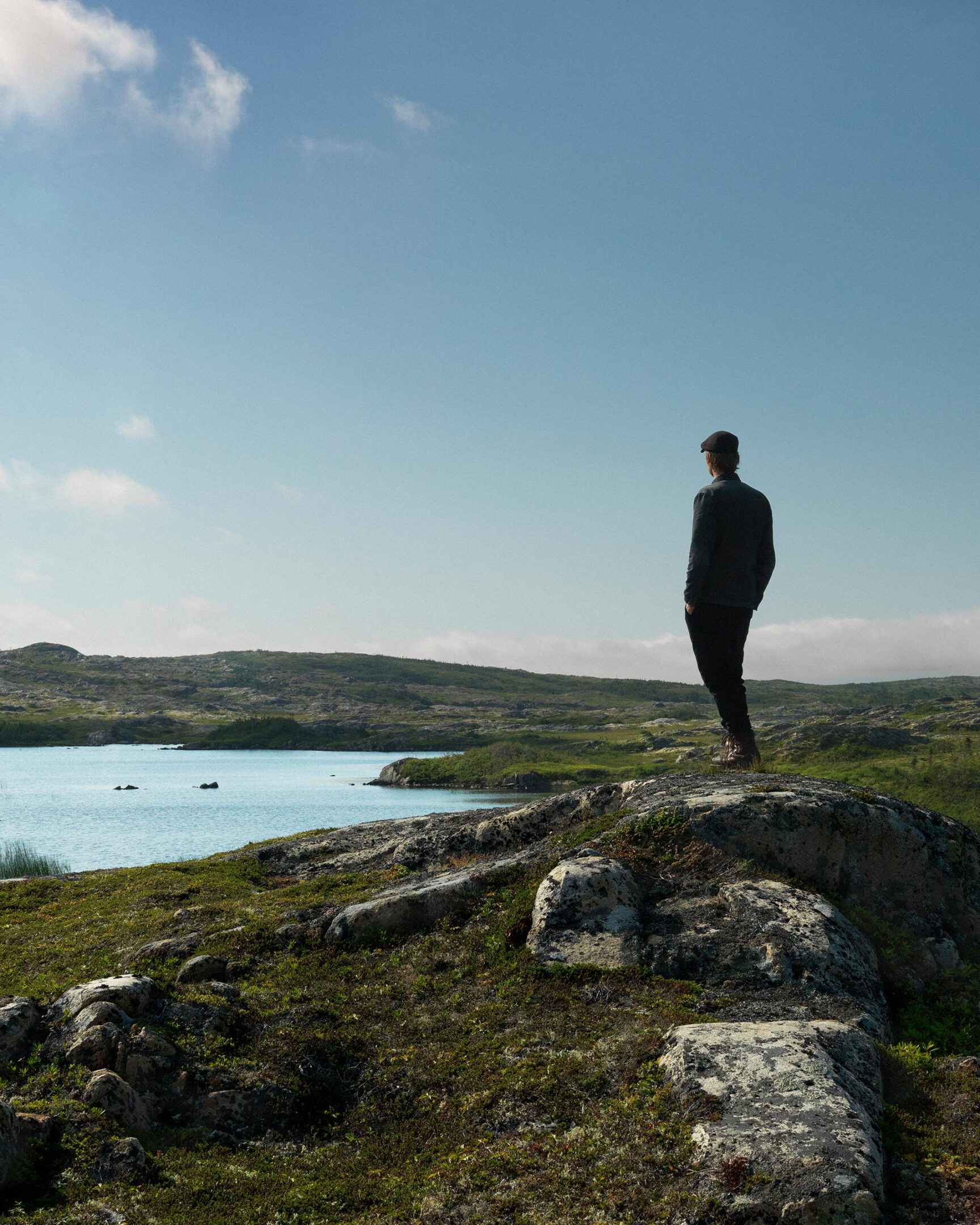
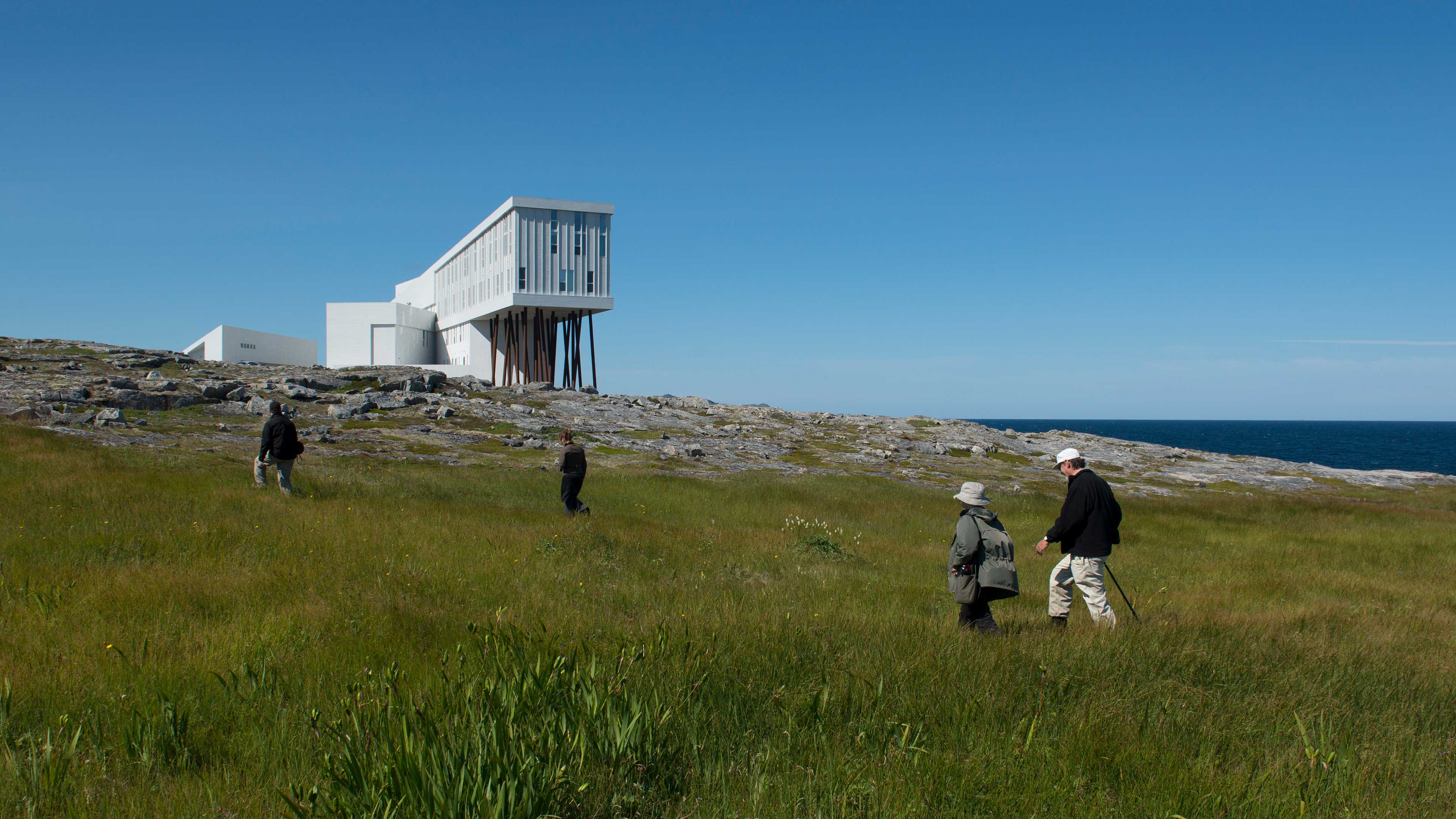
Since its establishment in 2004, Shorefast has been dedicated to cultivating economic and cultural resilience in Fogo Island, Newfoundland—a 400-year-old outport fishing community deeply affected by the decline of the cod fishery. Notably recognized for the Fogo Island Inn, which reinvests all profits back into the community, Shorefast sought the expertise of Puncture at the close of 2022.
Method & Process
In approaching this project, a comprehensive understanding of Shorefast was imperative. This involved extensive independent research, encompassing a thorough study of internal documents and reports, literature on Fogo Island, and films. Engaging in conversations with founders, staff, locals, and partners, we further immersed ourselves in the culture of Fogo Island during an on-site visit. This process culminated in two workshops—one centered on the brand and another focused on refining website details. The insights gained from these workshops became guiding principles, shaping the direction of our work and receiving approval from the Shorefast team.
Solution
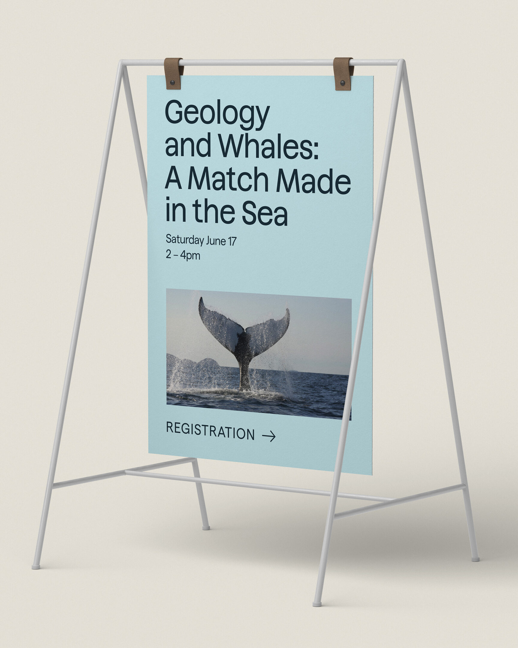
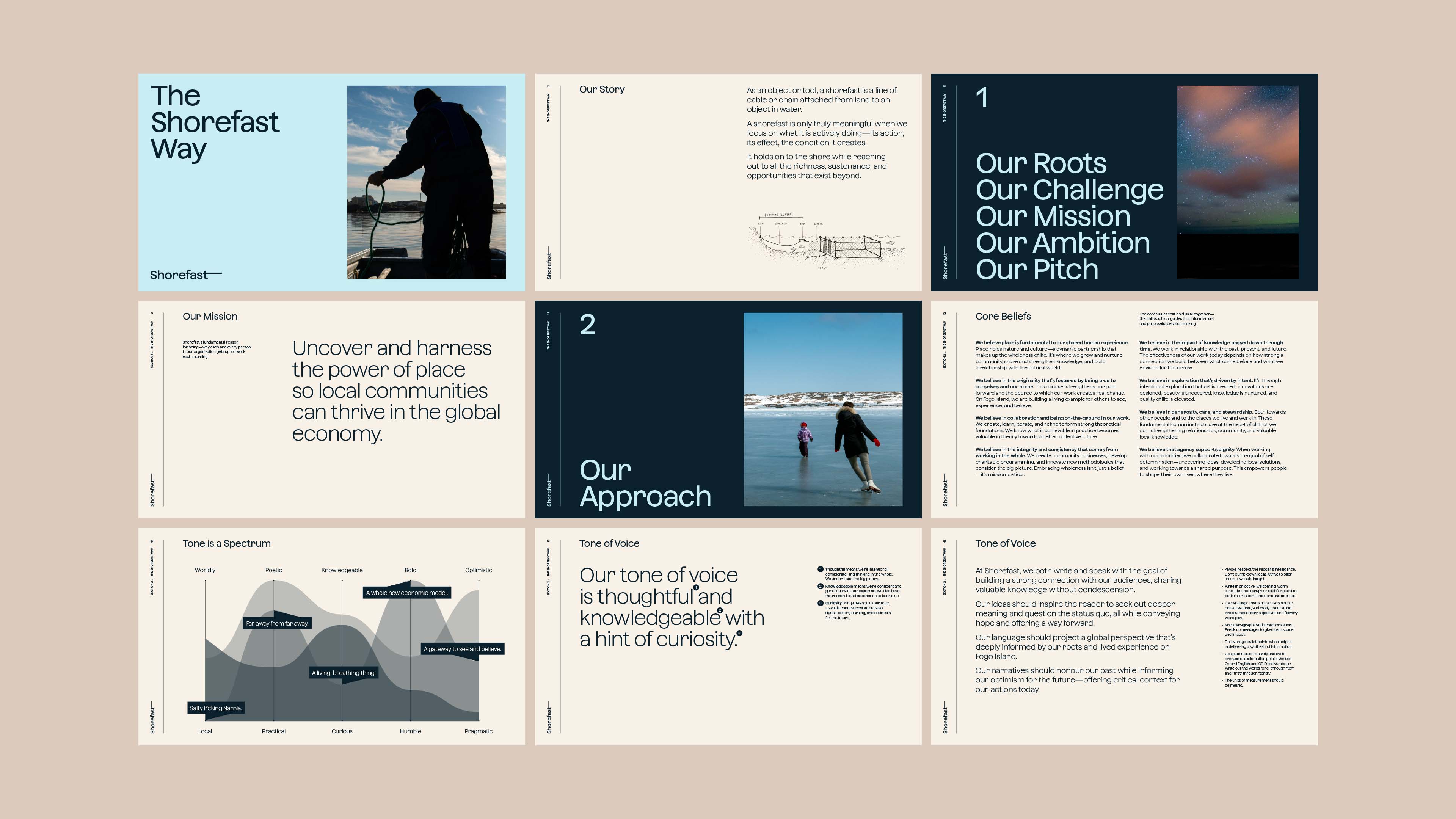
Recognizing that Shorefast required more than a conventional brand, we developed “The Shorefast Way”—a comprehensive communication guideline covering positioning, brand tone, elevator pitch, and beyond. Most importantly, The Shorefast way encourages consistent messaging across channels.

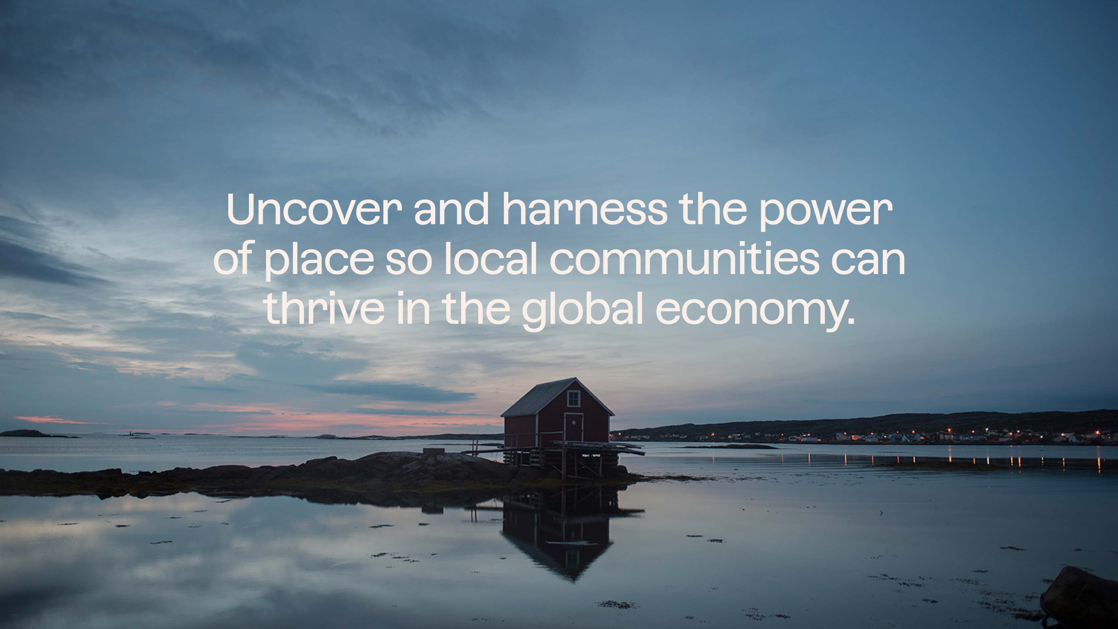
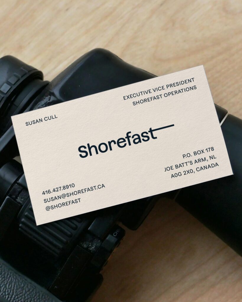
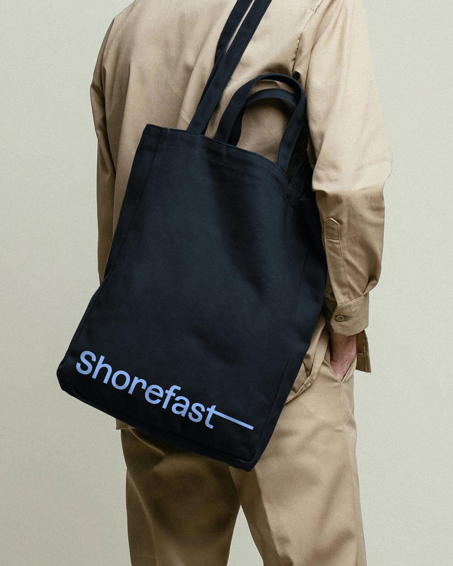
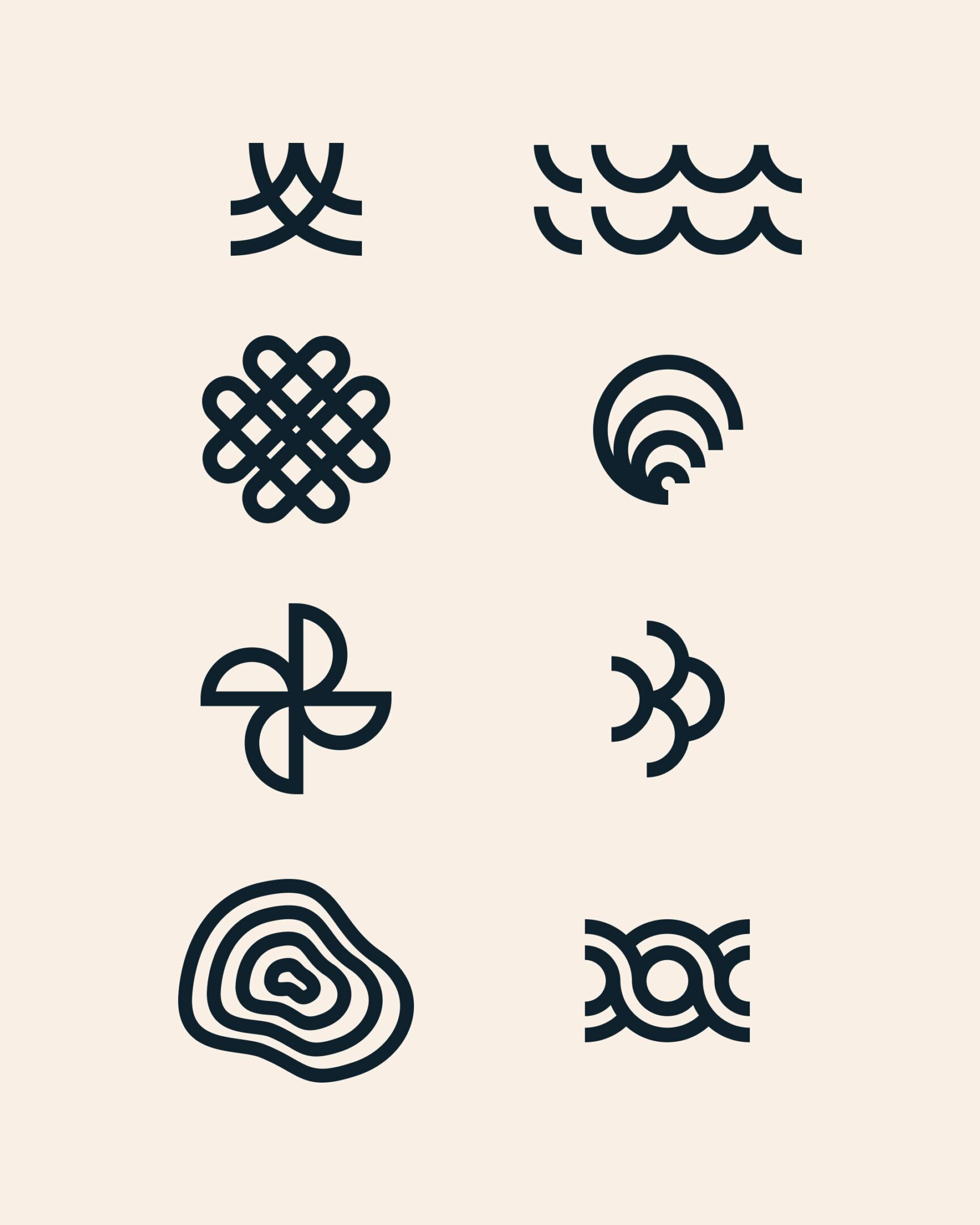
The redesigned Shorefast logo serves as a simple visual metaphor, embodying the notion of holding on while reaching out, expressed through the extending line from the “t.” The brand is complemented by a straightforward typographic system and layouts that mirror the openness, approachability, and consideration inherent in the landscape of Fogo Island and the spirit of its people. The resulting design is simple, bold, user-friendly, and narrative-driven.


The website concept draws inspiration from an organized bookshelf, offering a snapshot of personality, subjects, and themes at a glance, with deeper stories and interactions revealed upon exploration. The website, built on a custom Content Management System, ensures seamless and flexible content updates.
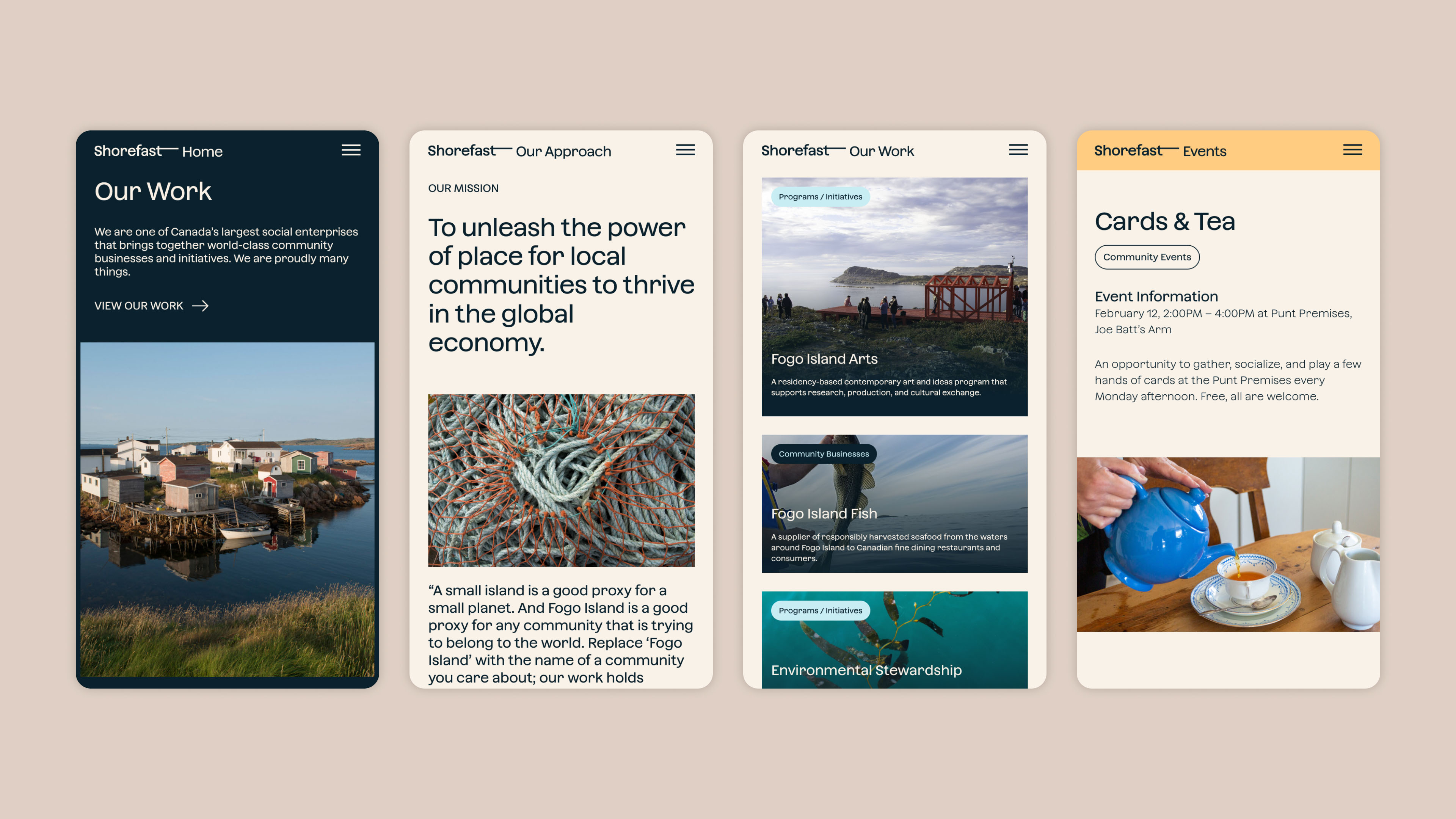


This collaboration aimed to address a growing disparity between Shorefast’s identity and its brand communication, particularly as the organization expanded its reach to collaborate with similar communities across Canada. Key challenges included clarifying the connection between Shorefast, Fogo Island Inn, Fogo Island Arts, and Fogo Island Fish. Additionally, Shorefast required a cohesive visual system and an enhanced website to effectively convey its message.
The refreshed identity has empowered Shorefast with a more assertive, focused, and thoughtful presence. Internally, streamlined processes for creating reports, workshops, and presentations have shifted the team’s focus from graphic design to content. This transformation has translated into increased speaking engagements and substantial growth in donorship. Equipped with the tools and language provided, every team member and Fogo Islander can now articulate Shorefast’s narrative authentically. Moreover, the simplified and user-friendly website has made content uploading a straightforward and even enjoyable experience for the entire team.
View more projects