SafeFest
Creating a highly visible and recognizable brand for a team dedicated to safety at music festivals.

Working with C3 Presents—the force behind top music festivals such as Austin City Limits and Lollapalooza—Puncture was tasked with creating the visual identity for SafeFest; all with the goal of standing out in a crowded and visually dense festival environment.
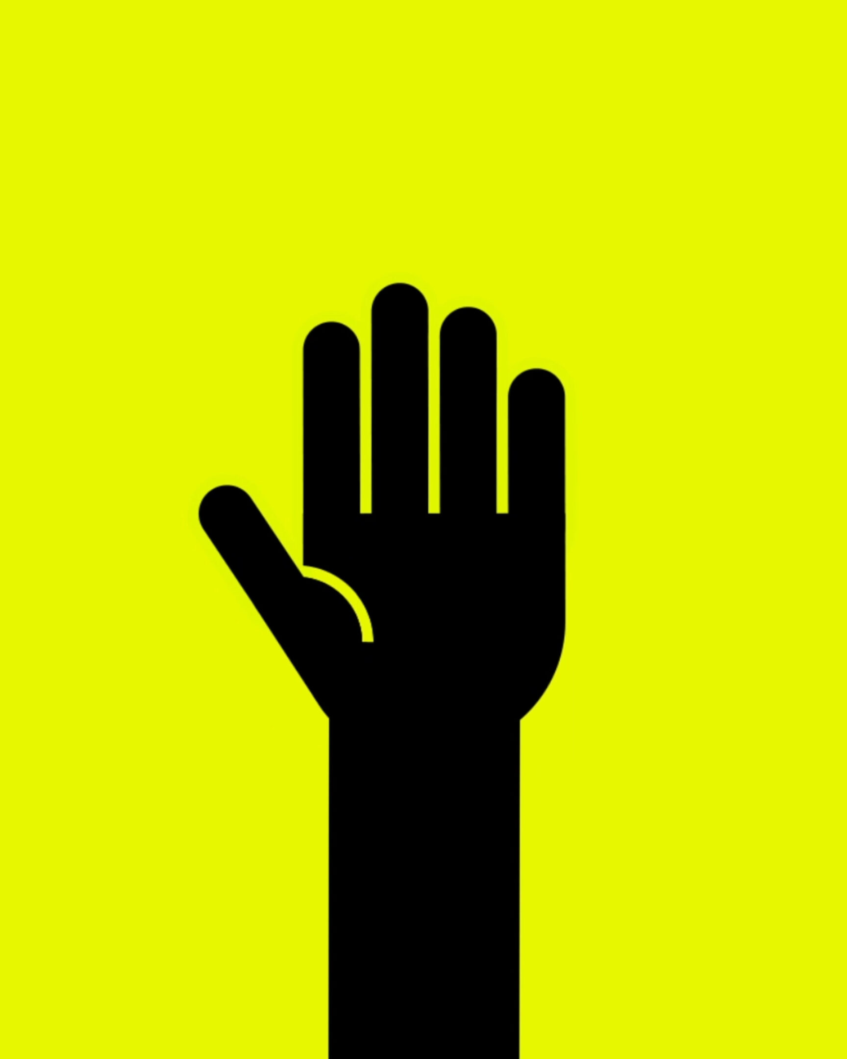
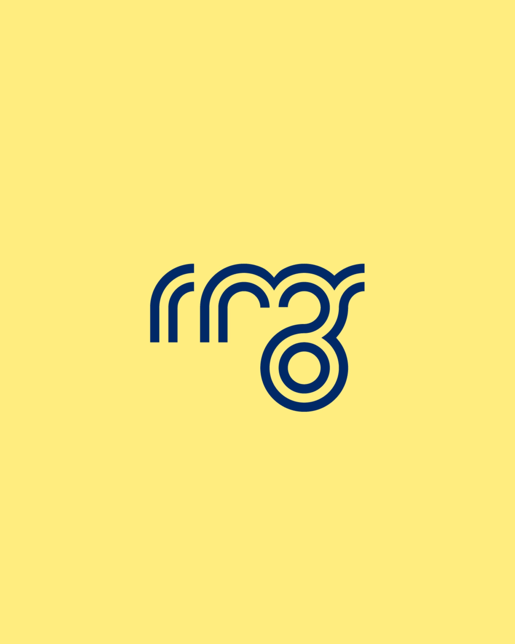
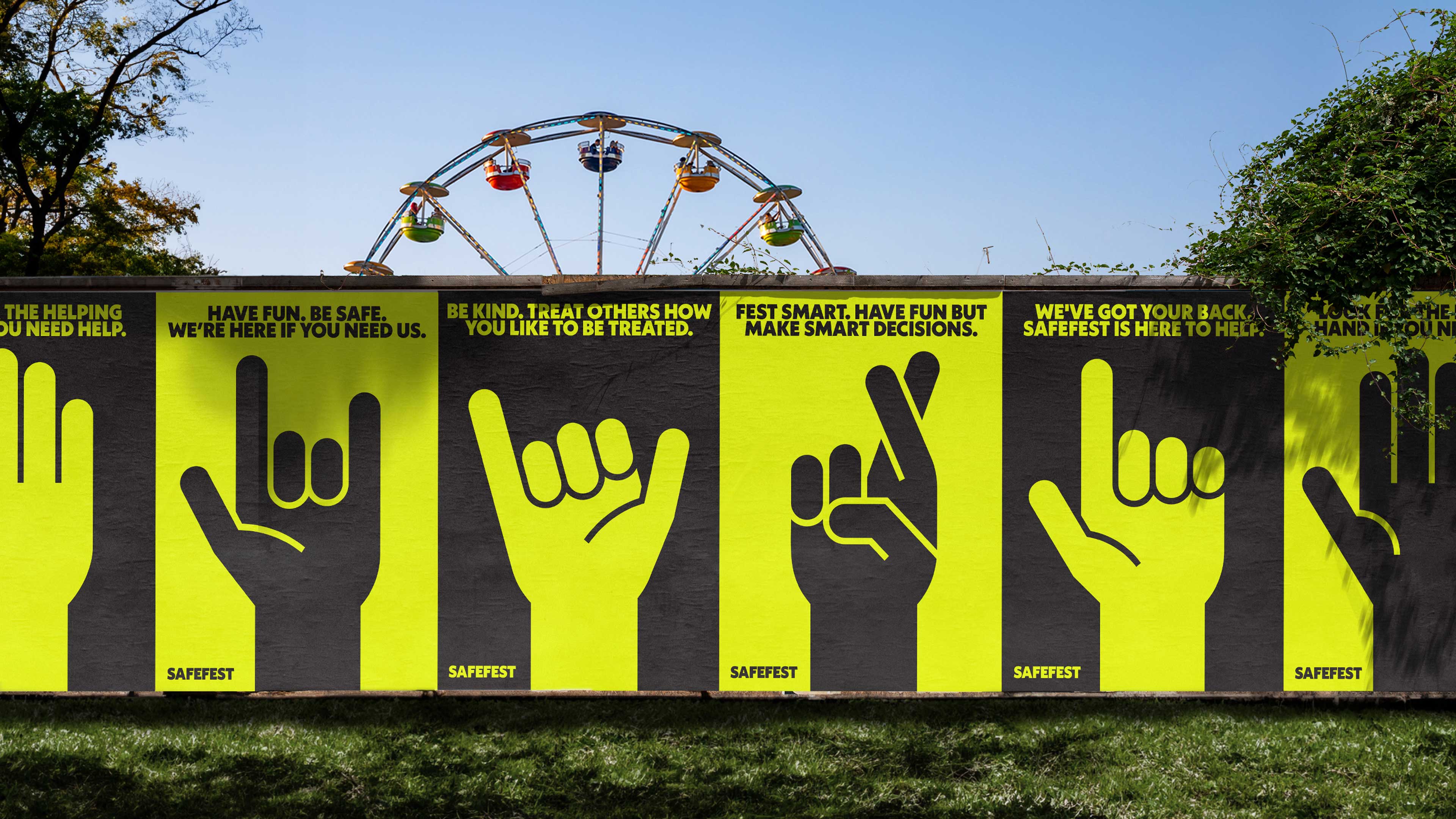
We developed the SafeFest hand raised in the air—a universal symbol representing a need for help, wanting attention, or having a question. It’s a gesture that is intuitive and can be understood quickly.


The Safest Hand also serves as a mascot for the brand. It takes on a positive and fun persona with its different hand gestures. It’s meant to make asking for help feel more accessible, differentiating itself from EMT or Police.
We paired the hand with a bright neon safety yellow. It’s meant to draw attention from a distance, in the dark, or under impairment. It’s a non-authoritative colour that will encourage festival goers to ask for help and watch out for each other.


Industry
Arts & Culture
Service
BrandingMotion
SafeFest is a brand new team dedicated to creating a safe space for music festival patrons by providing an additional resource that isn’t medical or security.
Launched in 2023, SafeFest found it’s way to many festivals, including Bonnaroo, Lollapalooza, and Austin City Limits and will continue to be present at festivals on an ongoing basis. If you need any assistance at an upcoming C3 festival, look for the helping hand or the SafeFest team in yellow T-shirts!
View more projects