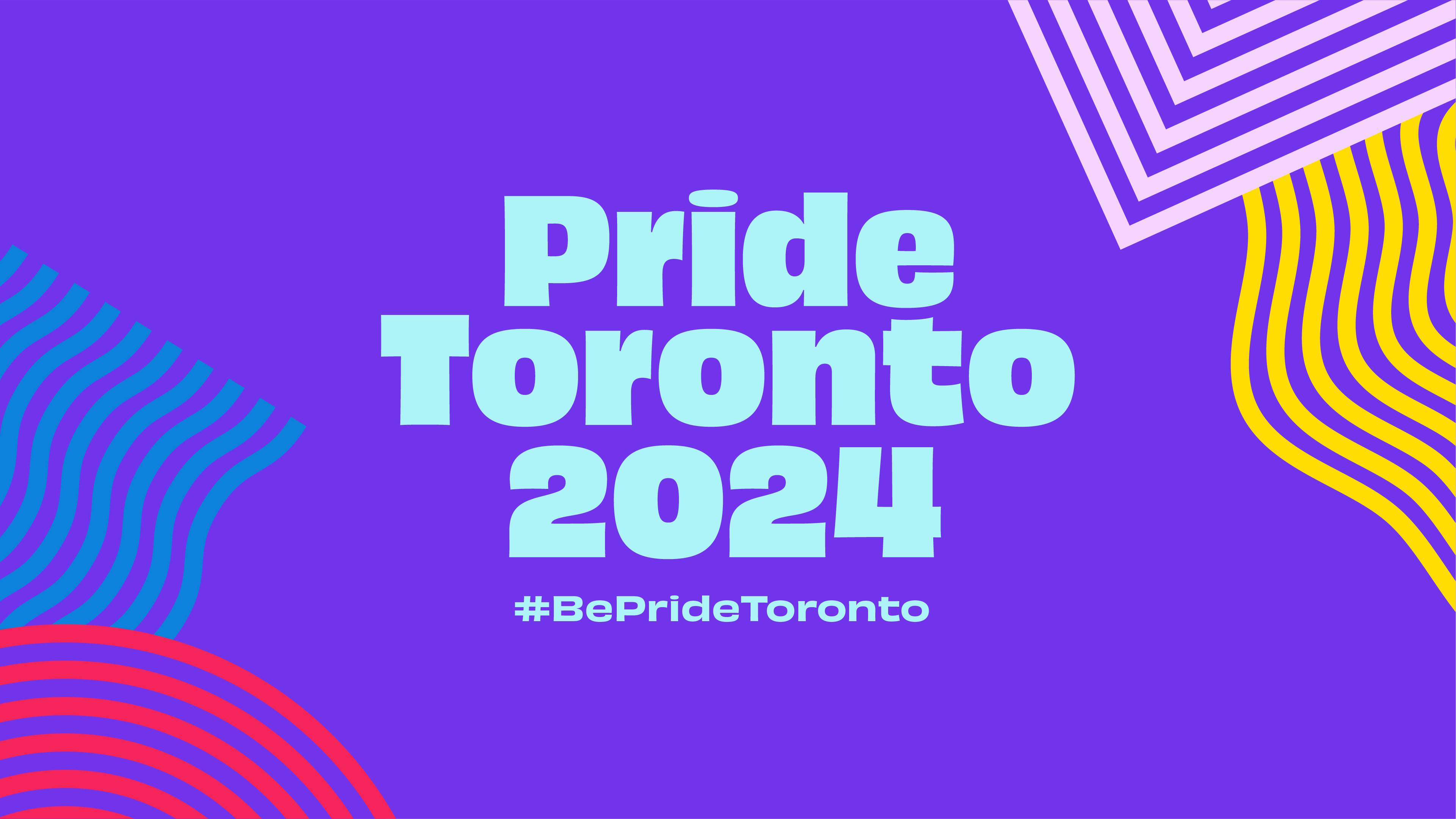
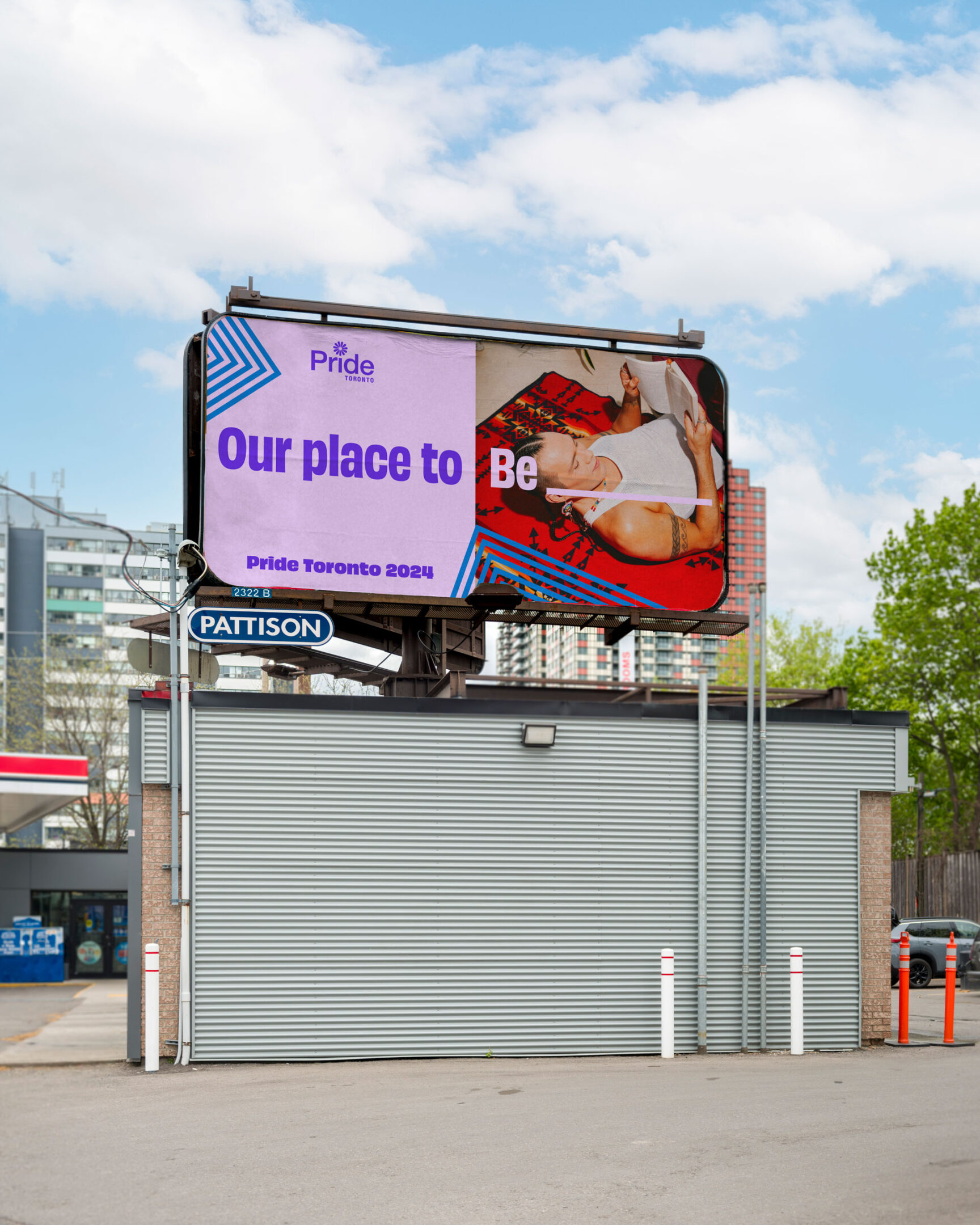
Pride Toronto 2024

Celebrating our right to Be.

Industry
Arts & CultureNon-Profit

Service
BrandingMotionPrint

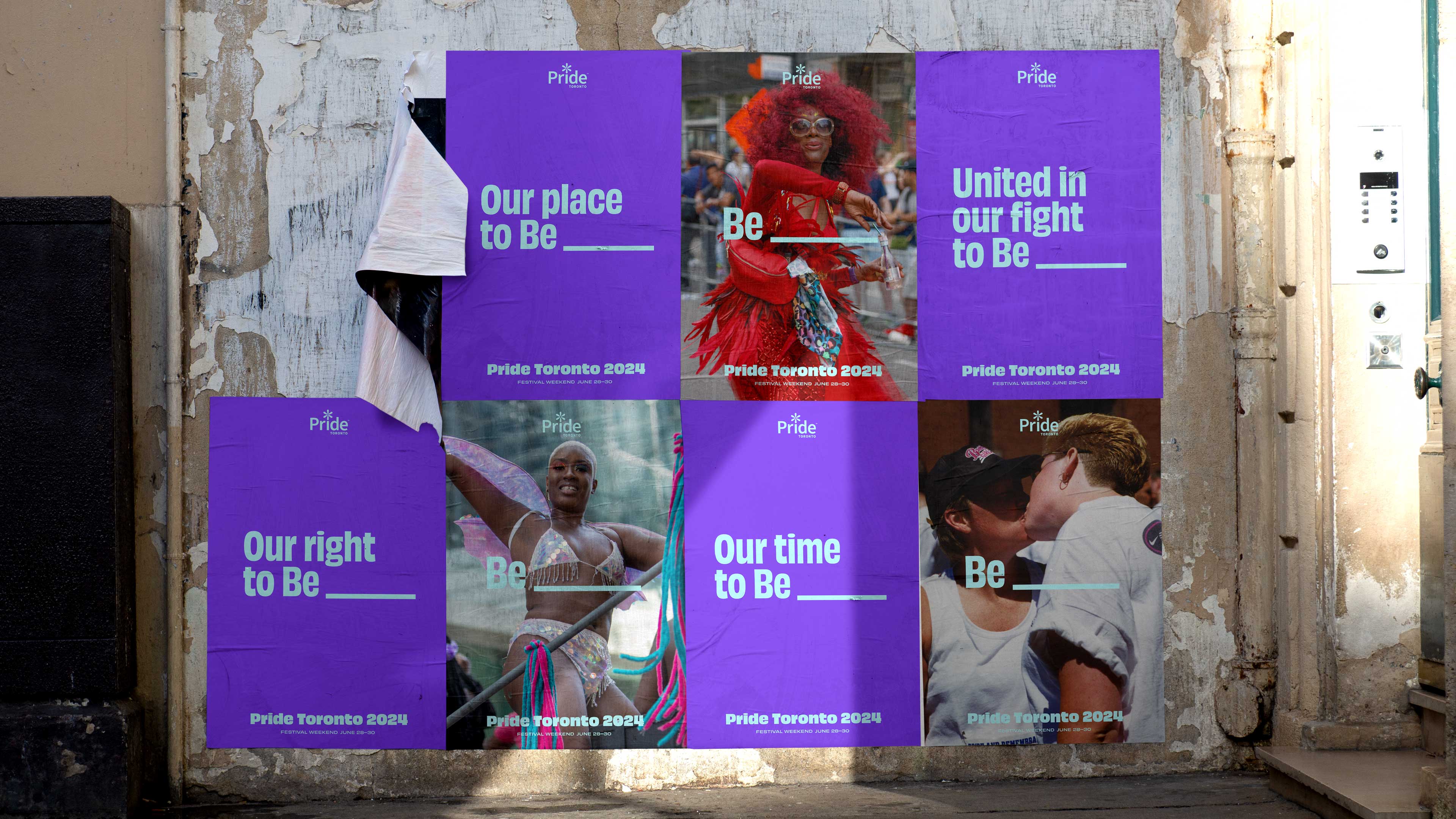
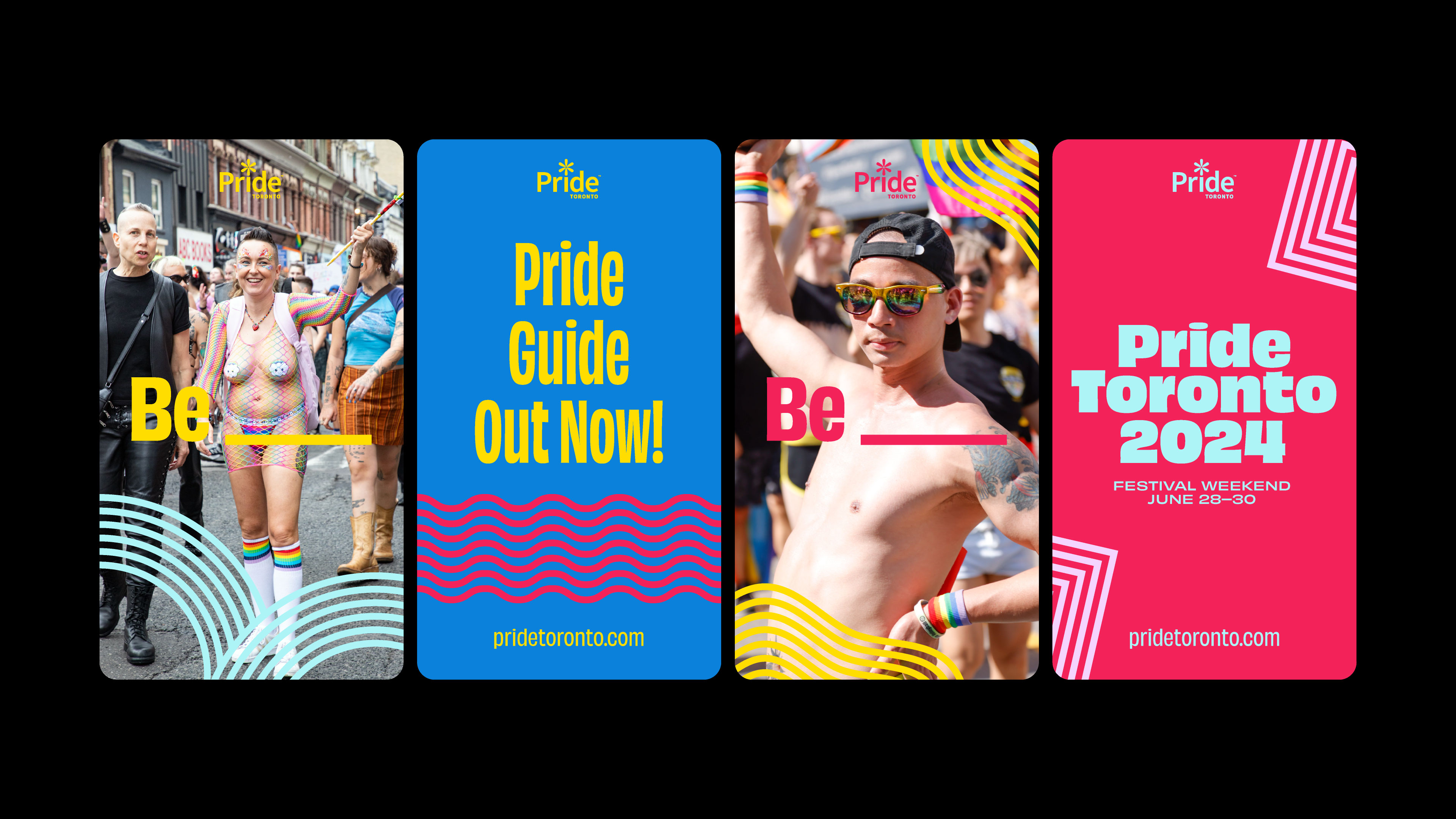
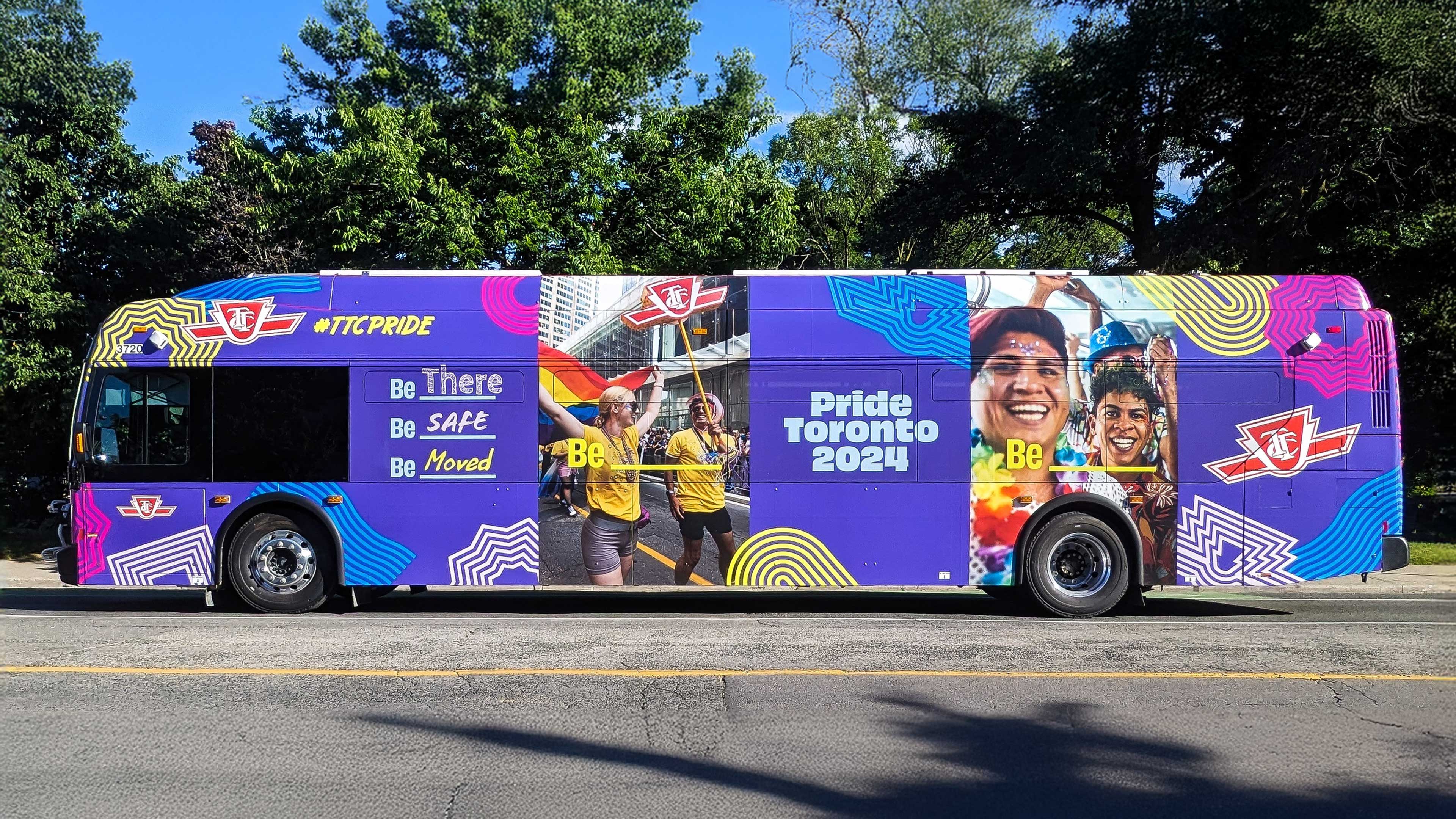
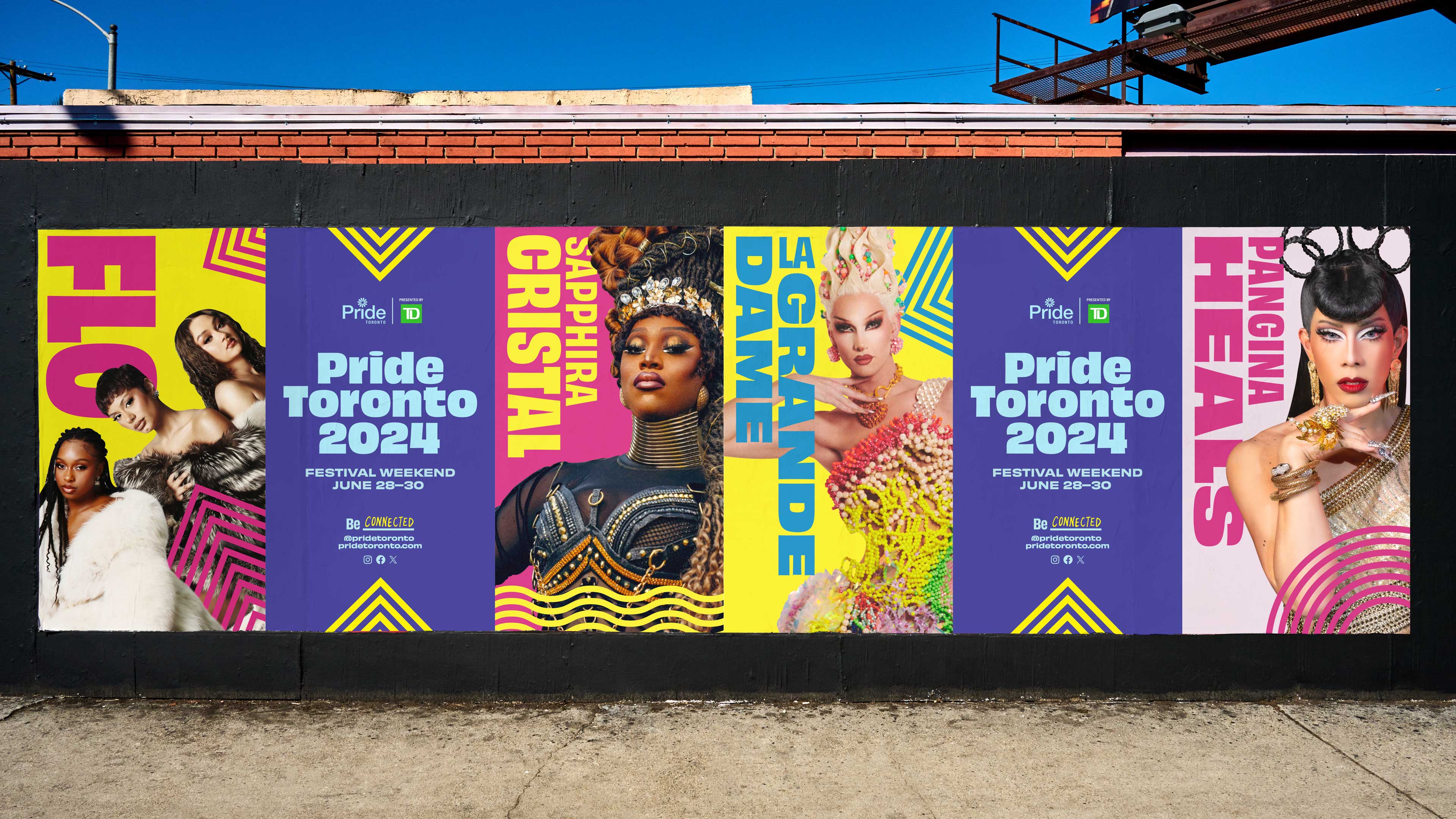
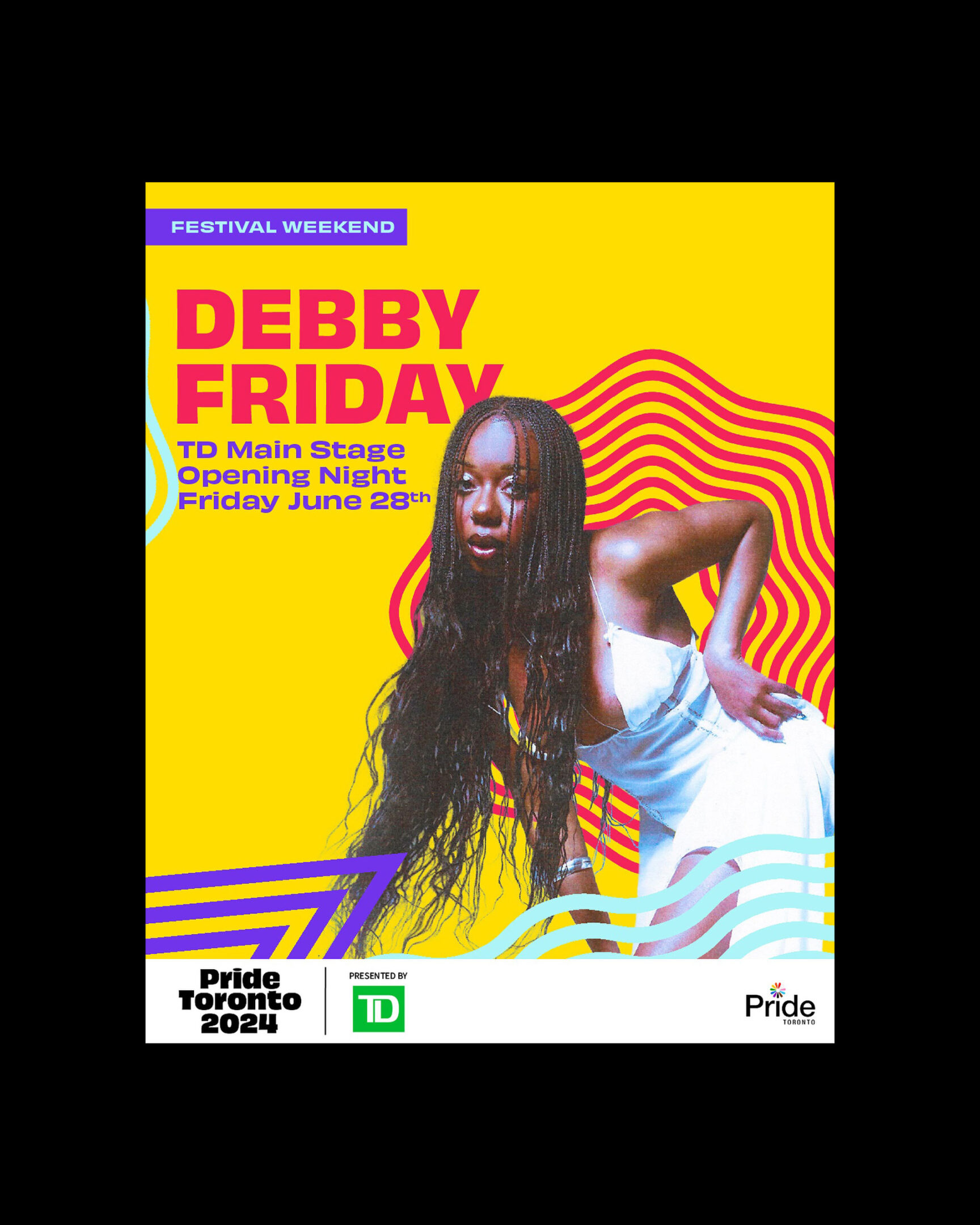
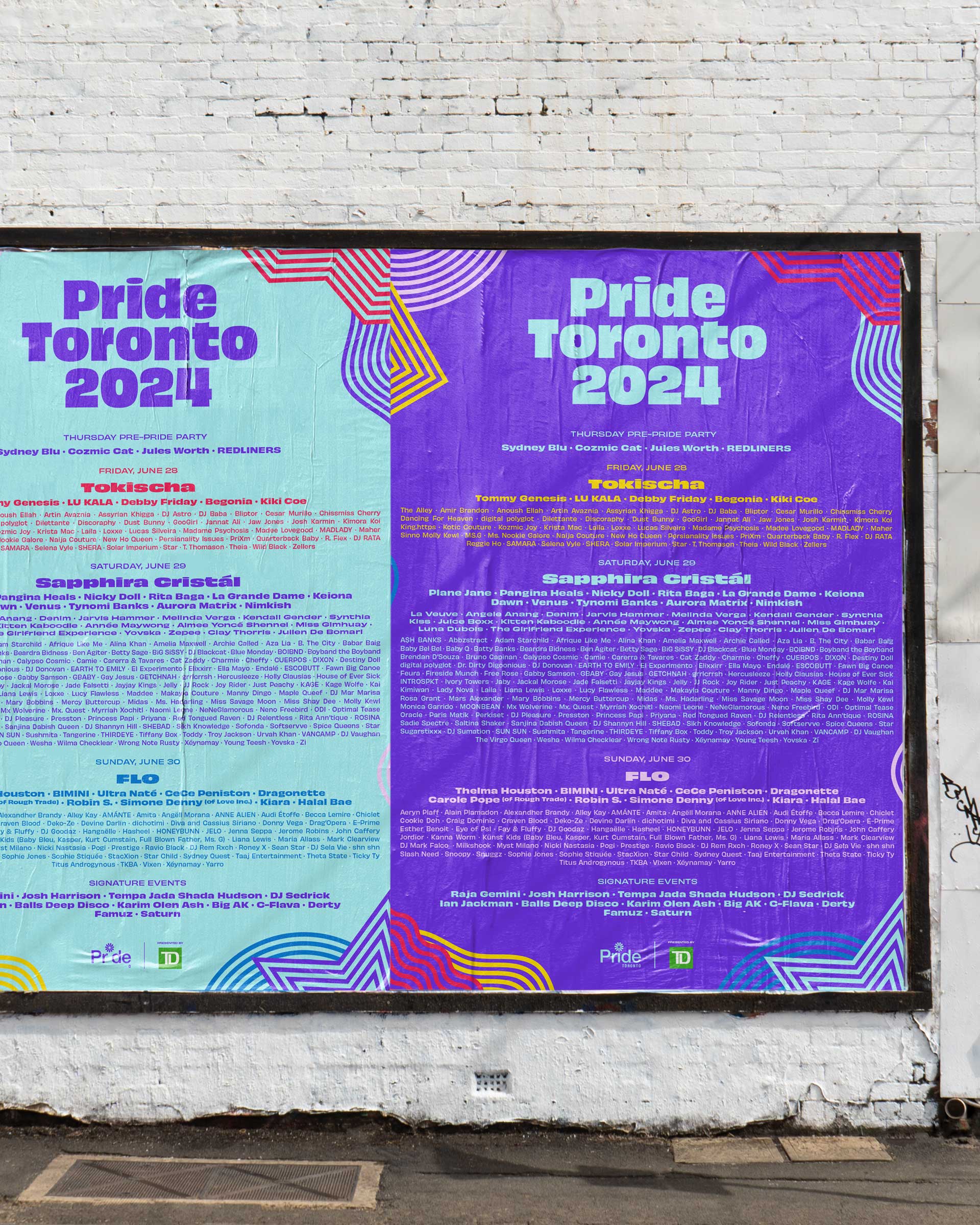
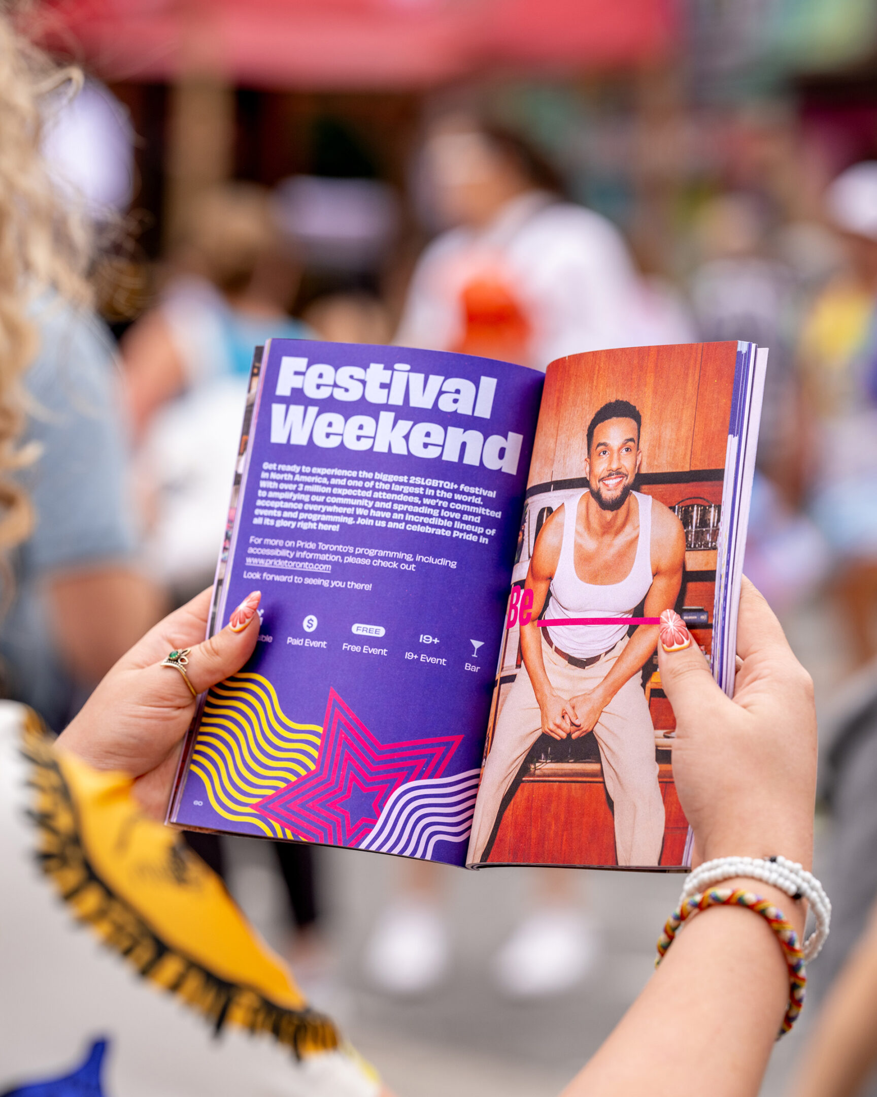
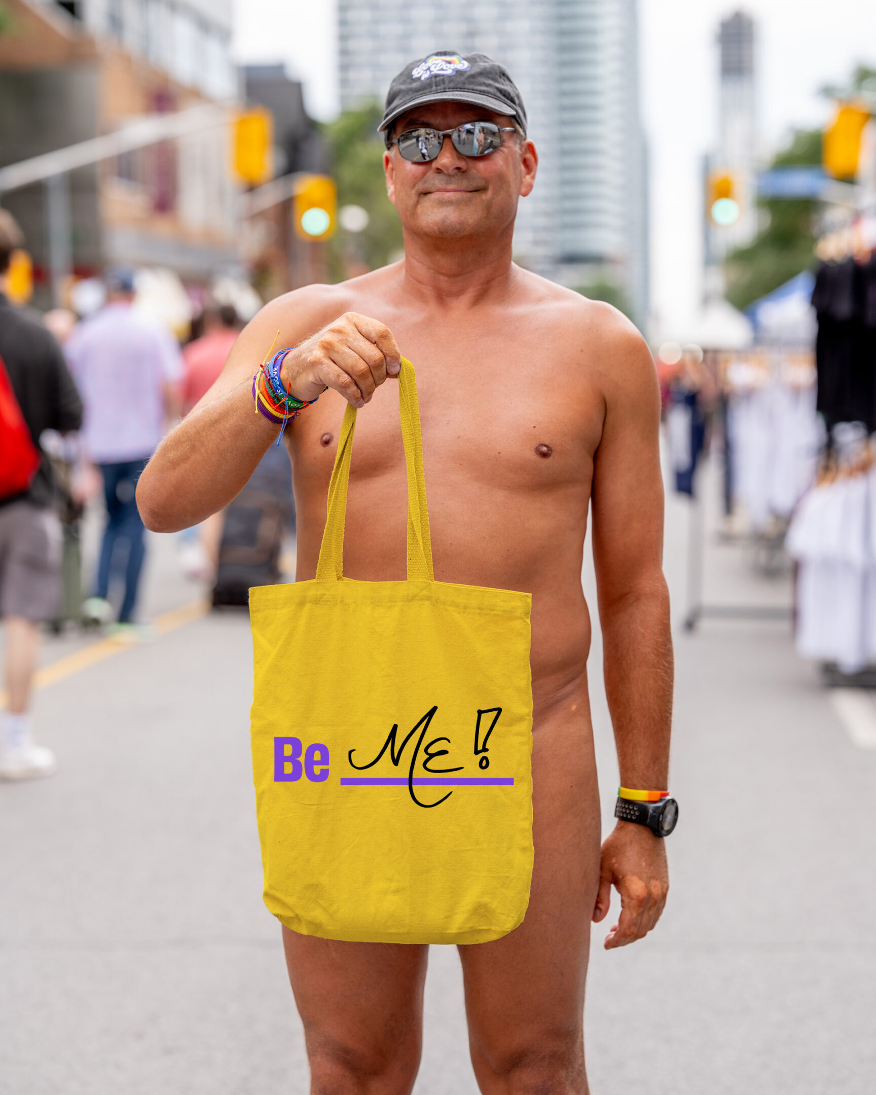
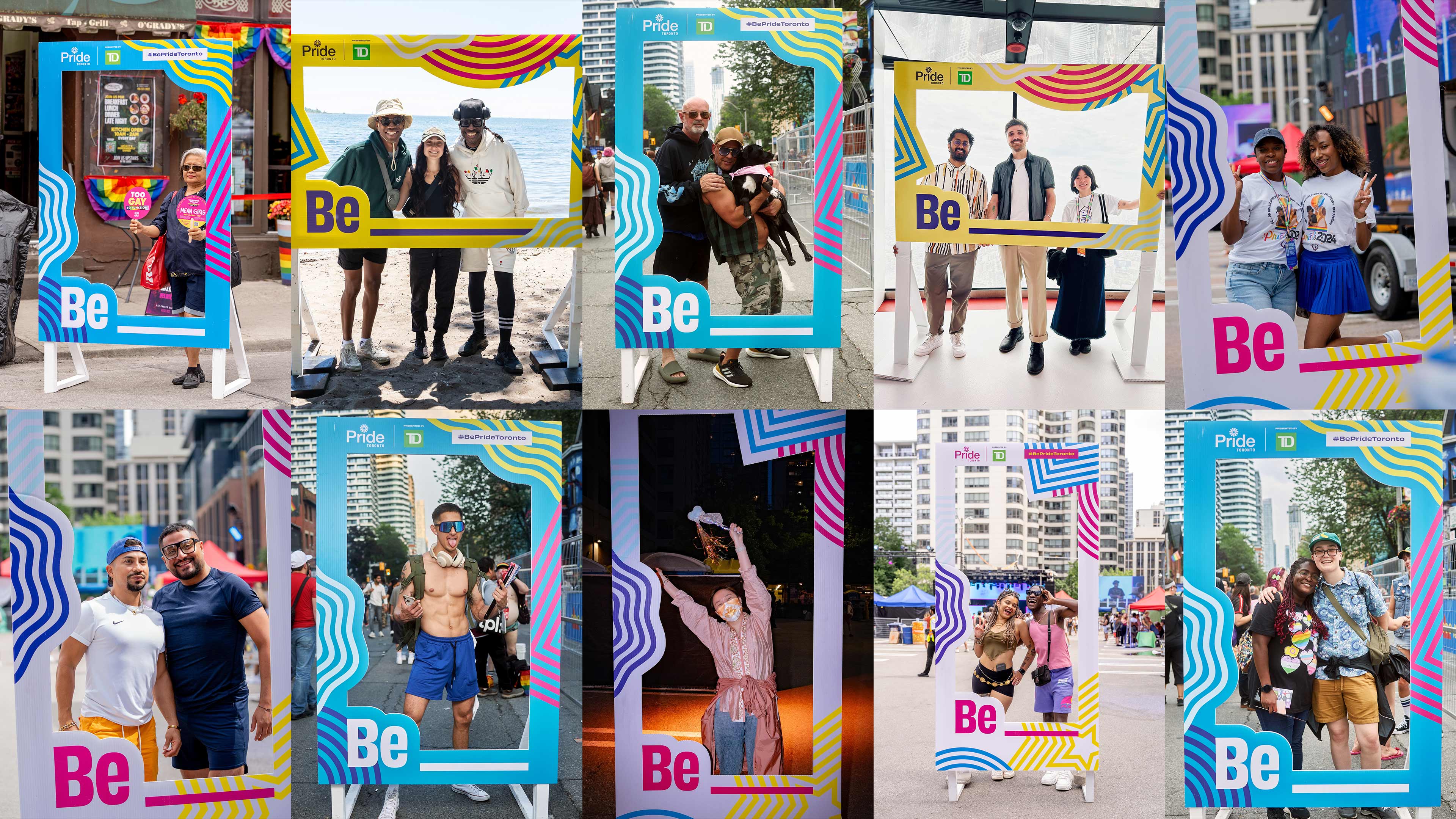
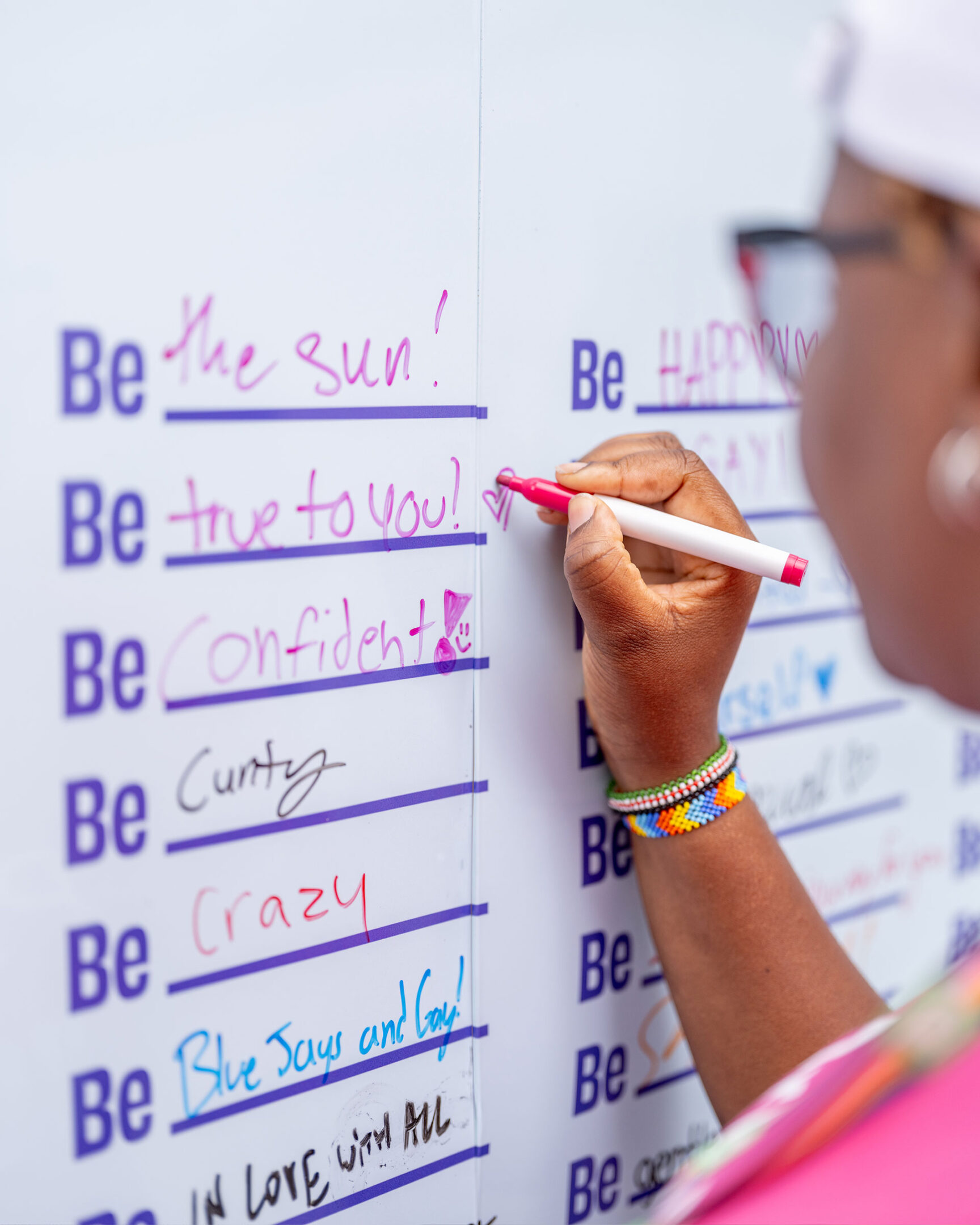
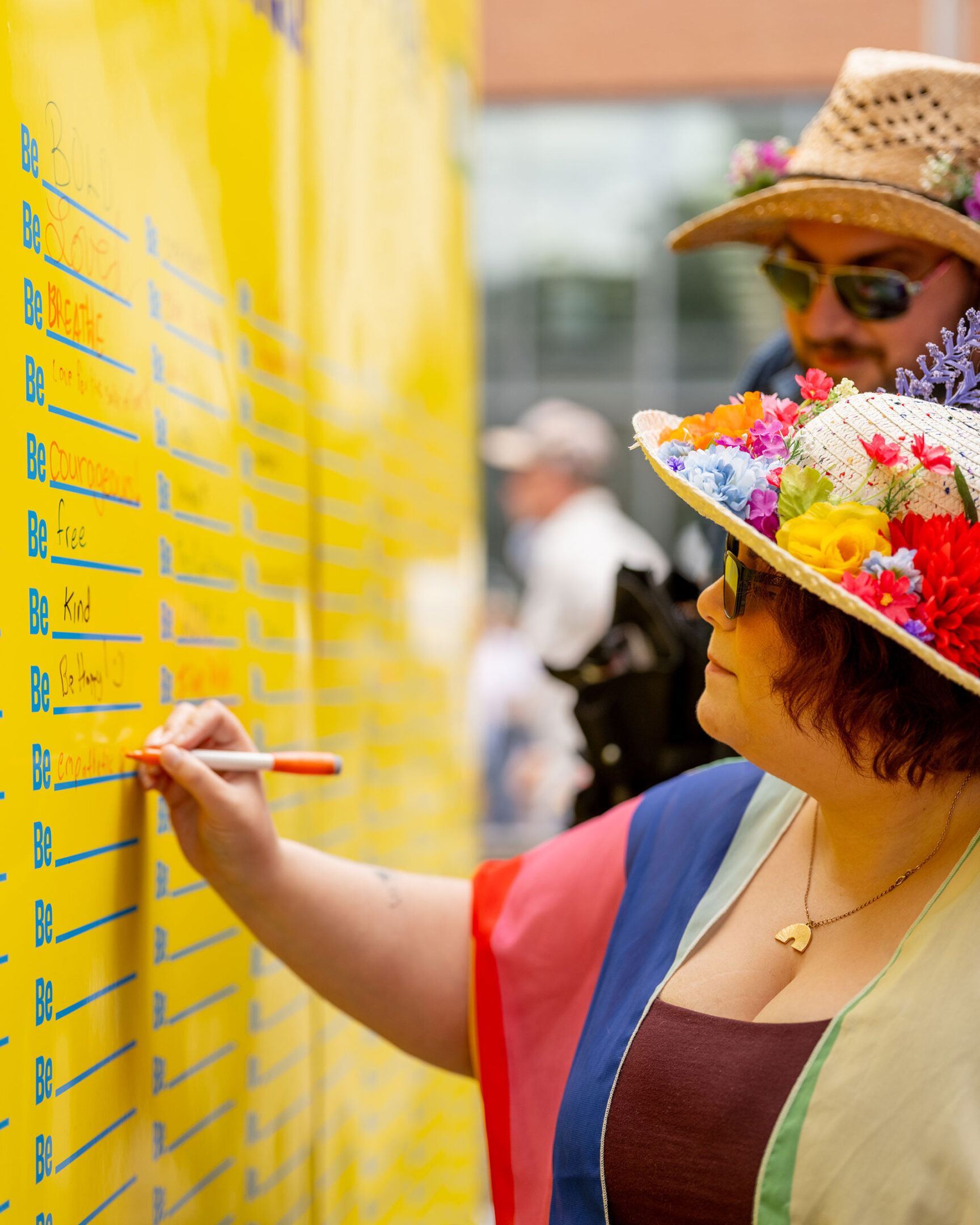
Pride Toronto 2024 embraces the powerful theme of “Be”—a declaration of existence, authenticity, and the fundamental right to simply be. More than just a theme, “Be” is a manifesto—a rallying cry that unites the 2SLGBTQI+ community and its allies in a bold, unapologetic celebration of identity, diversity, and human expression.

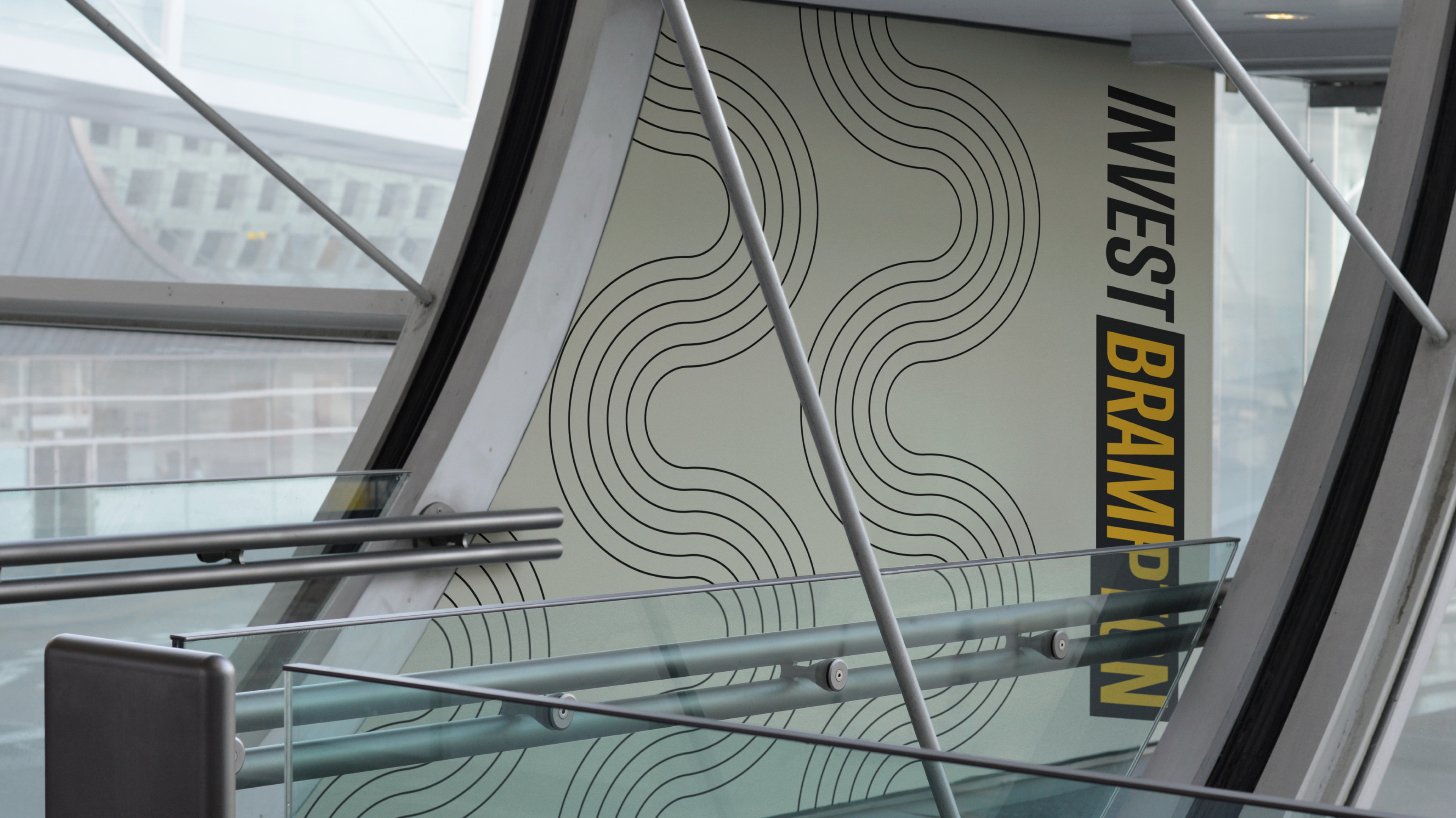
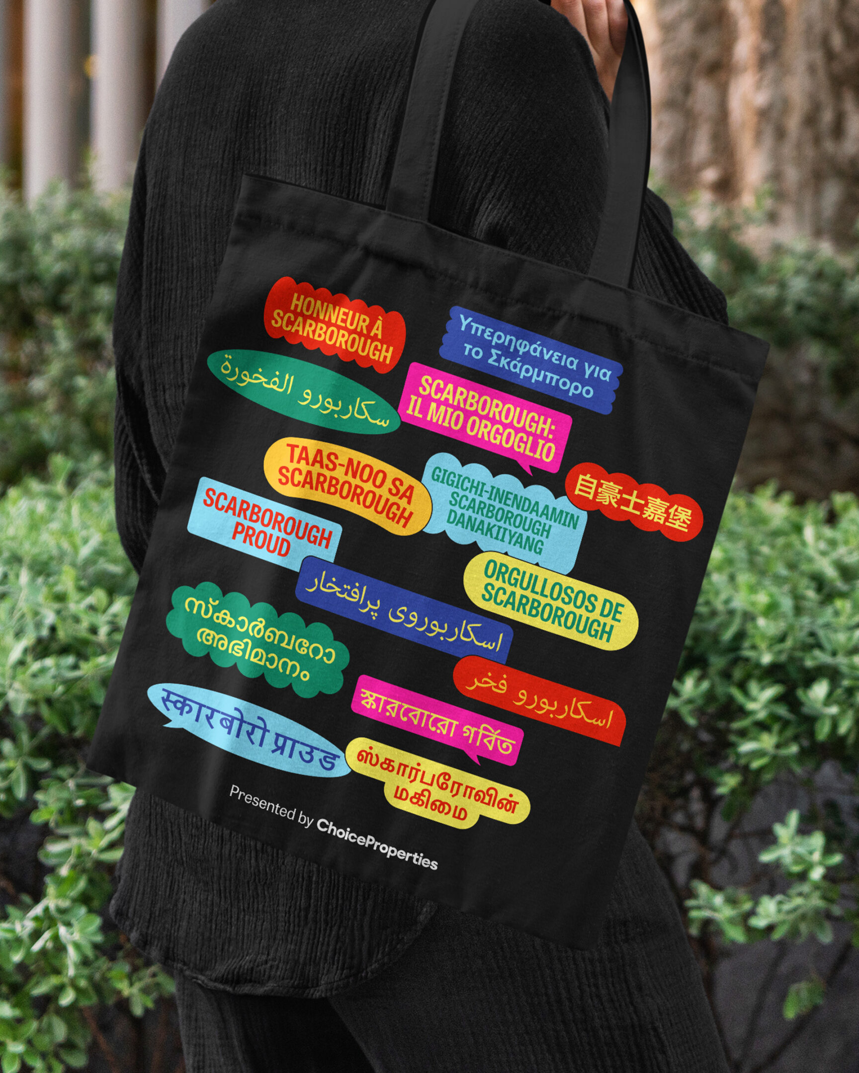
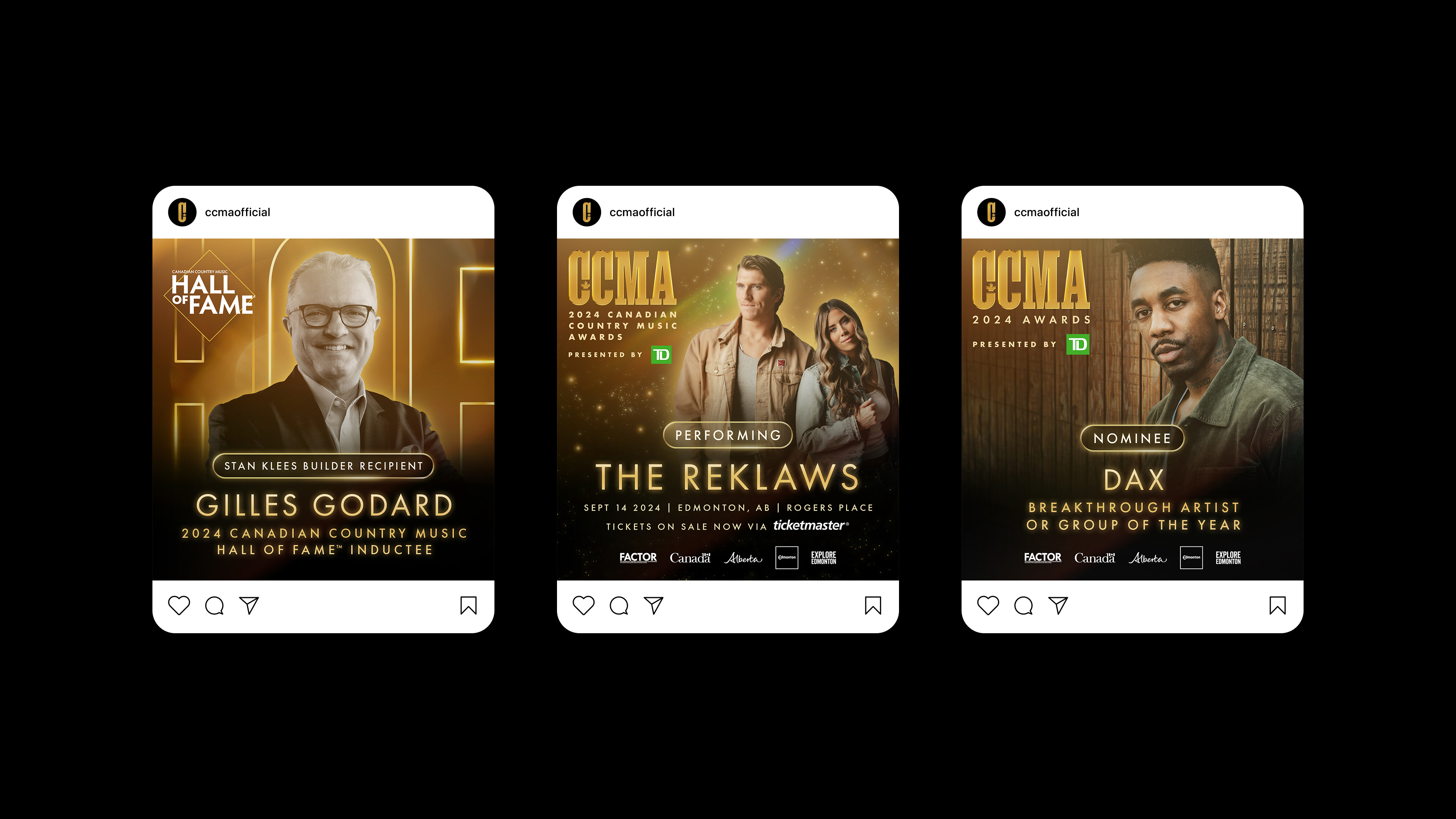
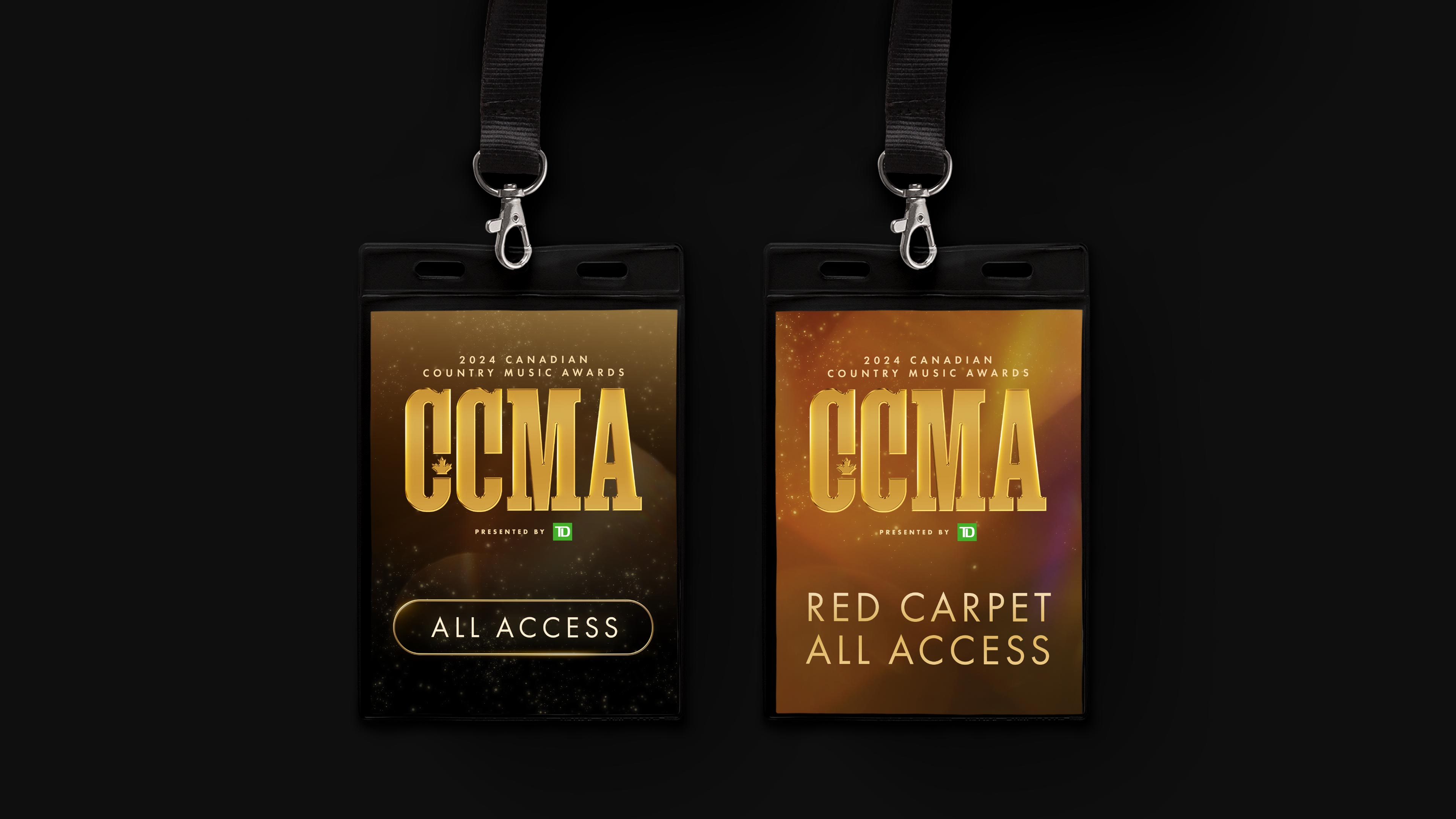
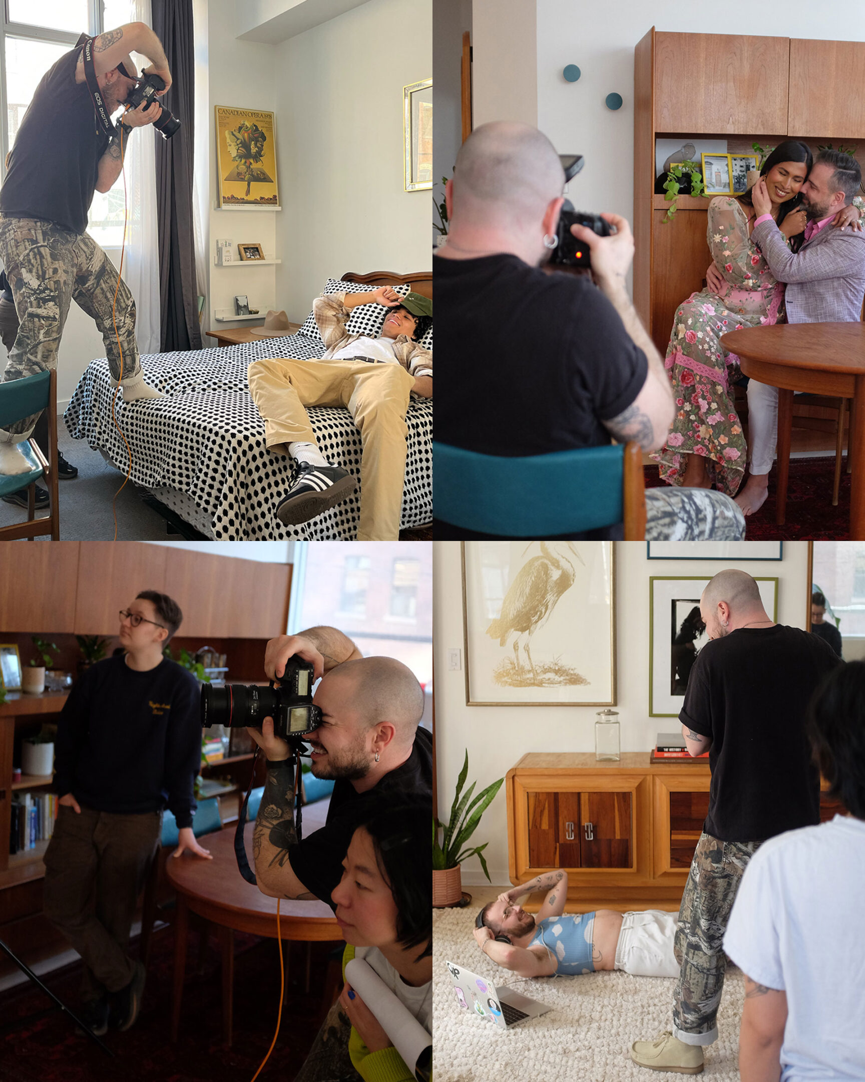
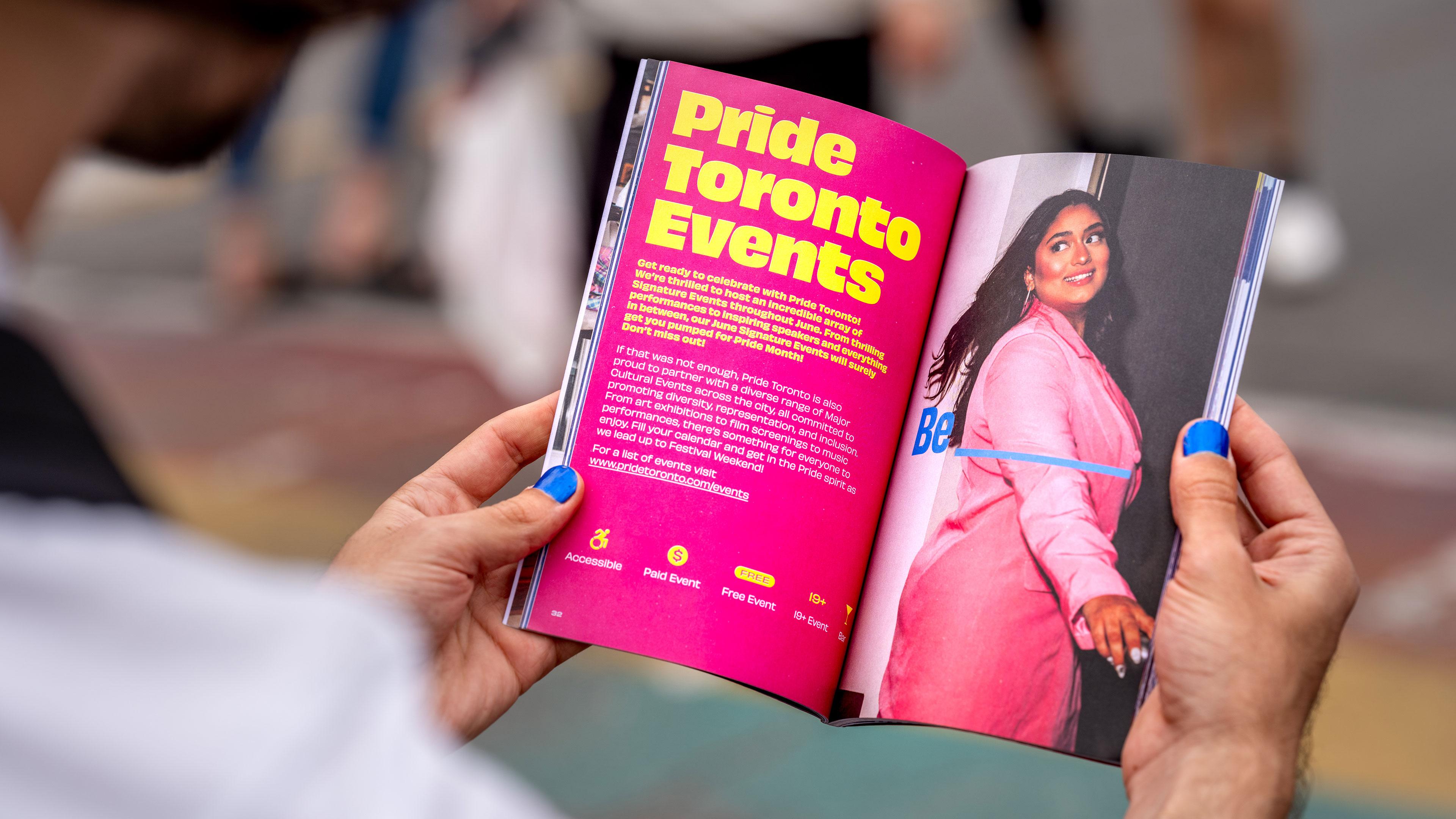
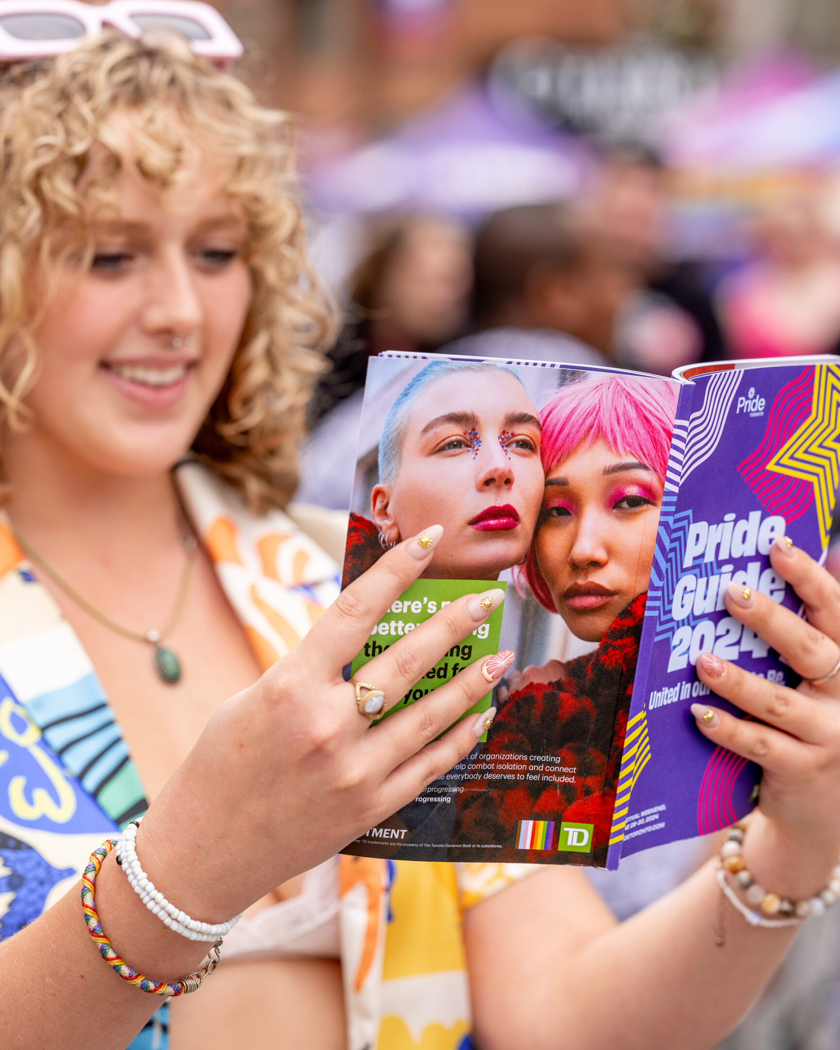
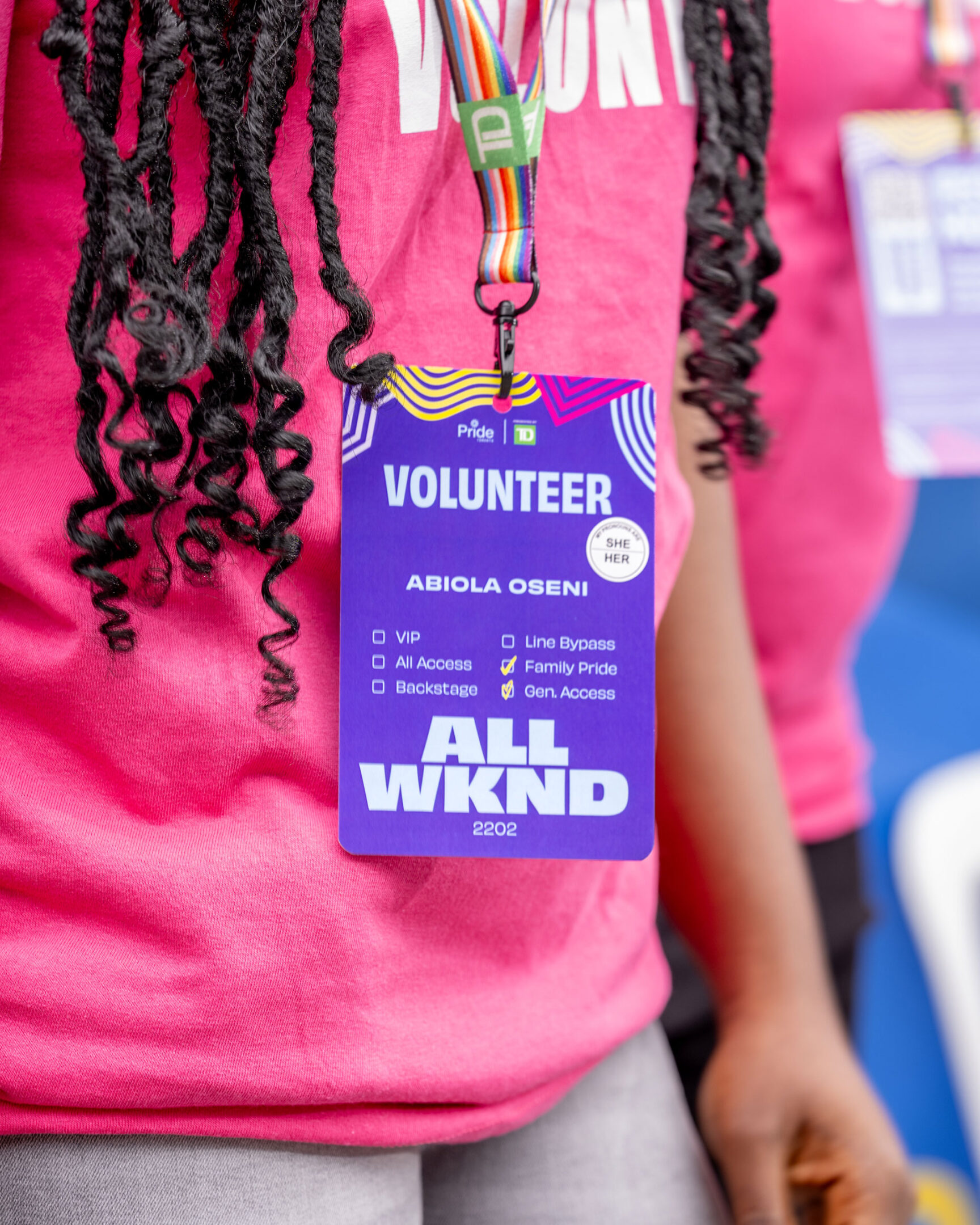
Puncture supported Pride Toronto in bringing this vision to life through dynamic marketing and communication assets, ensuring that the festival’s message resonated across digital and physical spaces. From refreshing the festival’s theme identity to producing digital marketing materials, wayfinding, onsite signage, and the official Pride Guide, our work helped shape an inclusive experience.

Together, we made Pride Toronto 2024 an undeniable presence—one that invites everyone to be seen, be heard, and simply be.

plazaPOPS Website

Building a new website and visual assets for a community organization that transforms underused spaces into accessible gathering places.

The new website for plazaPOPS captures the energy of suburban main streets in Toronto, using a vibrant colour palette and expressive street sign motifs.

Industry
Arts & CultureNon-Profit

Service
BrandingWebsite

plazapops.ca

plazaPOPS is a non-profit organization that transforms parking lots and other under-invested spaces, into free, safe and accessible gathering places. Largely located along suburban main streets where vibrant culture already exists, plazaPOPS partners with these local community groups, landowners and businesses, to support and celebrate these vital connections.

Their initiatives impact many different communities, in which Puncture was asked to create a new website that helps visualize and showcase the value that’s being created. The website captures the organization’s playful personality and forward-thinking initiatives, and provides an infrastructure for their events, programming and research—creating an open invitation for everyone to get involved.

Toronto Biennial of Art

Building a visual identity, communications toolkit and wayfinding strategy for Toronto’s first-ever biennial of contemporary art.

In 2019, prior to launching the inaugural Biennial to the public, TBA came to Puncture to define its visual identity. A key feature of the Biennial is that all of its exhibition sites are located near waterways that are significant to Toronto: Lake Ontario, the Humber River, Don River, and more. We came up with a vibrant brand that is inspired by nautical flags and symbols, these appear in the bold graphic devices we created. 

The system is bolstered by artwork treatments, a celebratory and accessible colour palette, and a custom wordmark to bring the importance of public and free art to the city’s consciousness. In addition to visual identity, we helped simplify the Biennial’s communication platform and got it to its most distilled form, “72 days of Free Art”.

Industry
Arts & Culture

Service
BrandingPrint

The Toronto Biennial of Art’s (TBA) mission is to make contemporary art accessible to everyone. For 10 weeks every two years, local, national, and international Biennial artists transform Toronto and its partner regions with free exhibitions, performances, and learning opportunities.

Since the inaugural year, we have worked with TBA on all aspects of their marketing materials including communications, digital production, graphic design, video production, motion graphic design, and environmental and experiential design. 

Invest Brampton

A brand refresh to support the innovation and success of the City of Brampton.

Industry
Corporate

Service
Branding

Canadian Country Music Awards

Celebrating Canada’s biggest night in country music with glamour.

Industry
Arts & Culture

Service
BrandingMotion

The Canadian Country Music Association (CCMA) is a membership-based, not-for-profit organization committed to the promotion and recognition of Canadian country music. Built upon the foundation to educate, elevate and celebrate Canadian talent, the CCMA progressively heralds the spirit, community and creativity that country music fosters.

Each year, the Canadian Country Music Association honours its members who have excelled during the past year, with a Canadian Country Music Association Award. The CCMA turned to Puncture to elevate their look with glamour and create visually stunning marketing assets for the 2024 awards show in Edmonton, Alberta.

Choice Properties

Creating a purposeful and inspirational brand for one of Canada’s leading Real Estate Investment Trusts.

Choice Properties, a leading Real Estate Investment Trust, is dedicated to creating enduring value through the ownership, operation, and development of high-quality commercial and residential properties. In 2018, Choice Properties underwent a transformative acquisition of Canadian Real Estate Investment Trust (CREIT), solidifying its position as the largest Real Estate Investment Trust in Canada. Recognizing the need for a cohesive brand identity post-acquisition, Galen Weston Jr. sought the expertise of Puncture to refine the brand and unite both entities under a new direction.

Method & Process
The discovery process started like any other; one-on-one interviews and working sessions to gain an in-depth understanding of the organization.Their internal structure, brand architecture, contexts of their work, audiences, competitors, and peers, and most importantly, their united vision for the future.

However, bringing two different organizations together, we had to adjust the process so that there was a high-level of participation and wide buy-in from staff. We wanted this new positioning and brand to be something the internal culture would unify and rally behind. 

This was achieved by creating working sessions with all departments then bringing together key groups at the right moments to help contribute and participate in the process. 

Solution
The outcome of our collaboration was a revitalized communications platform and a refreshed visual identity that seamlessly blends purpose and inspiration. Choice Properties, being committed to long-term value, now boasts a visual identity that authentically mirrors this dedication.

Industry
Corporate

Service
BrandingWebsite

choicereit.ca

Choice Properties is a leading Real Estate Investment Trust that creates enduring value through the ownership, operation and development of high-quality commercial and residential properties.

Since 2019, Puncture has been a strategic partner, offering ongoing integrated marketing communication services to the Choice Properties team. Our services cover a spectrum of touchpoints reinforcing the brand and delivering key messages. From major corporate reports, sales brochures, and Investor Presentations to advising on community engagement strategies and contributing to the development of experiential assets like electric vehicle charging stations, bike stations, and George Weston Limited booth designs. We provide comprehensive support in writing, narrative development, video production, motion graphics, social media, websites, and photography services. This holistic approach ensures a cohesive and impactful brand presence across diverse communication channels.

Mosaic

Modernizing a brand system to reflect the evolution of a software-driven company.

Industry
Corporate

Service
BrandingWebsite

mosaic.pe

Mosaic is a software platform built by investment professionals, for investment professionals—designed to eliminate the manual modeling bottlenecks that slow down high-value work. By taking users from CIM to LBO model in under 10 minutes, Mosaic streamlines the due diligence process with accurate, consistent results, enabling teams to shift their focus to higher-order decision-making and deliver stronger outcomes for investors.

CAMH Virtual Tour

A virtual tour of CAMH’s new facilities, created to show donors the impact of their donations.

Industry
Non-Profit

Service
VideoWebsite

explore.camh.ca

The Centre for Addiction and Mental Health (CAMH) is Canada’s largest mental health teaching hospital and one of the world’s leading research centres in its field. A large part of their strategic plan includes rebuilding their campus to become one of North America’s leading mental health research hospitals.

CAMH engaged us to create a website and interactive tool to showcase two newly constructed buildings to their existing donors. As COVID-19 hit and restrictions were enforced, donors who would likely donate again, could not physically come into the buildings to see the impact of their donations. We designed and built an interactive virtual tour experience of the newly completed buildings that houses over 40 videos that we scripted, shot and produced. The experience is designed in a way that donors can explore it based on their own interests, or it can be tailored for personalized guided virtual tours.

Weston Family Foundation

A new visual identity and communications platform for a foundation dedicated to creating a healthier, more resilient Canada.

For three generations, the Weston Family has maintained a strong tradition of giving. After a two-year strategic review, the foundation narrowed their focus to generate impact by advancing the health and landscapes of Canada. This new mission and vision called for a new name, identity and website, as The W. Garfield Weston Foundation became the Weston Family Foundation.

With a new name and a refreshed mission, Puncture was asked to create a new identity to capture this important shift, while also reaffirming the roots of the Weston family legacy. Agriculture has always been at the heart of the Weston story, as well as Canada’s history as a whole. Our team started from the iconic image of a wheat sheaf, integrating a unique Weston “W”, and built a simple but robust visual identity system around it to create a cohesive and confident brand that expresses the Weston Foundation story.

Industry
Non-Profit

Service
BrandingWebsite

The website reflects the foundation’s innovative spirit and forward-thinking initiatives, and provides an infrastructure for all programs and supports an online hub for posting and applying for grants.

Choice Eastway and Caledon

Introducing two state-of-the-art industrial spaces with a bold identity and website.

Industry
Corporate

Service
BrandingWebsite

choicecaledon.ca

In a move to broaden their industrial portfolio, Choice Properties partnered with Rice Group, leading to the acquisition of two new properties located in East Gwillimbury and Tullamore.

After renaming the projects to Choice Eastway Industrial Centre and Choice Caledon Business Park, we held a collaborative workshop to gain deeper insights into their objectives and to envision their goals. Building upon the established Choice brand, we developed two visual identities that reflect the properties’ clean and modern facilities. Additionally, we created a responsive website and informative brochure aimed at attracting prospective tenants.