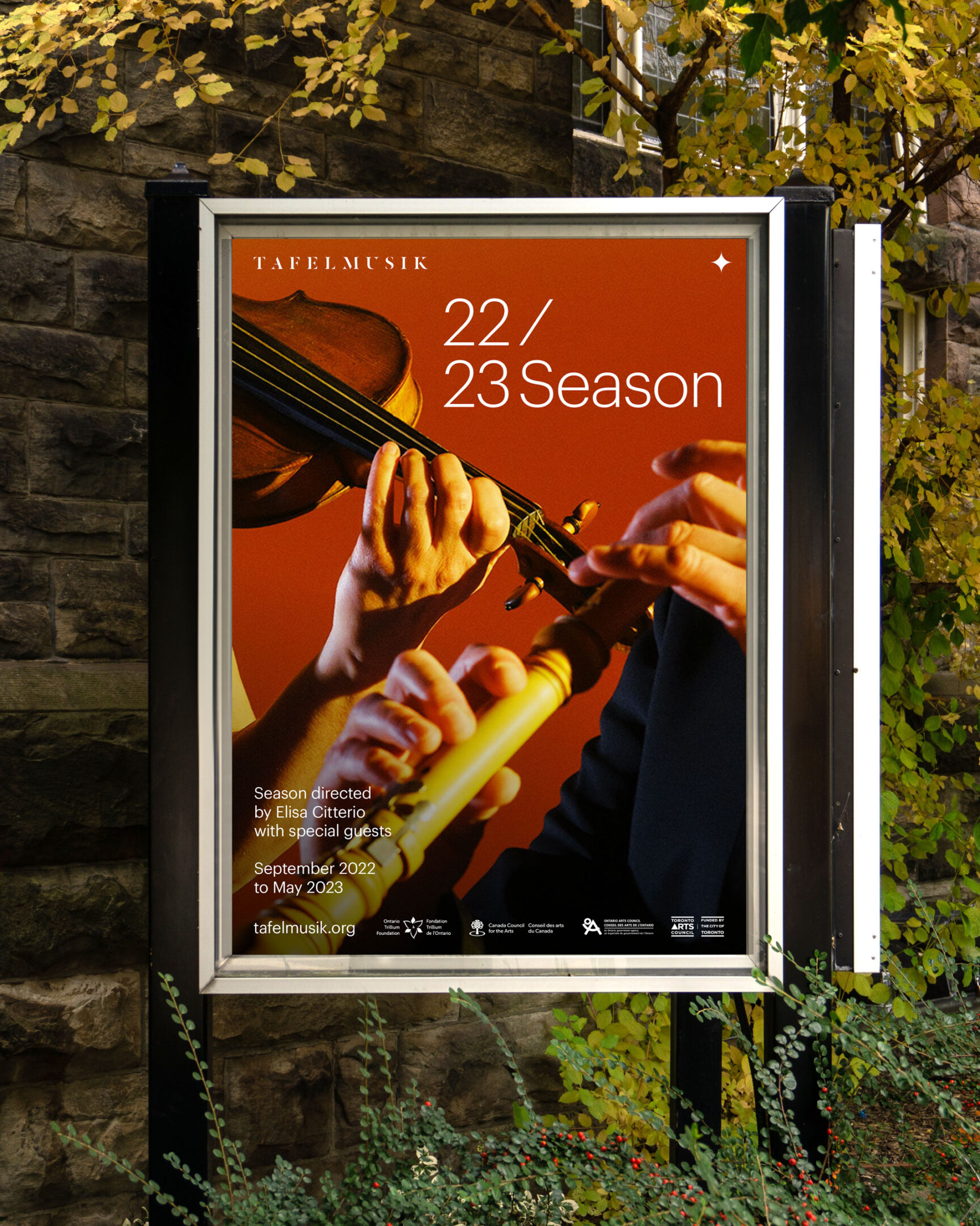
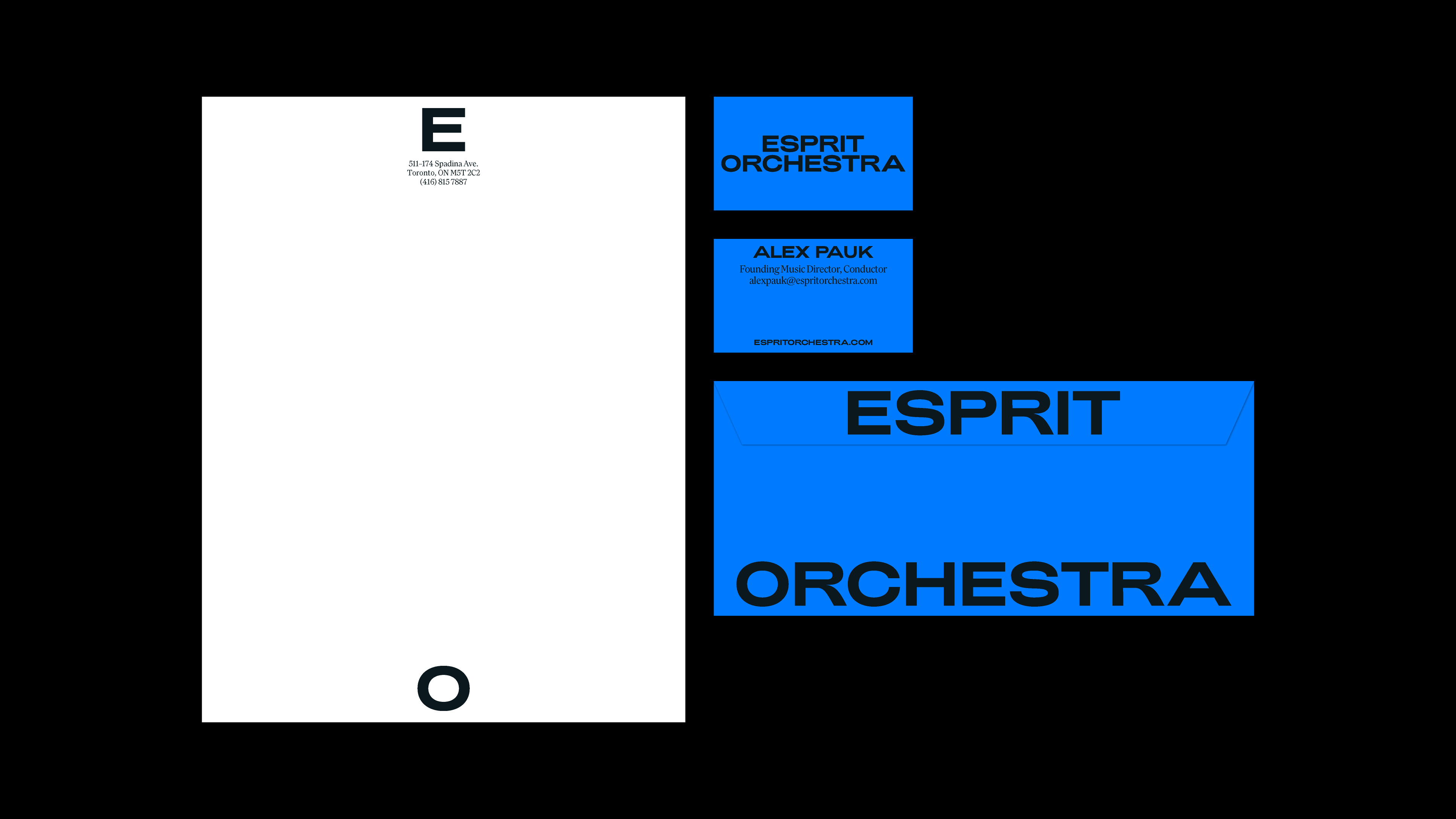
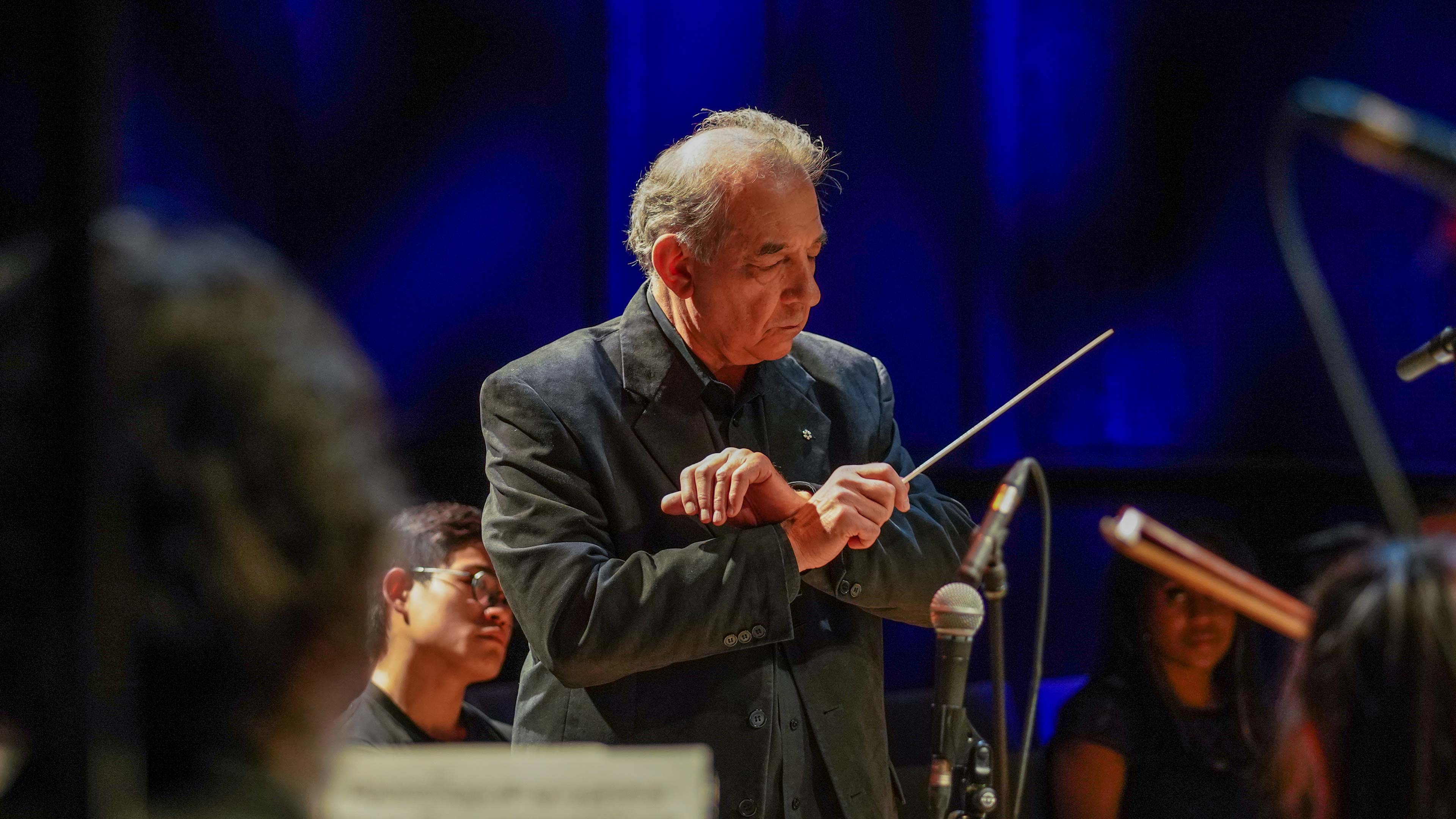
Esprit Orchestra
Developing a bold, striking visual identity for an orchestra devoted to cutting-edge contemporary music.
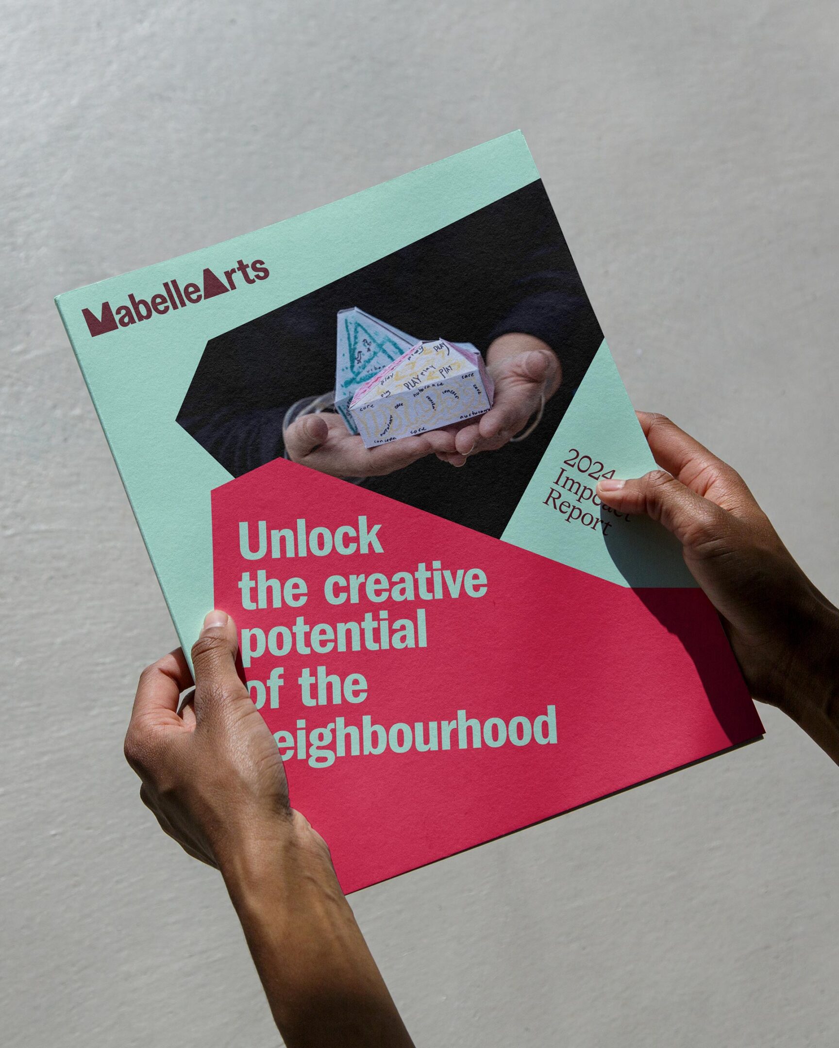
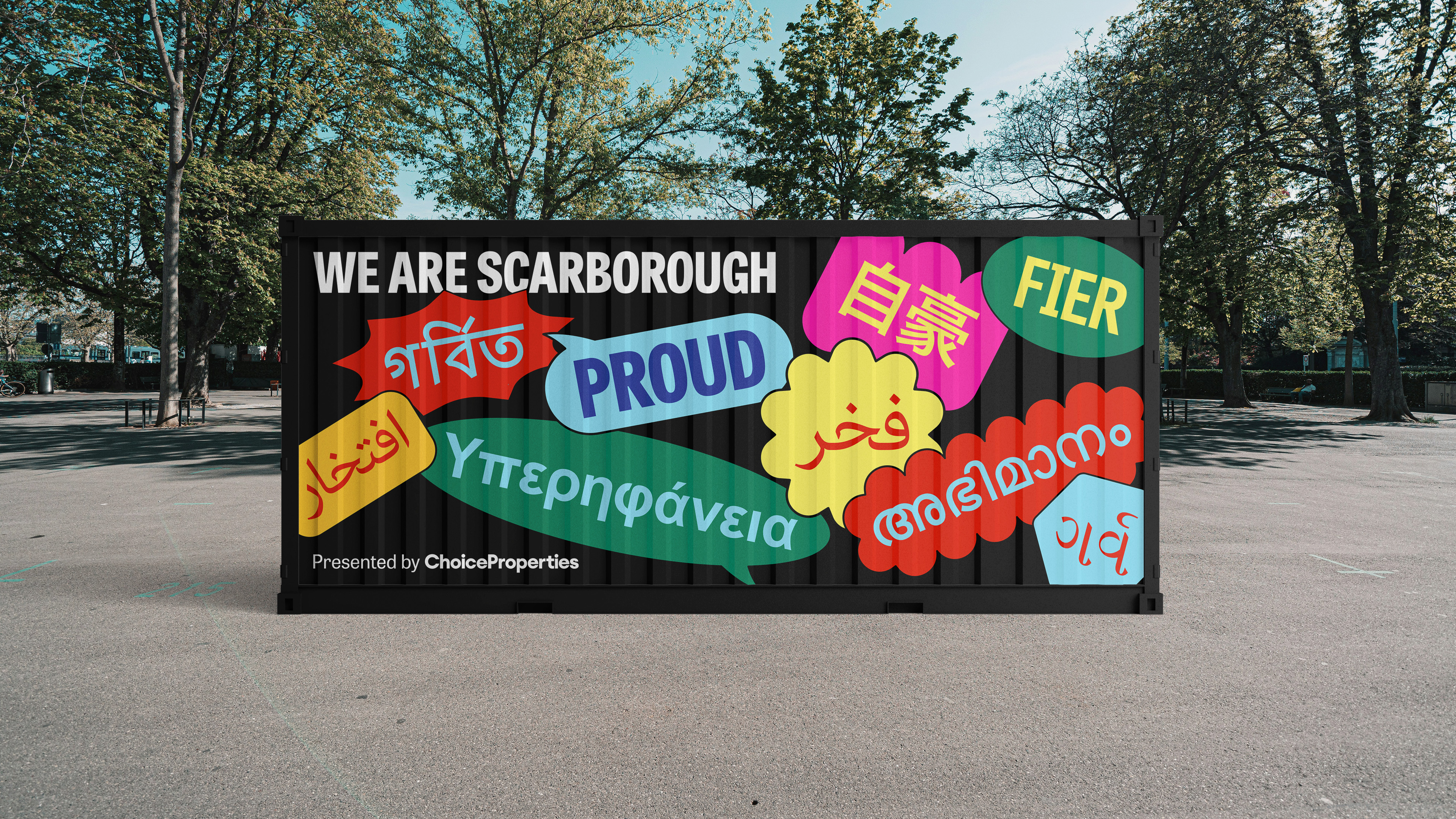
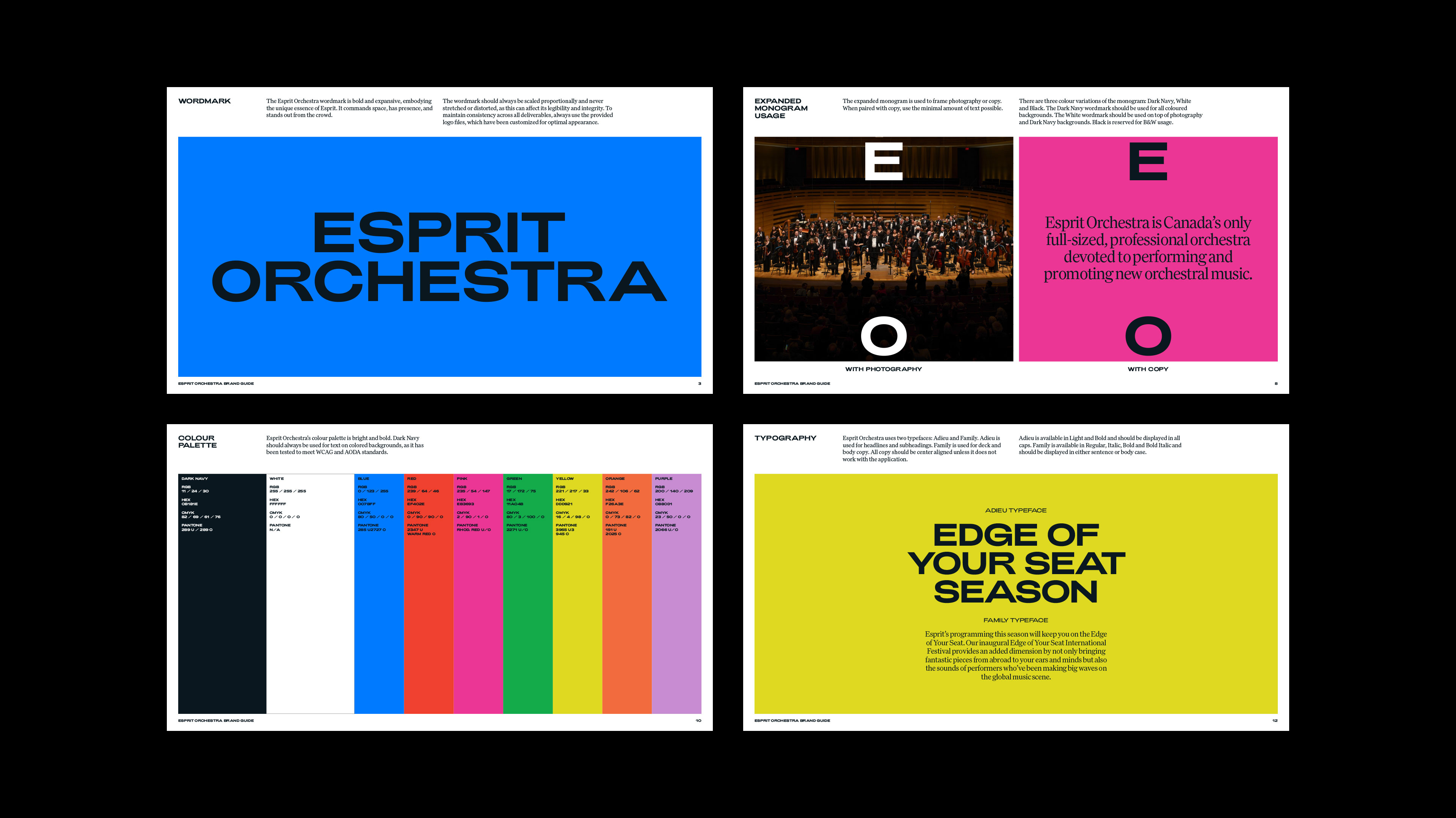
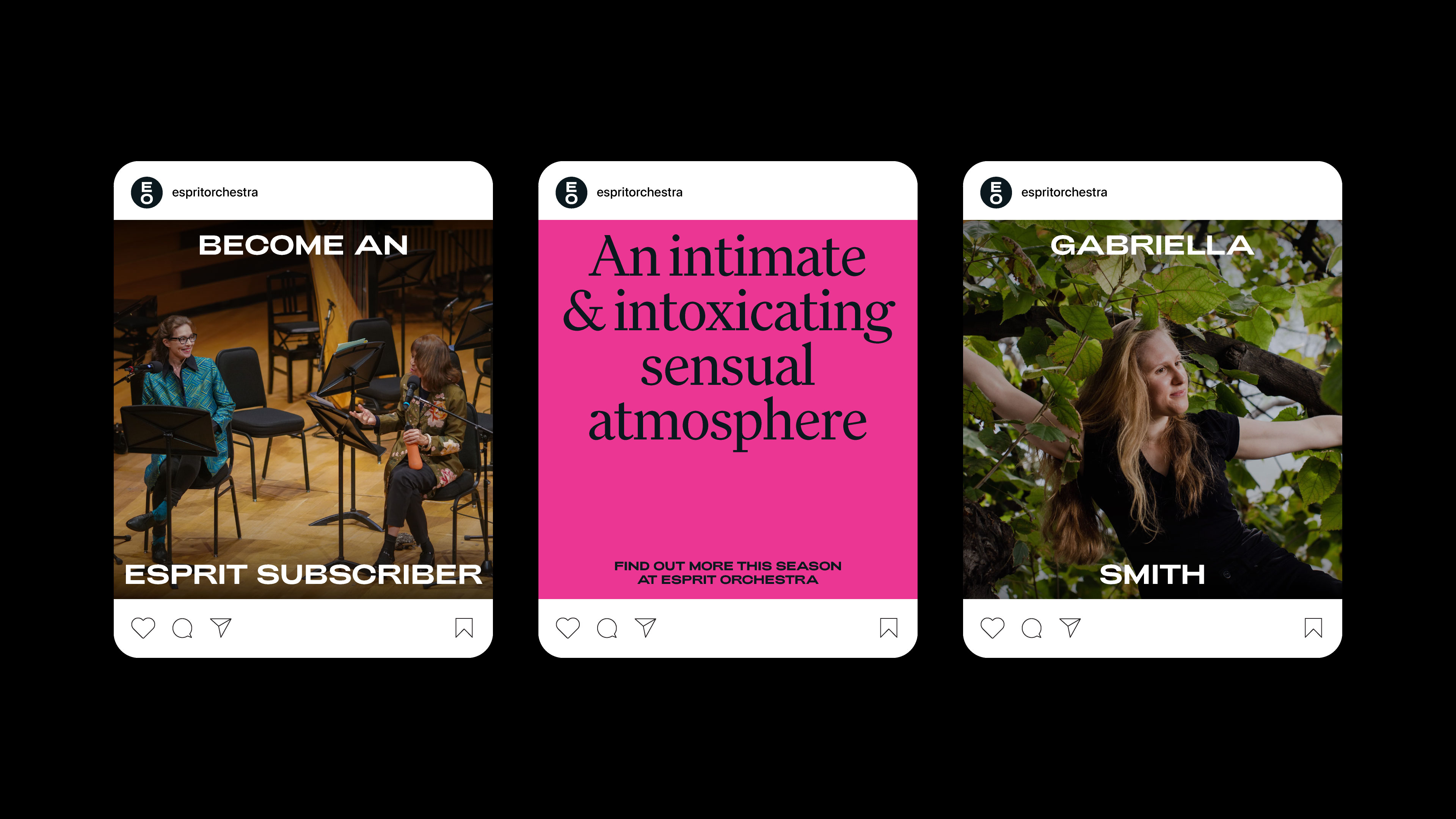
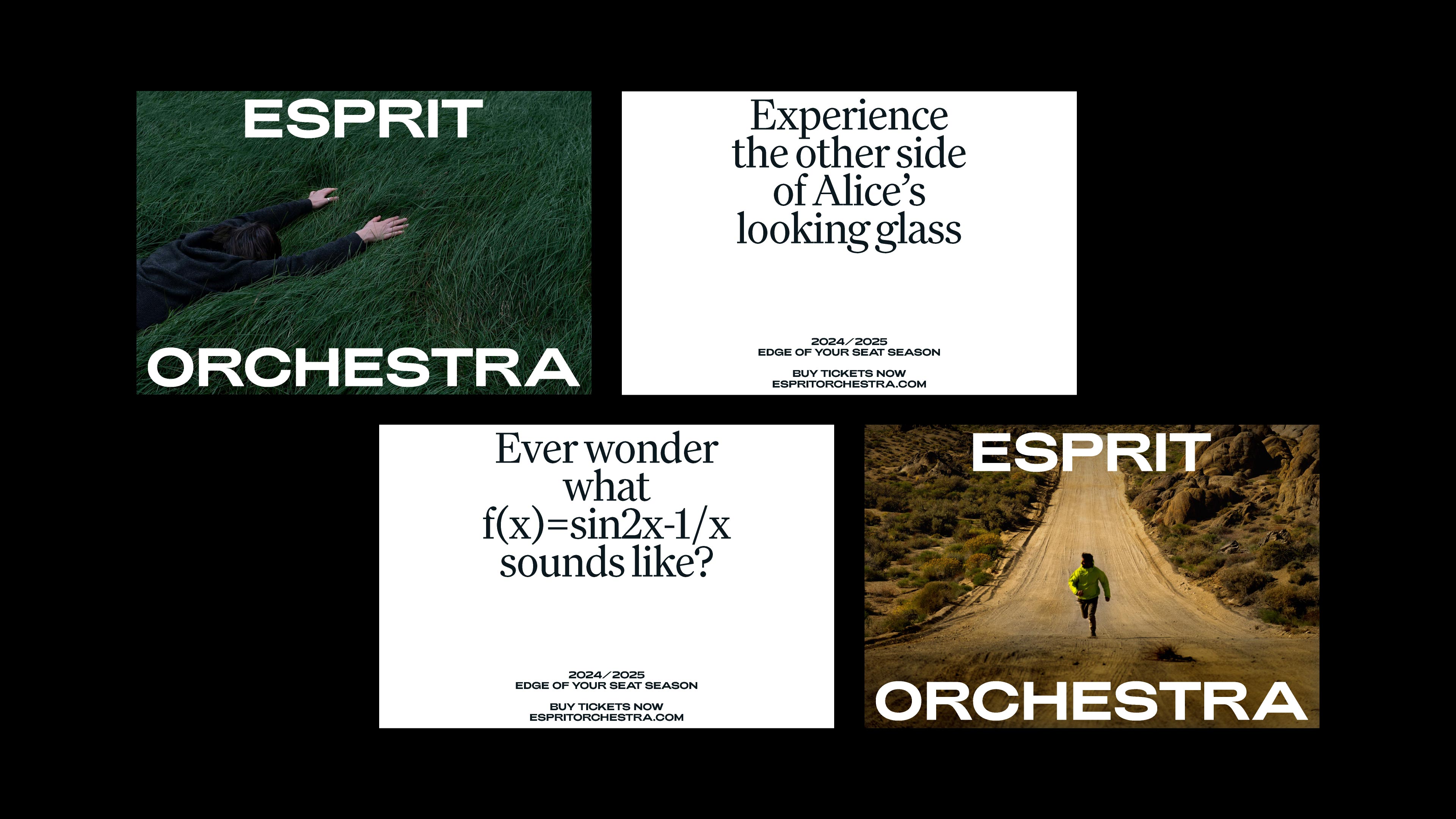
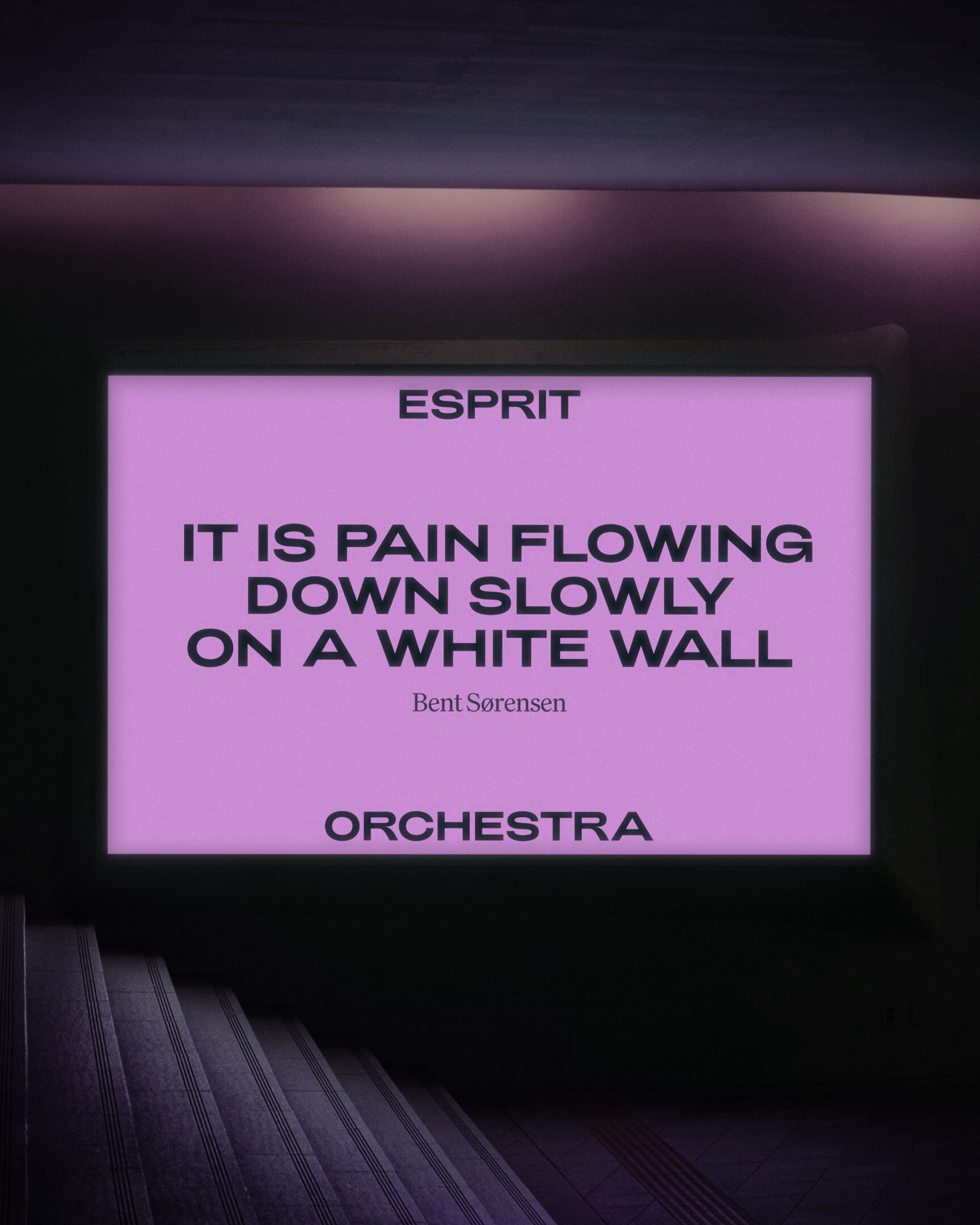
Esprit Orchestra is Canada’s only full-sized, professional orchestra dedicated to performing and promoting new orchestral music. Puncture was tasked with refreshing their visual identity, moving away from a traditional look to one that embodies Esprit’s innovative spirit.
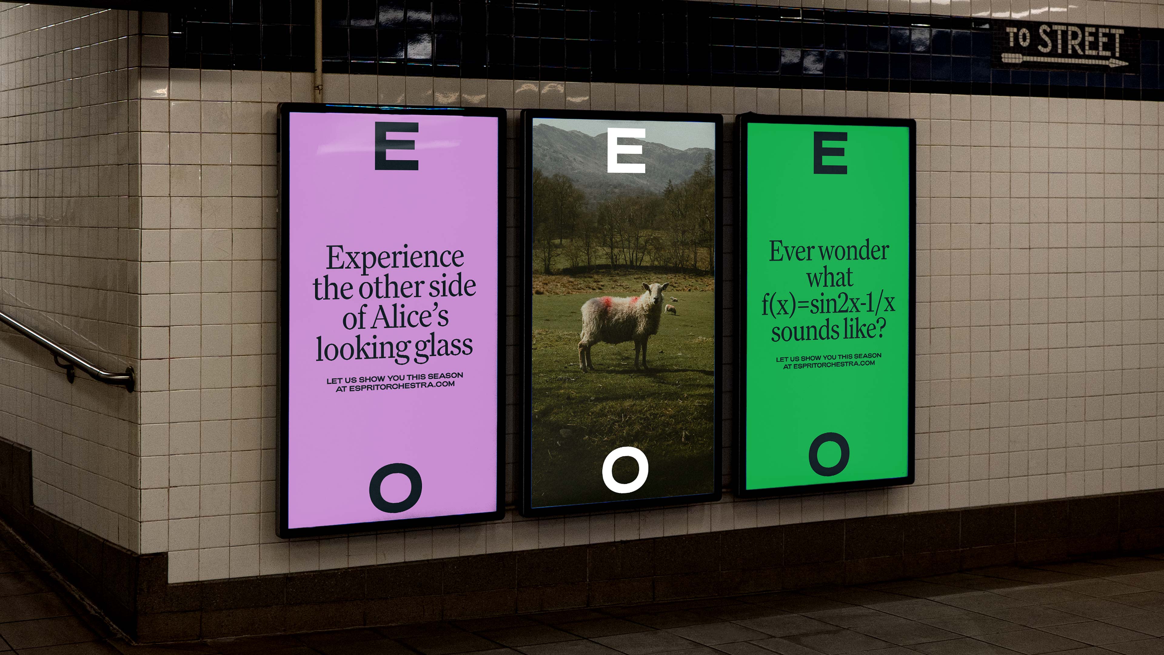
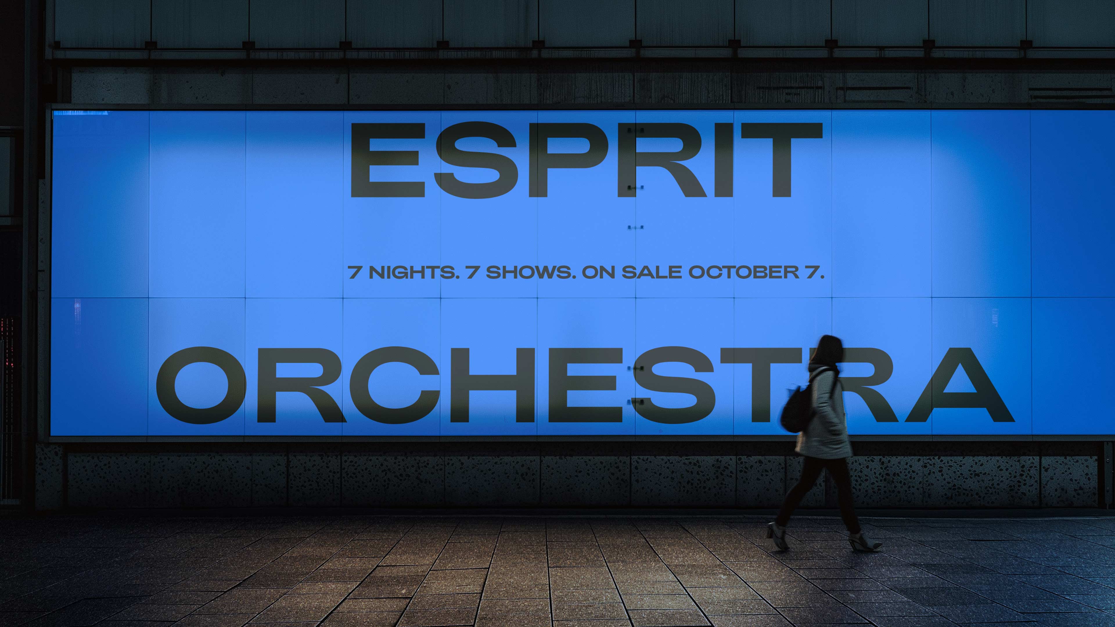
The new identity is dynamic, expanding to create a space that establishes Esprit as a stage for new music and culture. The open wordmark frames the people behind the music—musicians, composers, and soloists—and invites the audience to explore new music with curiosity. With a vibrant colour palette, captivating imagery, and poetic language, this refreshed identity resonates with those seeking a fresh perspective on orchestral music.


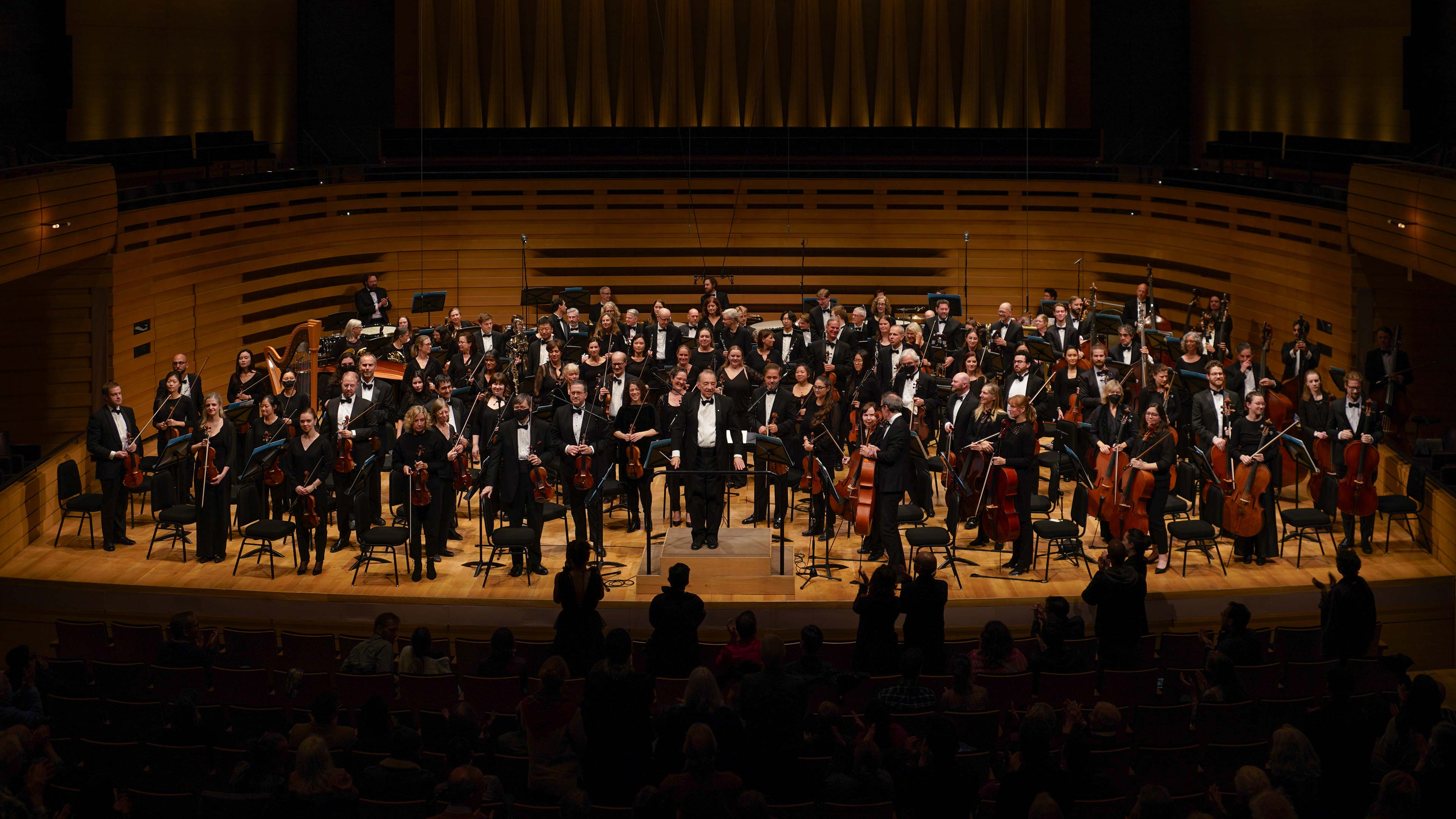
Founded in 1983, Esprit Orchestra’s commitment to delivering thought-provoking and unexpected musical experiences distinguishes it as one of the few organizations of its kind globally. By collaborating with leading composers, premier soloists, and ensembles from Canada and abroad, Esprit showcases Canadian works alongside international premieres each season. With unique, one-time-only performances, every concert is a rare, exclusive event. Esprit also nurtures the next generation of new music professionals and audiences through its mentorship and outreach programs.
View more projects