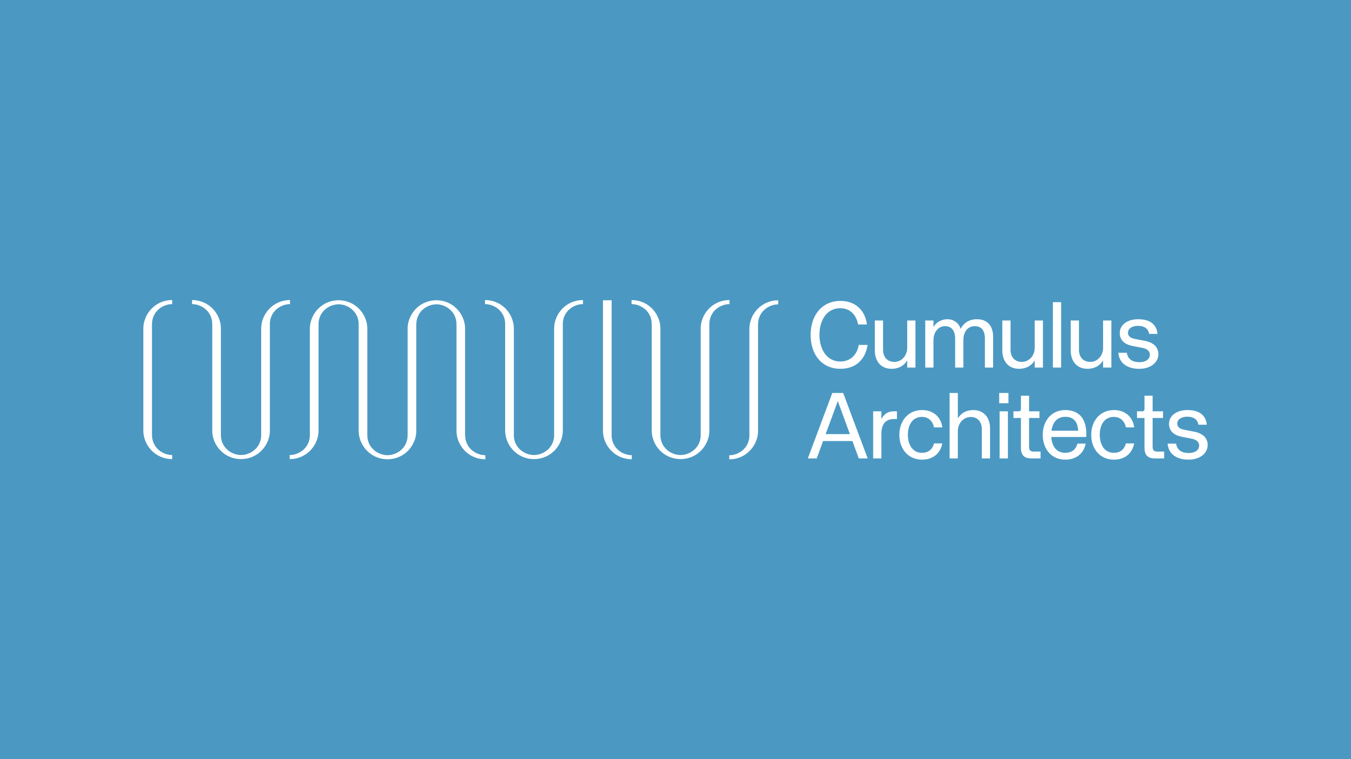
Cumulus Architects
Creating a refreshed brand and website that captures Cumulus Architects’ blue sky thinking and open approach to design.

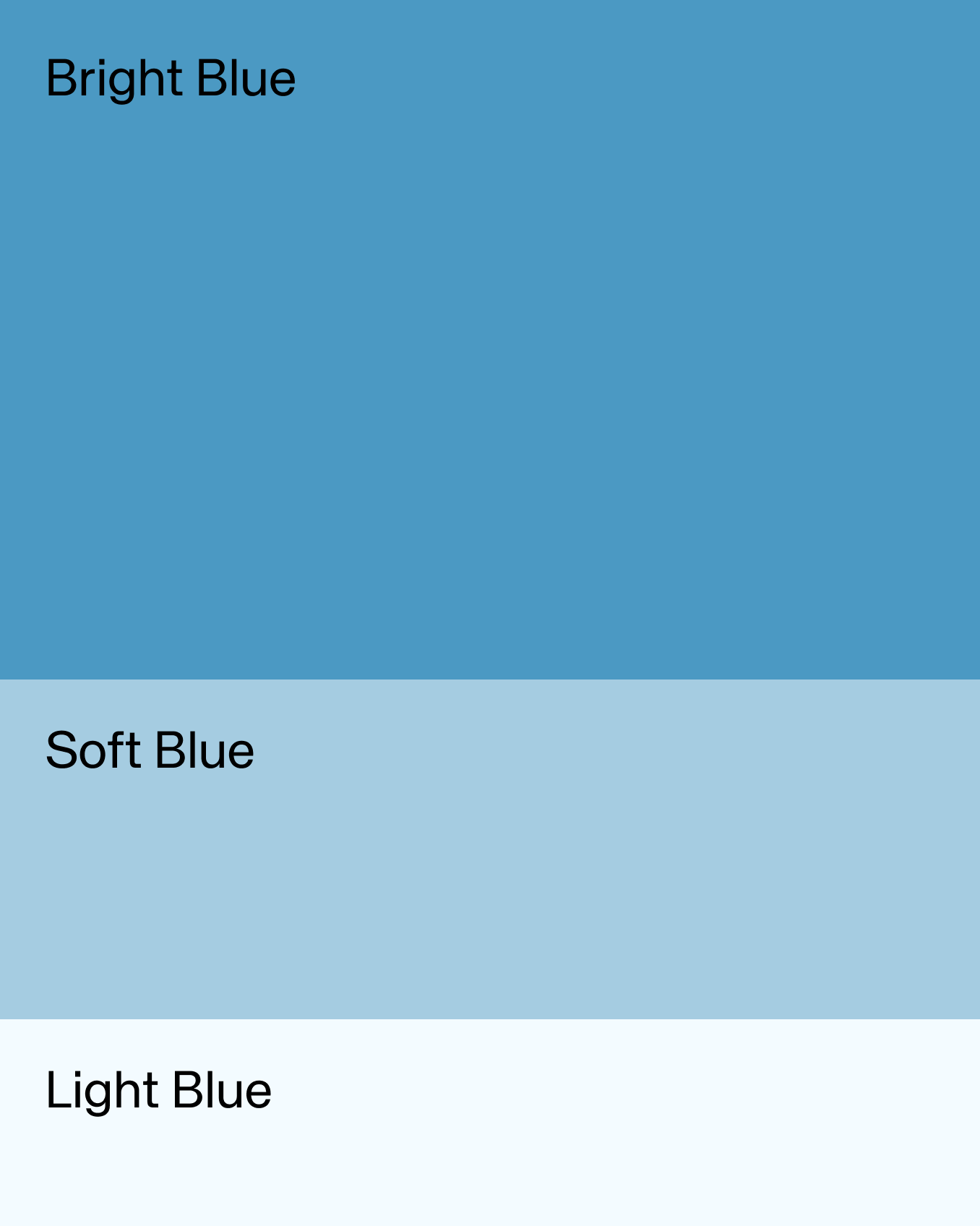
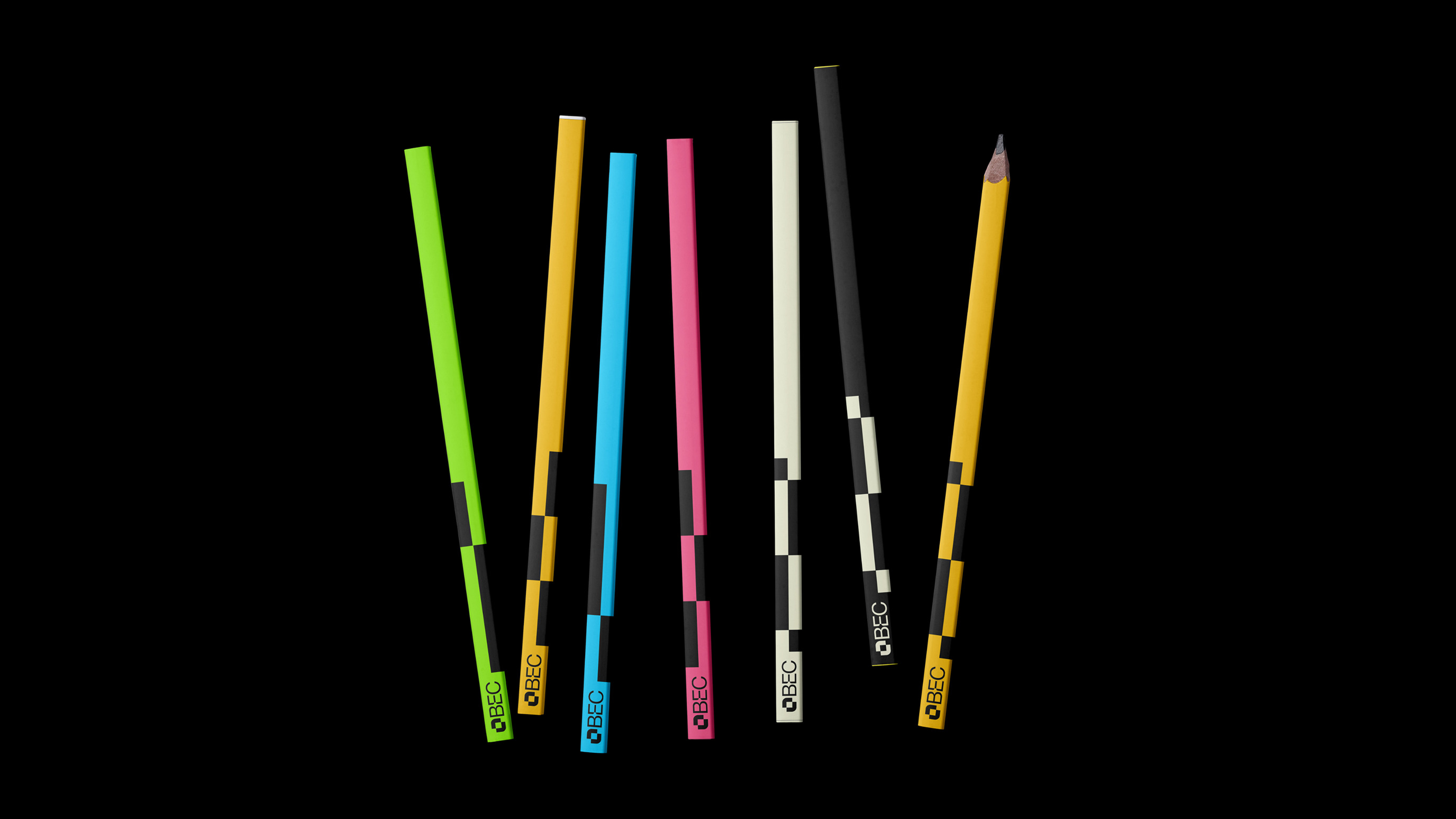
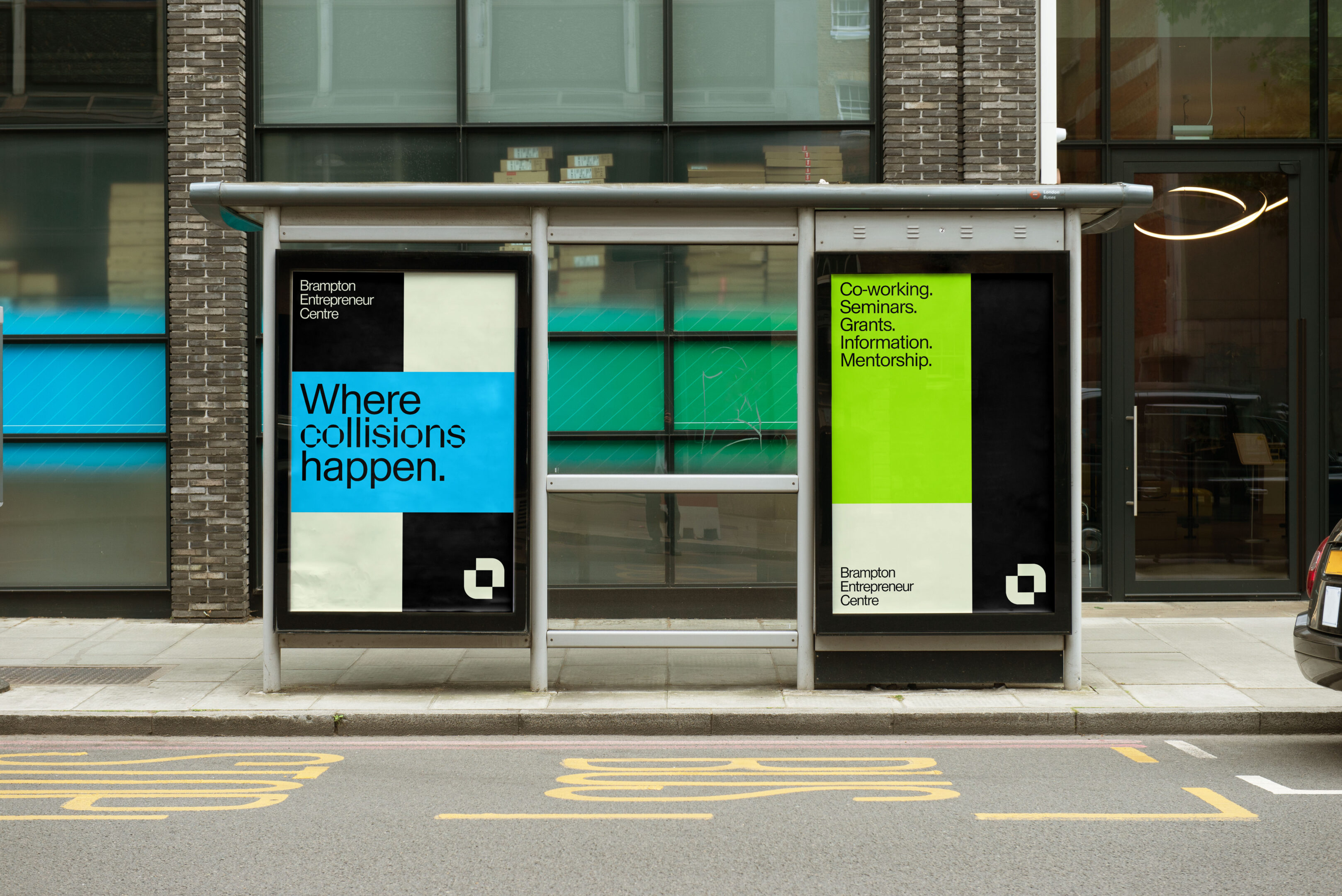
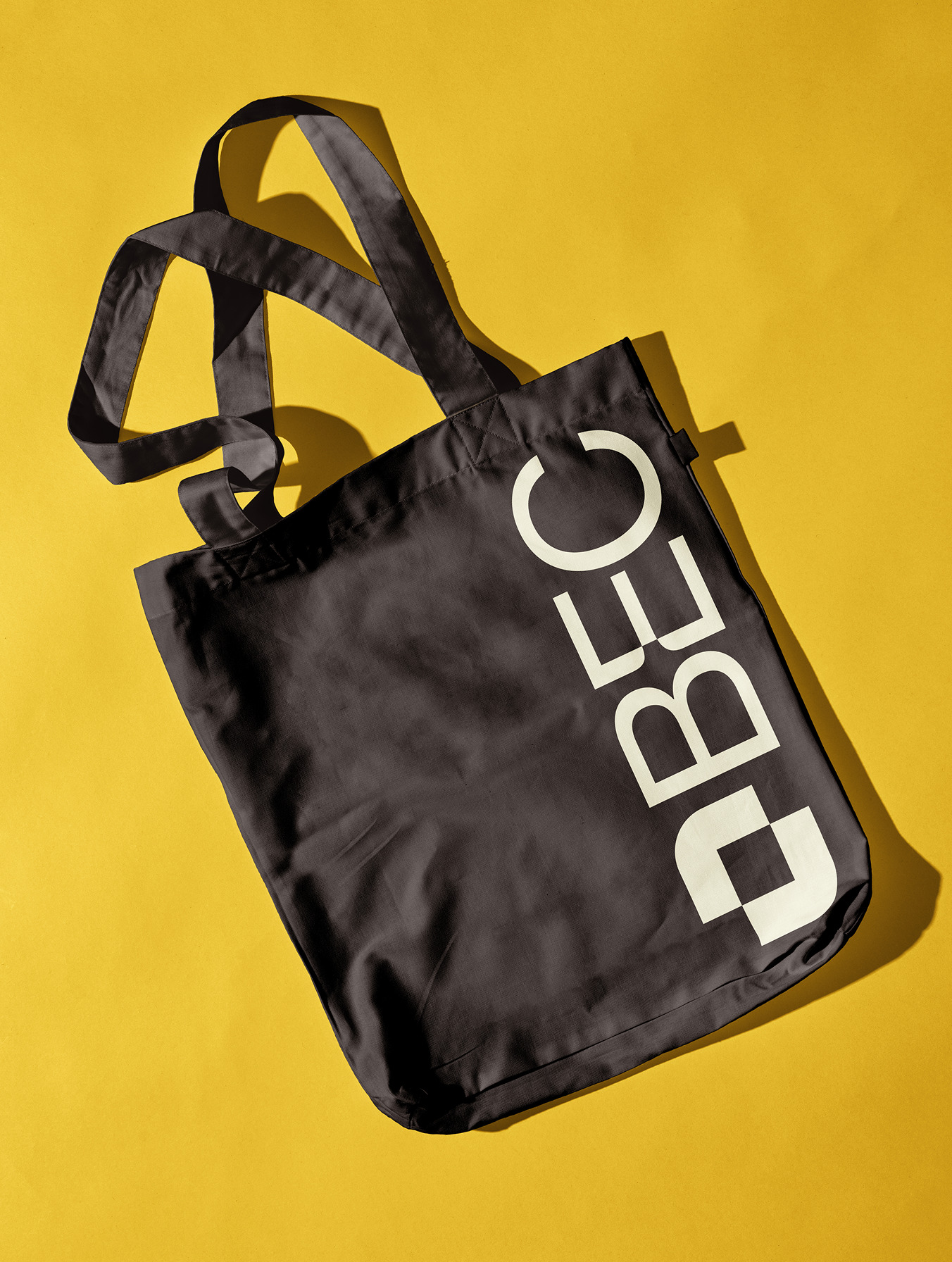
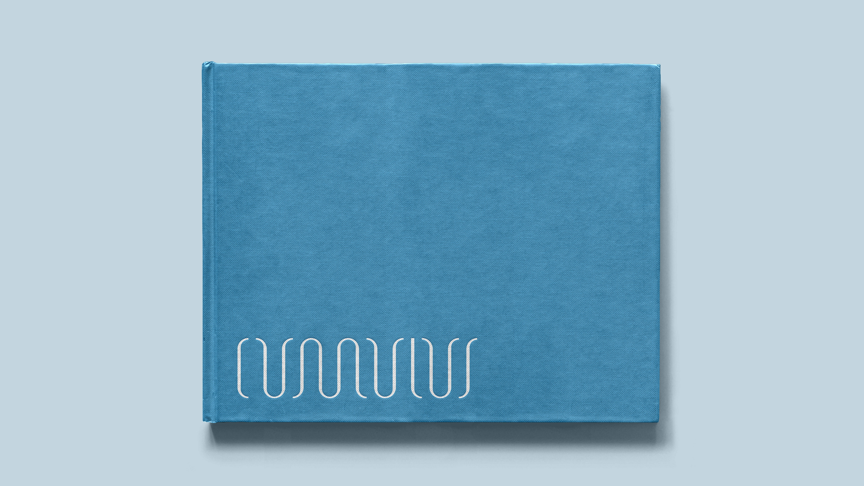
The visual identity for Cumulus Architects draws inspiration from the openness and fluidity of the sky. A bright, airy colour palette evokes a sense of clarity and optimism, while the custom wordmark mirrors the soft, rounded forms of cumulus clouds—capturing the studio’s collaborative, evolving approach to design. Together, these elements create a system that feels expansive, thoughtful, and grounded in possibility.


Industry
Architecture
Service
Branding, Digital
cumulusarch.com
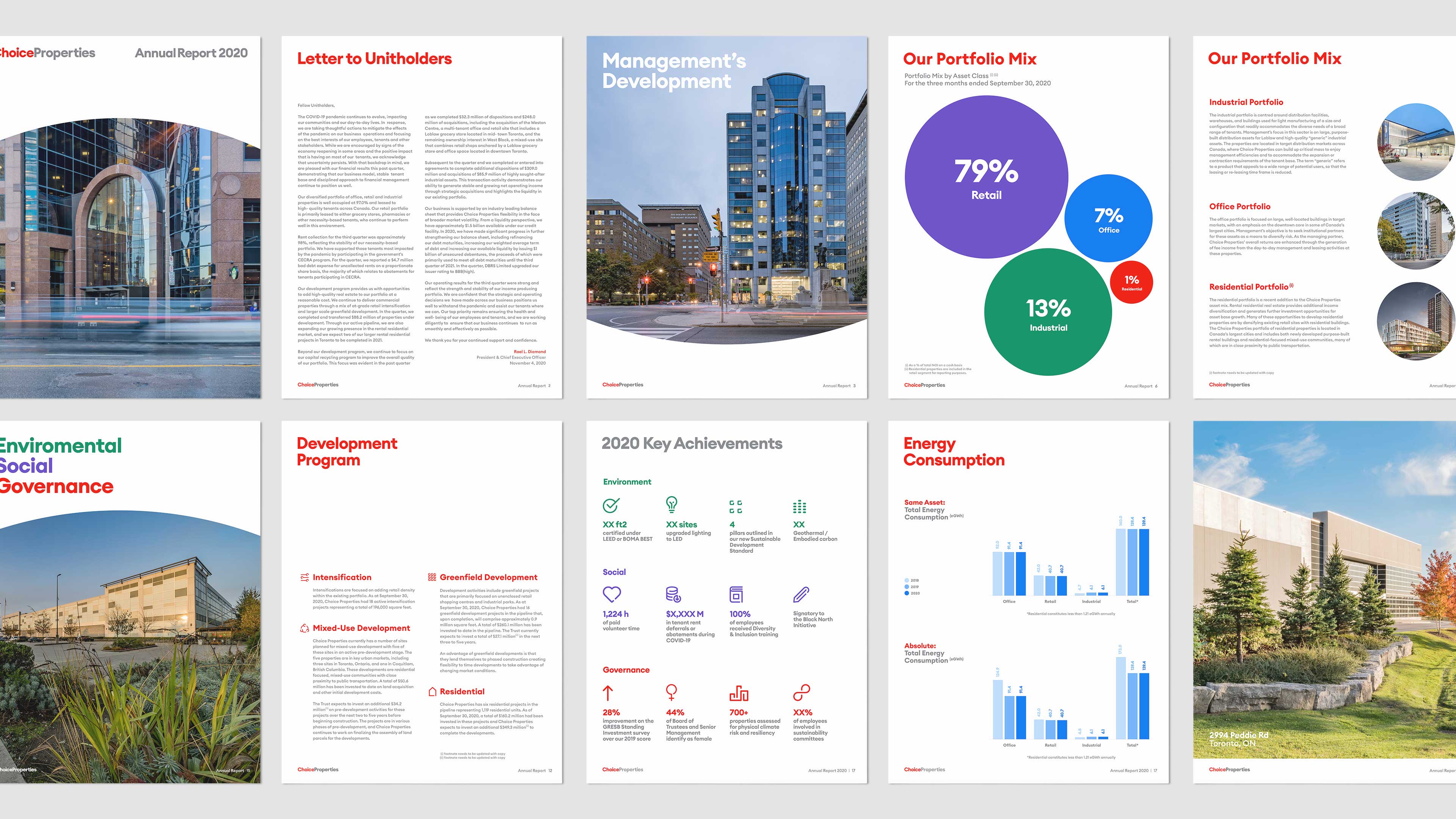
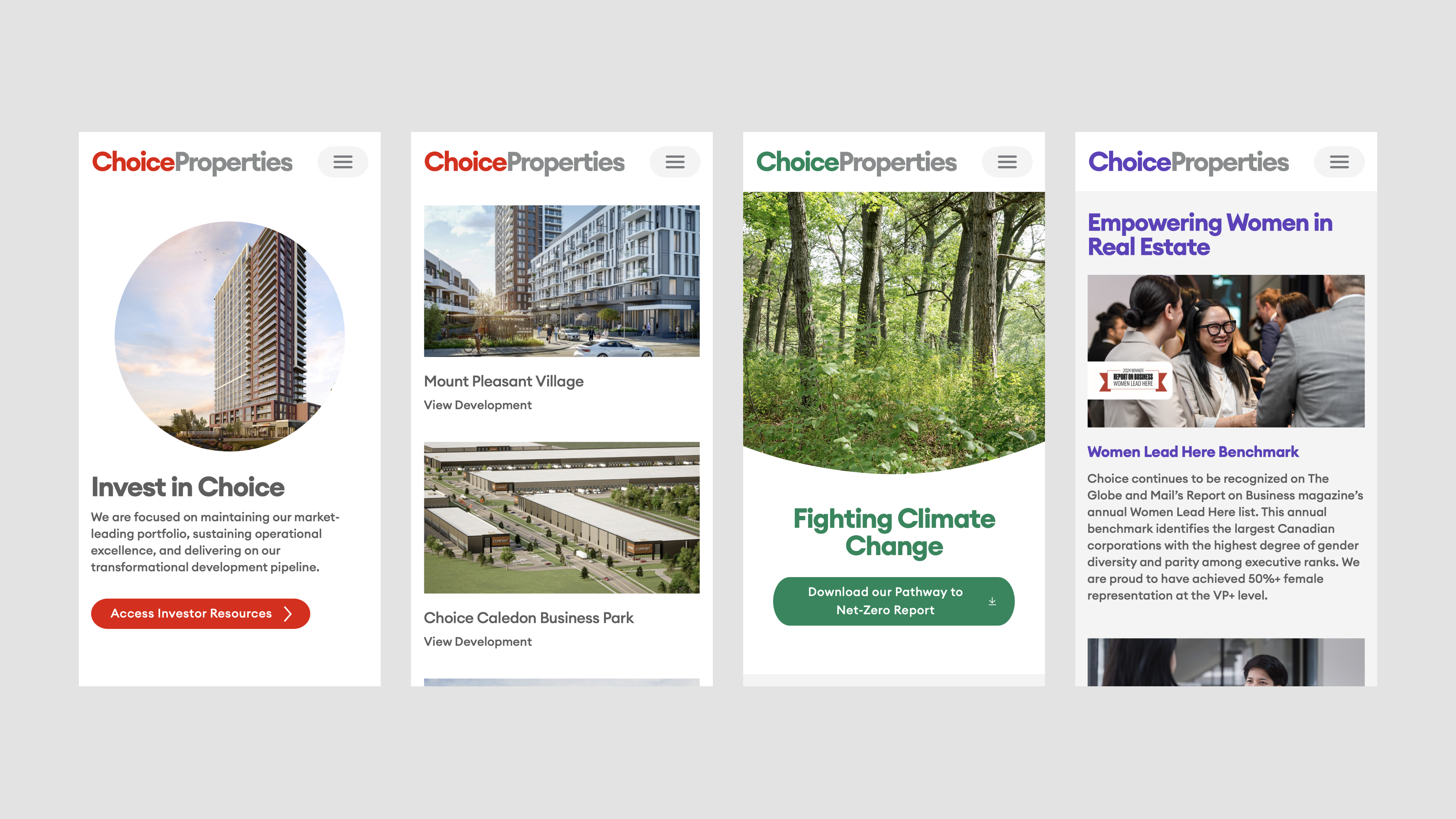
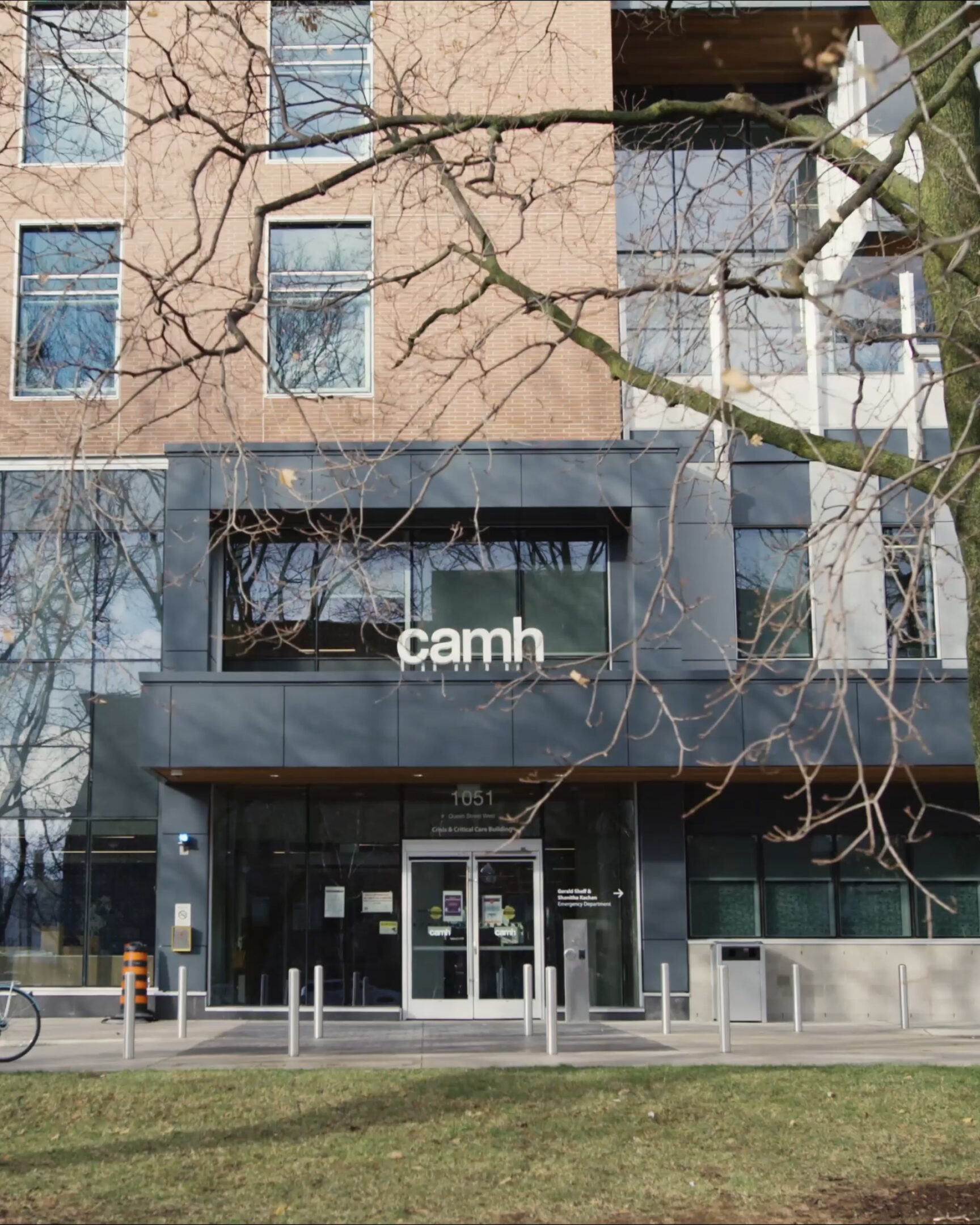
Cumulus Architects approached us to help mark their 10 year milestone. With this anniversary came an opportunity to refresh how they present themselves to the world.
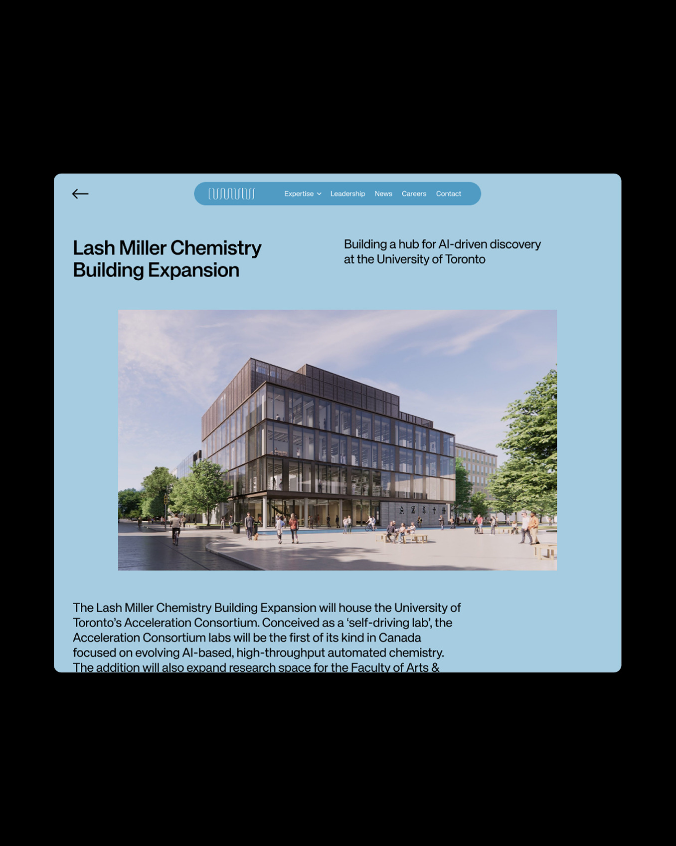
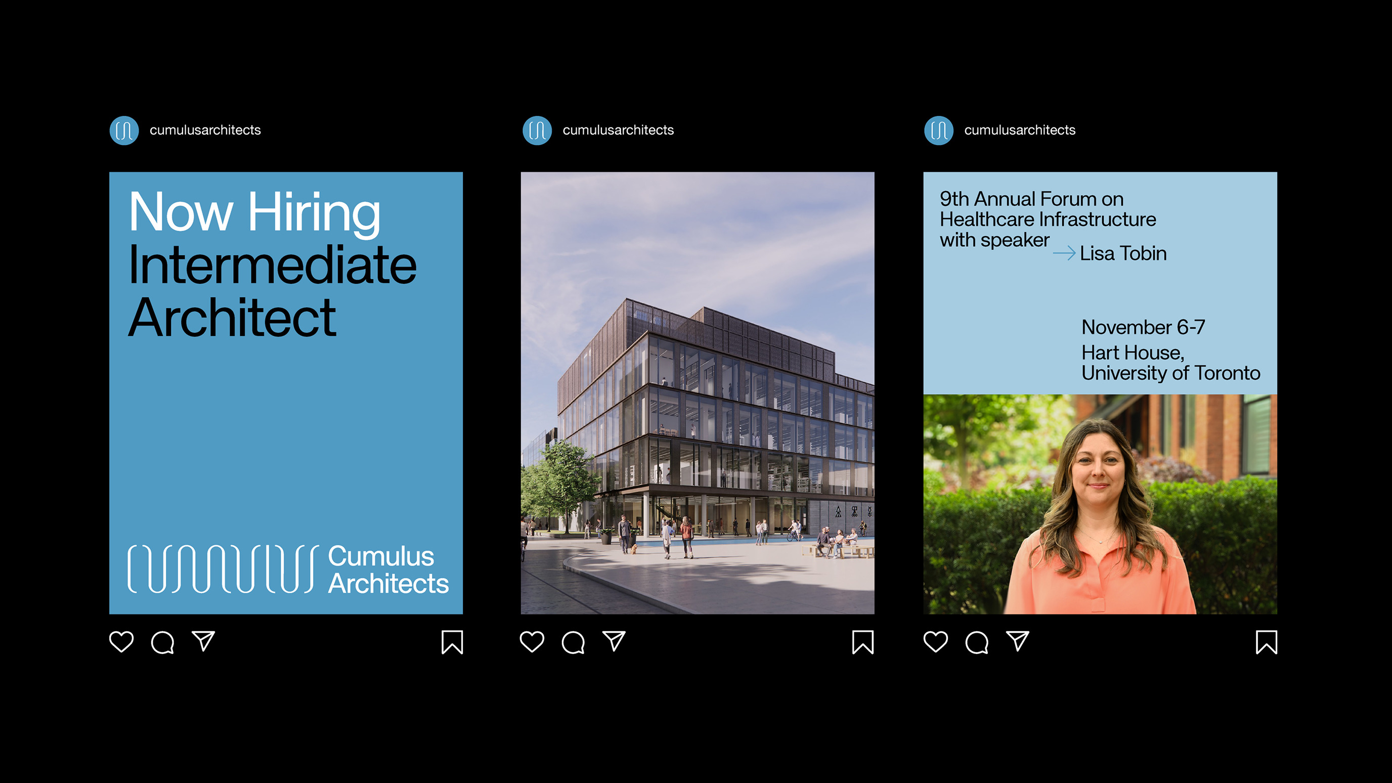
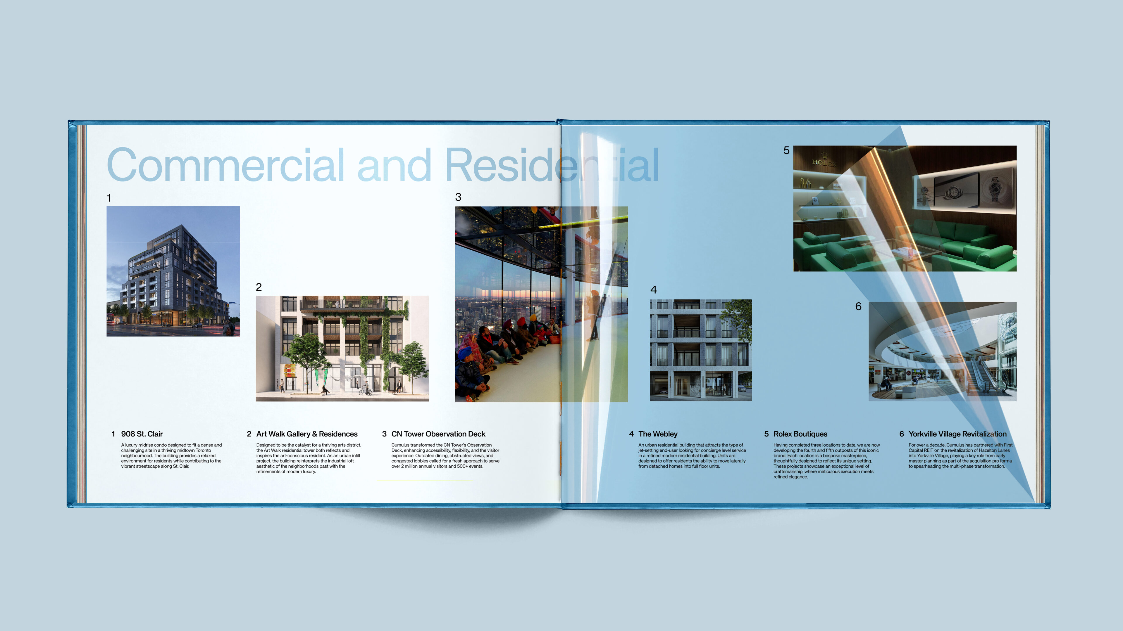
We partnered with them to evolve their brand and redesign their website—creating a digital space that better reflects their collaborative values, work, and culture. Inspired by their name and philosophy, we introduced a light, sky-driven visual direction that mirrors their clarity of thought and collective process. The result is a refreshed identity and website that not only showcases their portfolio, but also invites prospective clients and collaborators into their way of thinking.
View more projects