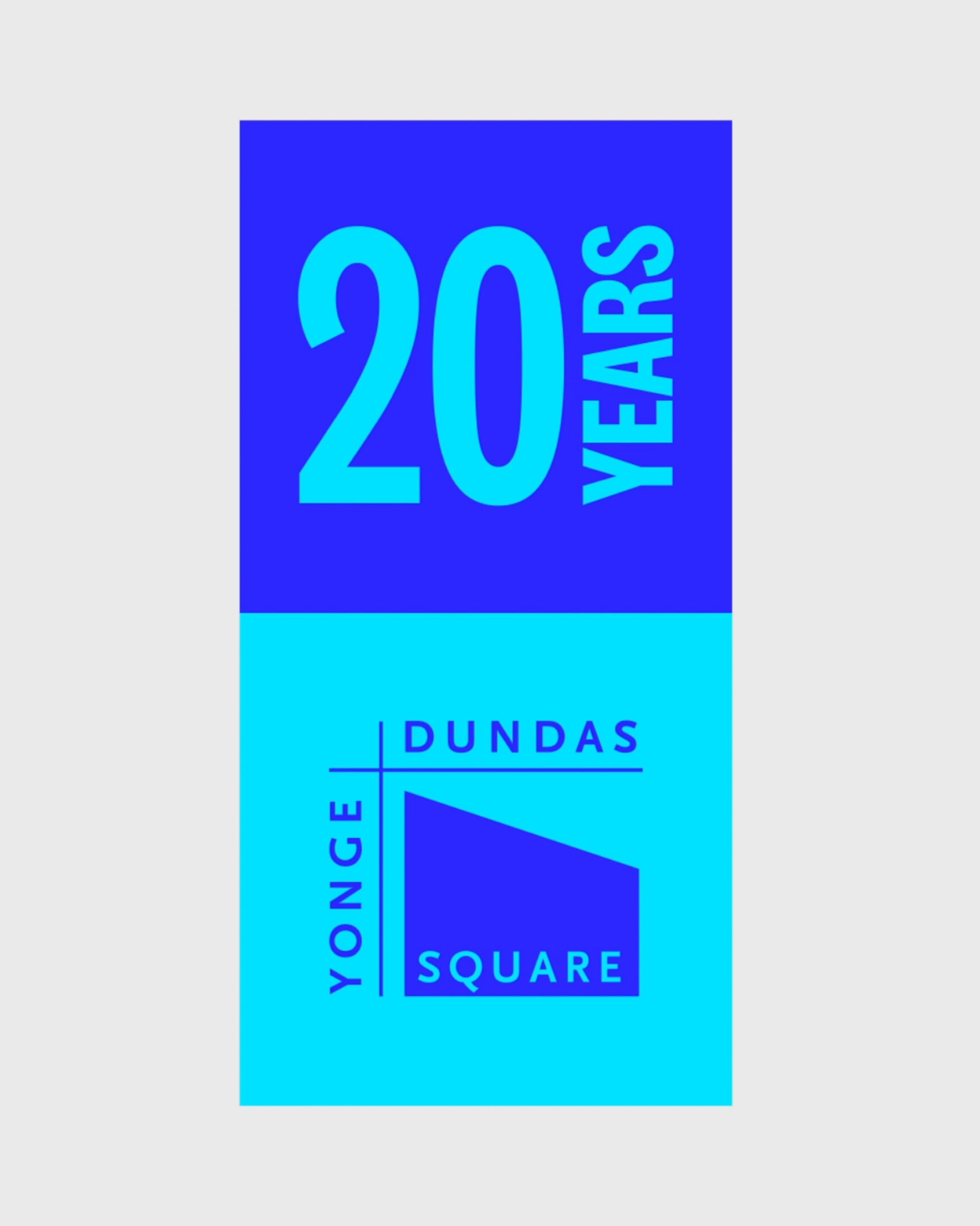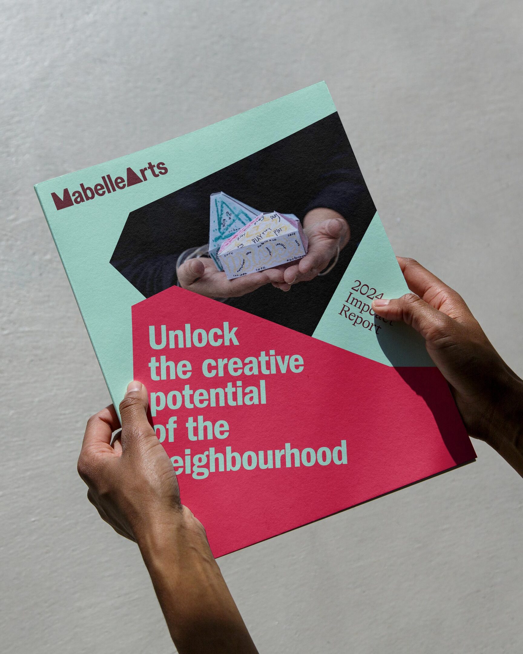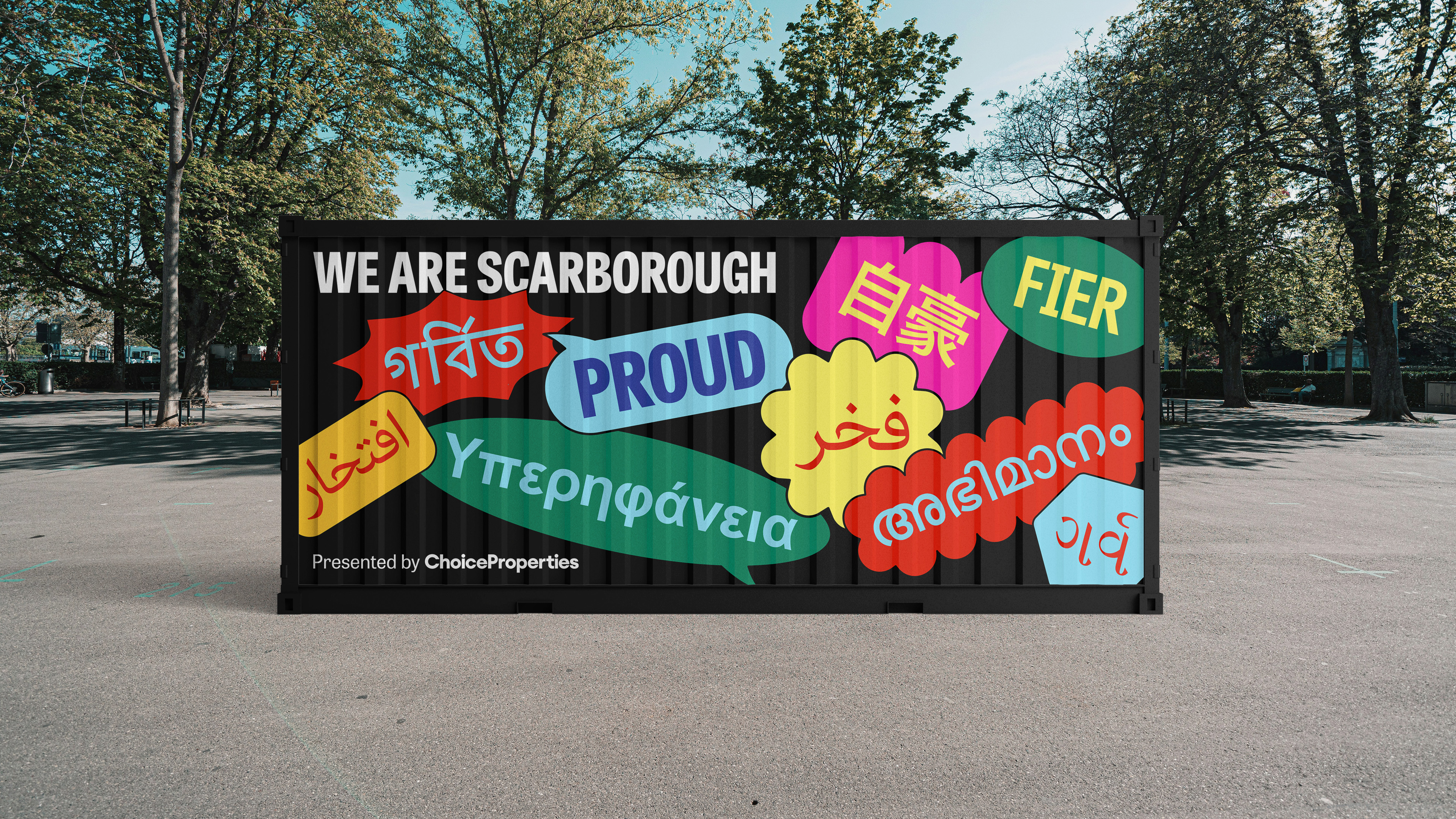
Rolling Stone
Translating the legacy of a 55+ year old media powerhouse into a prestigious live concert series through naming, identity and rollout.
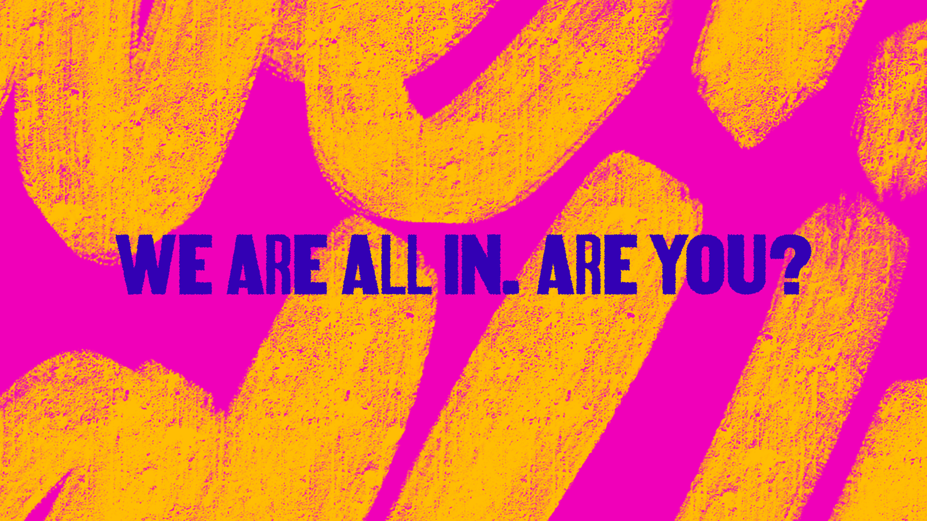
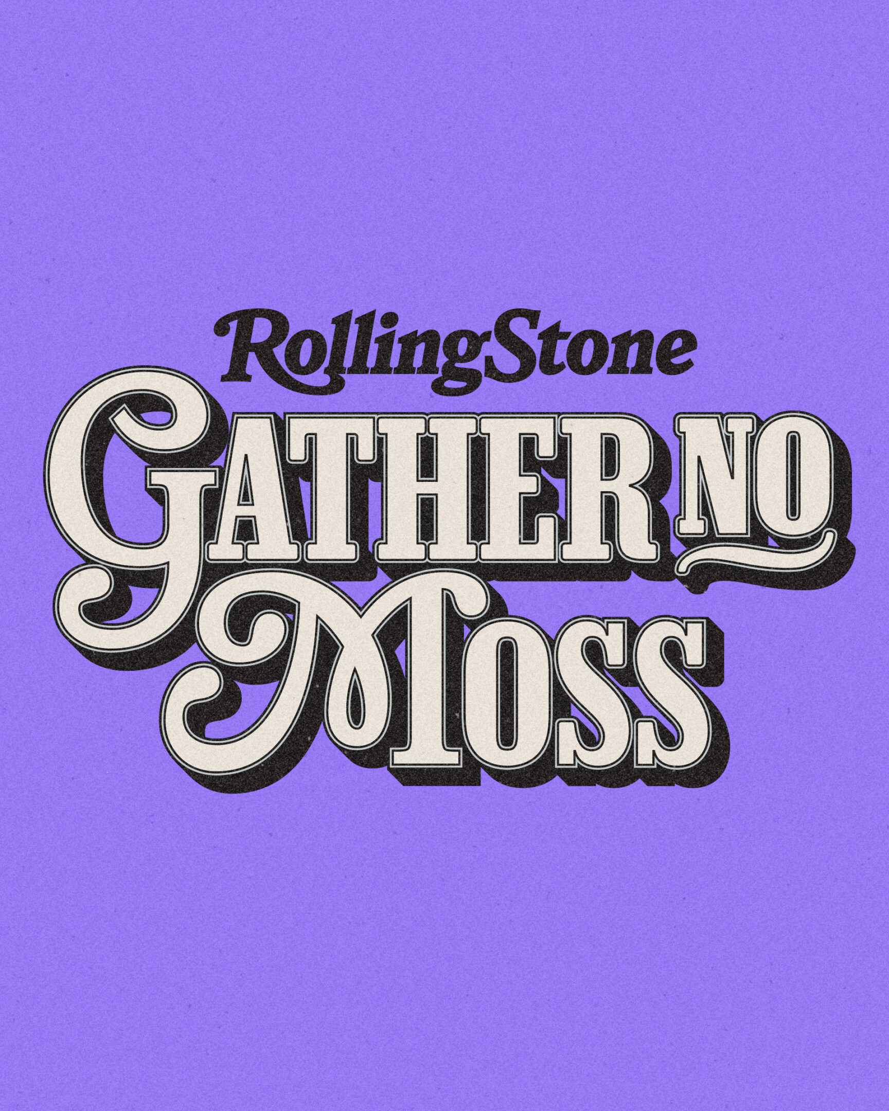
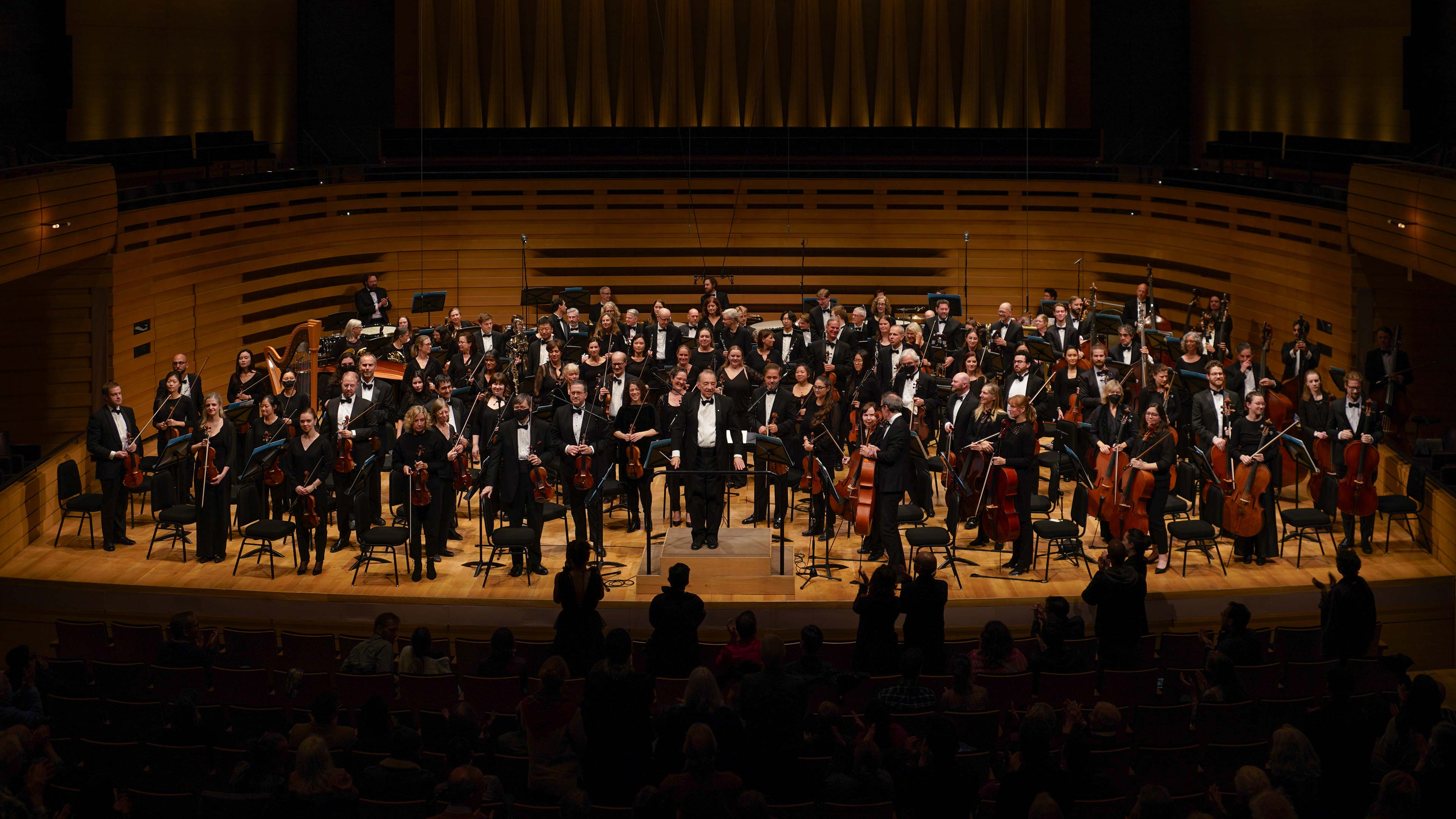
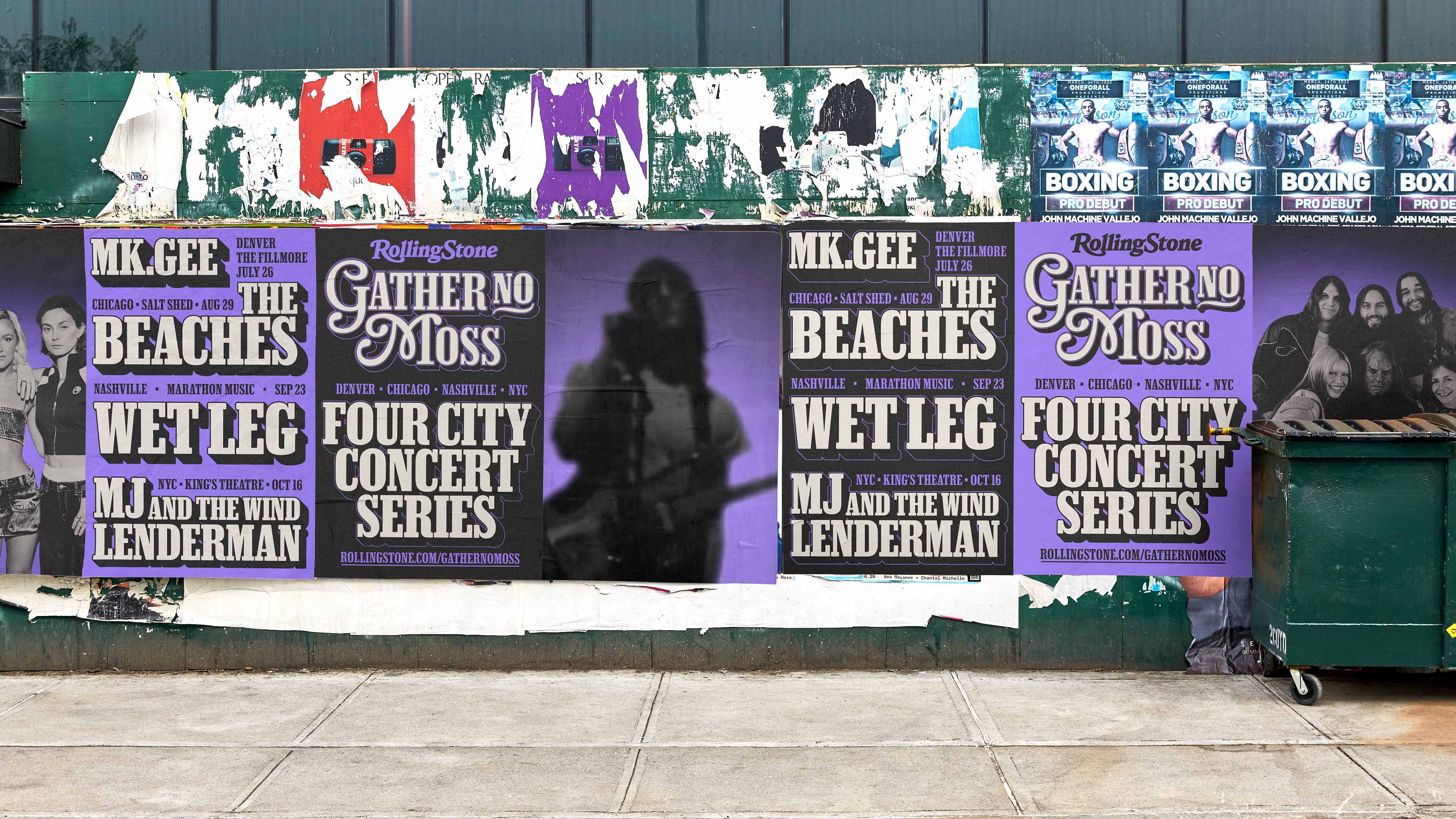
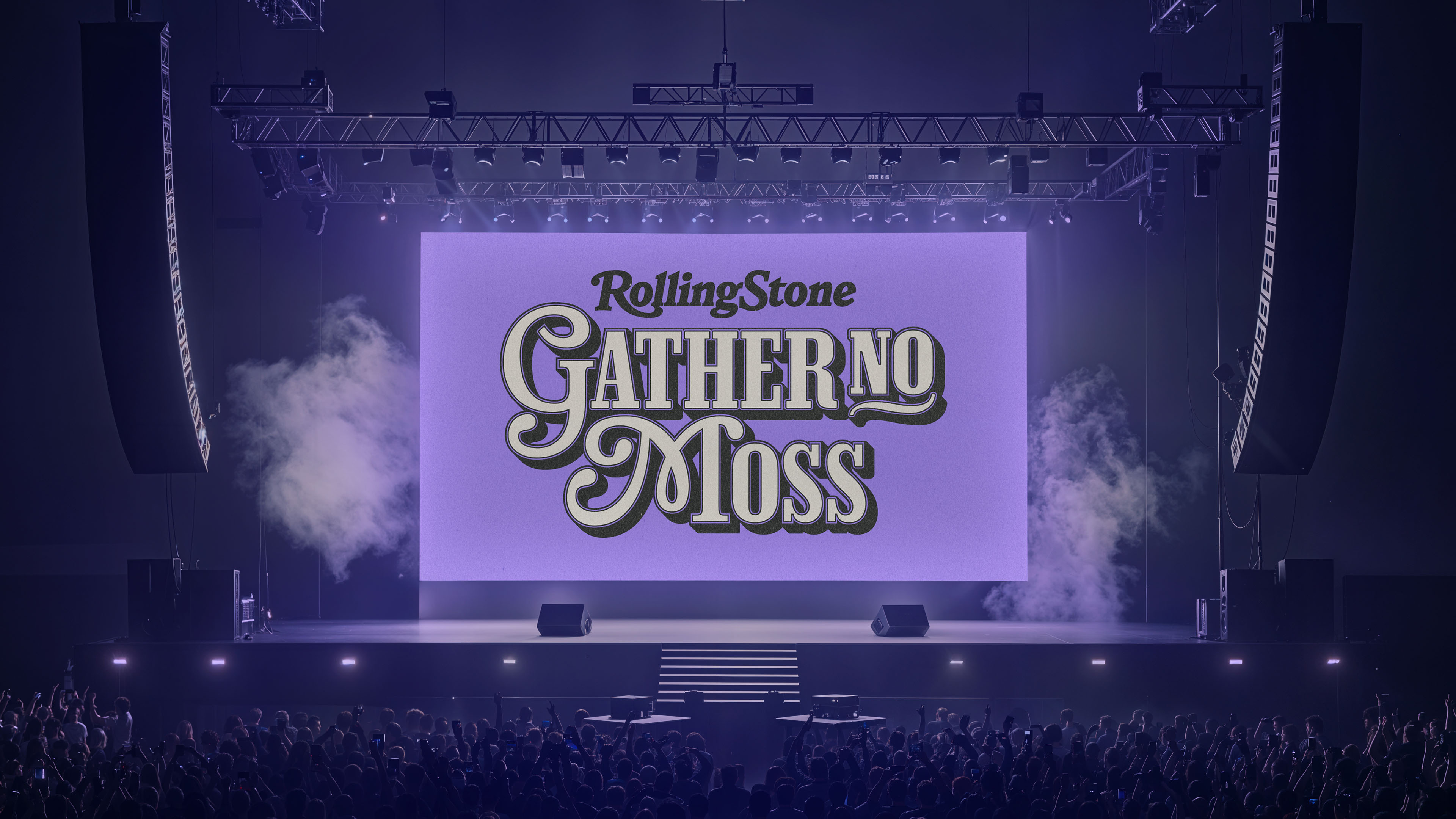
Rolling Stone, the iconic magazine that has chronicled nearly six decades of rock & roll, is expanding into live events with the launch of a national concert series. The idea emerged from shifts in the festival landscape and growing interest in shared, in-person experiences. How can Rolling Stone bring the spirit of its pages to the stage? The result is the Gather No Moss tour.

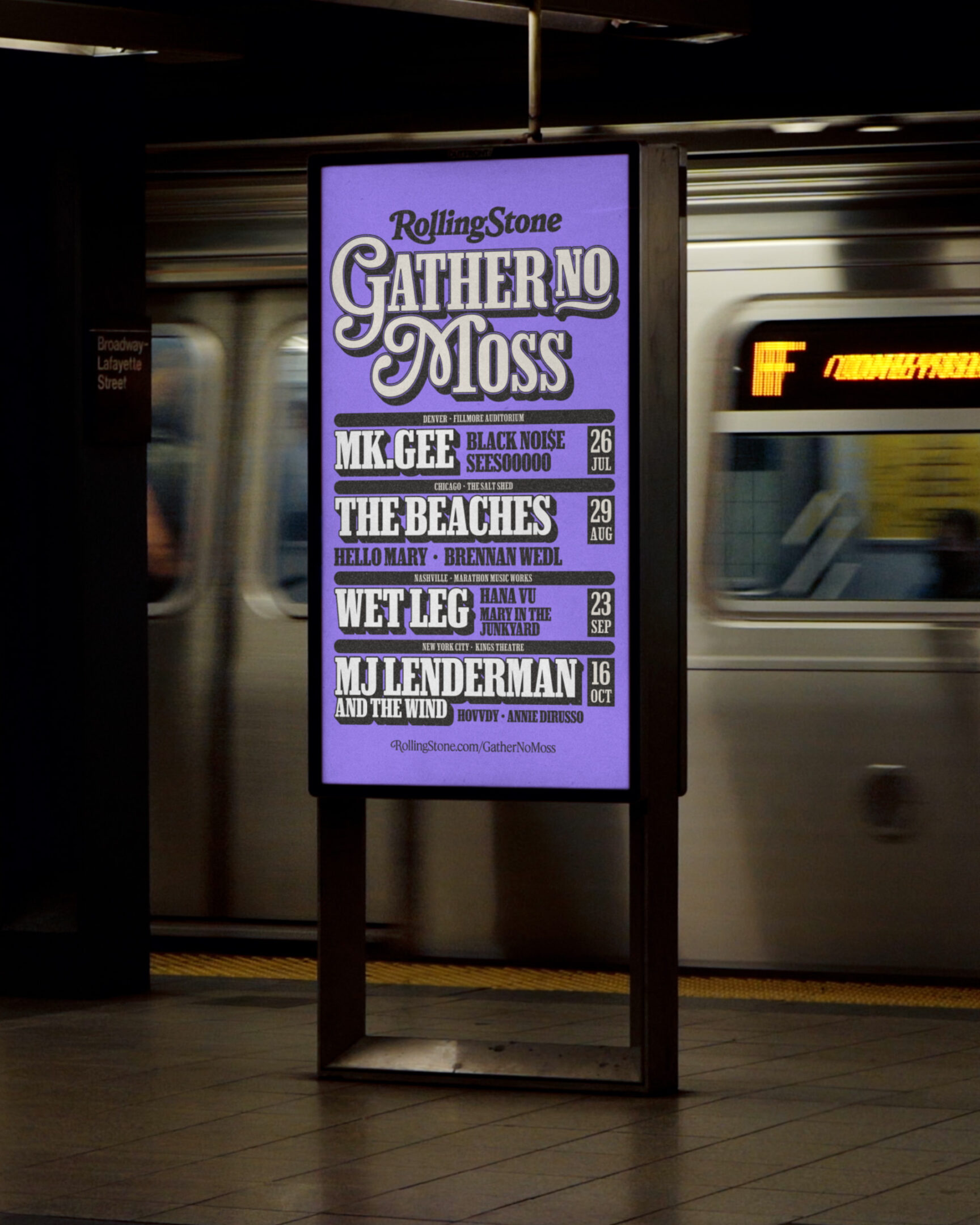
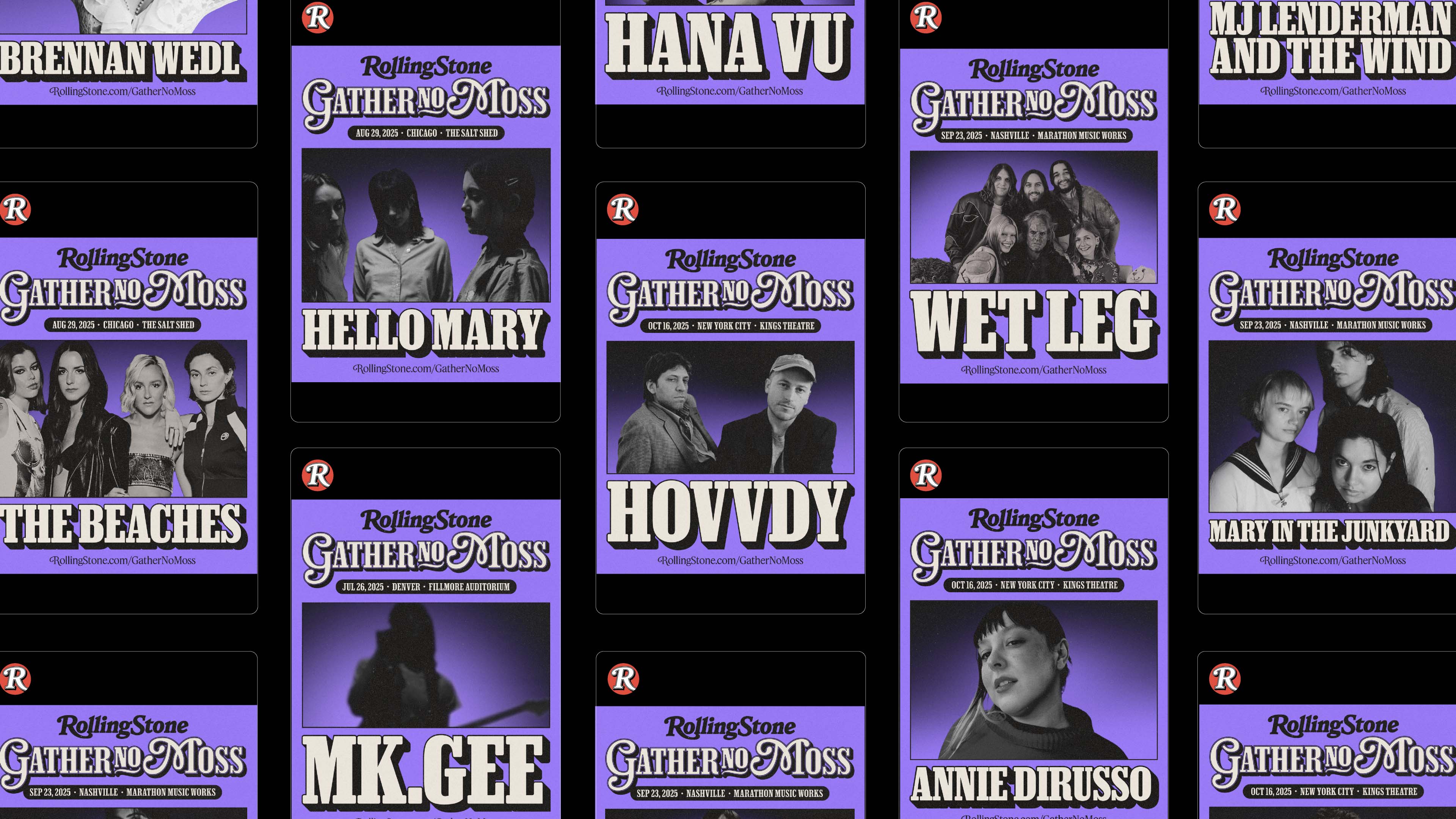
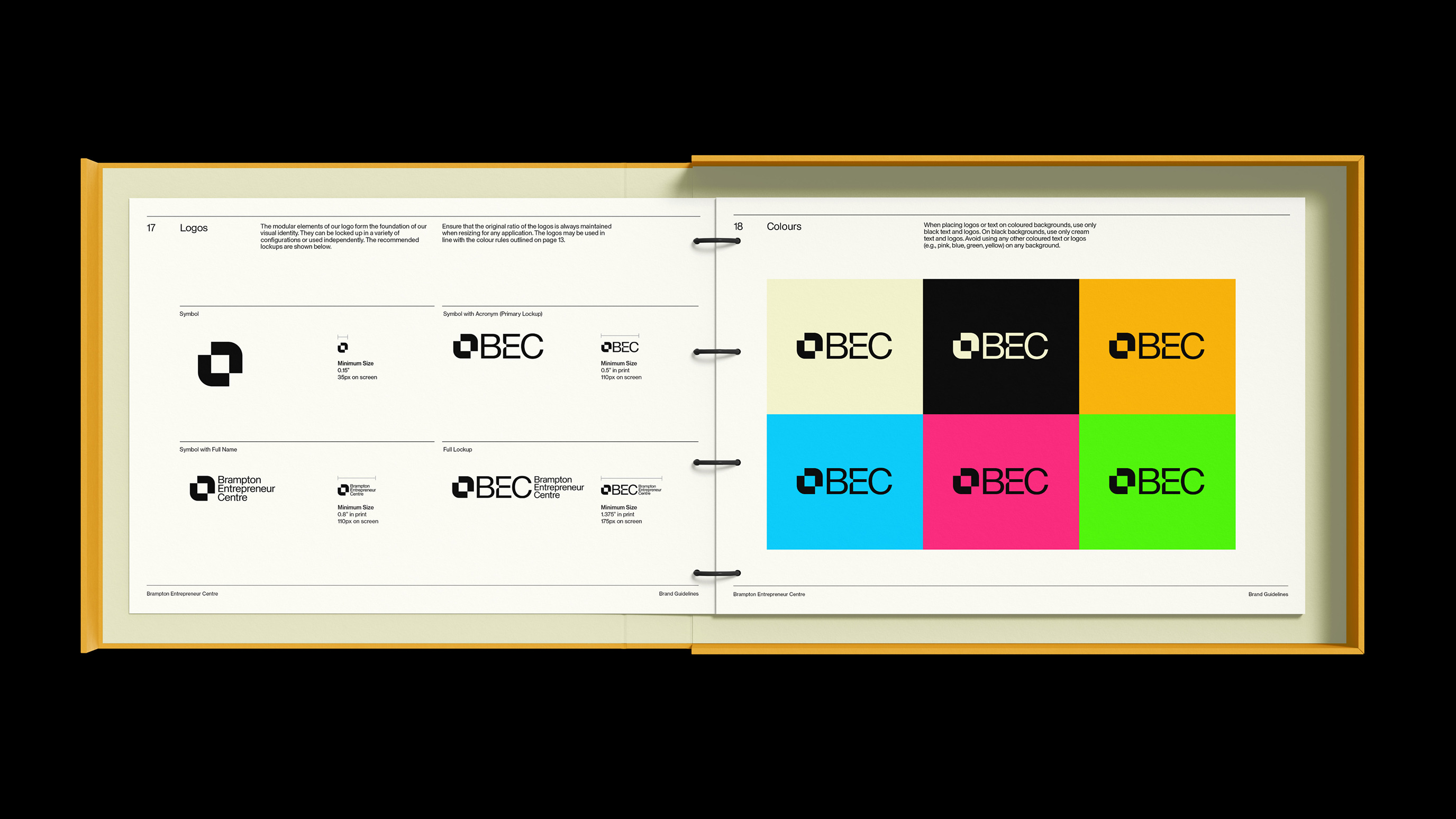
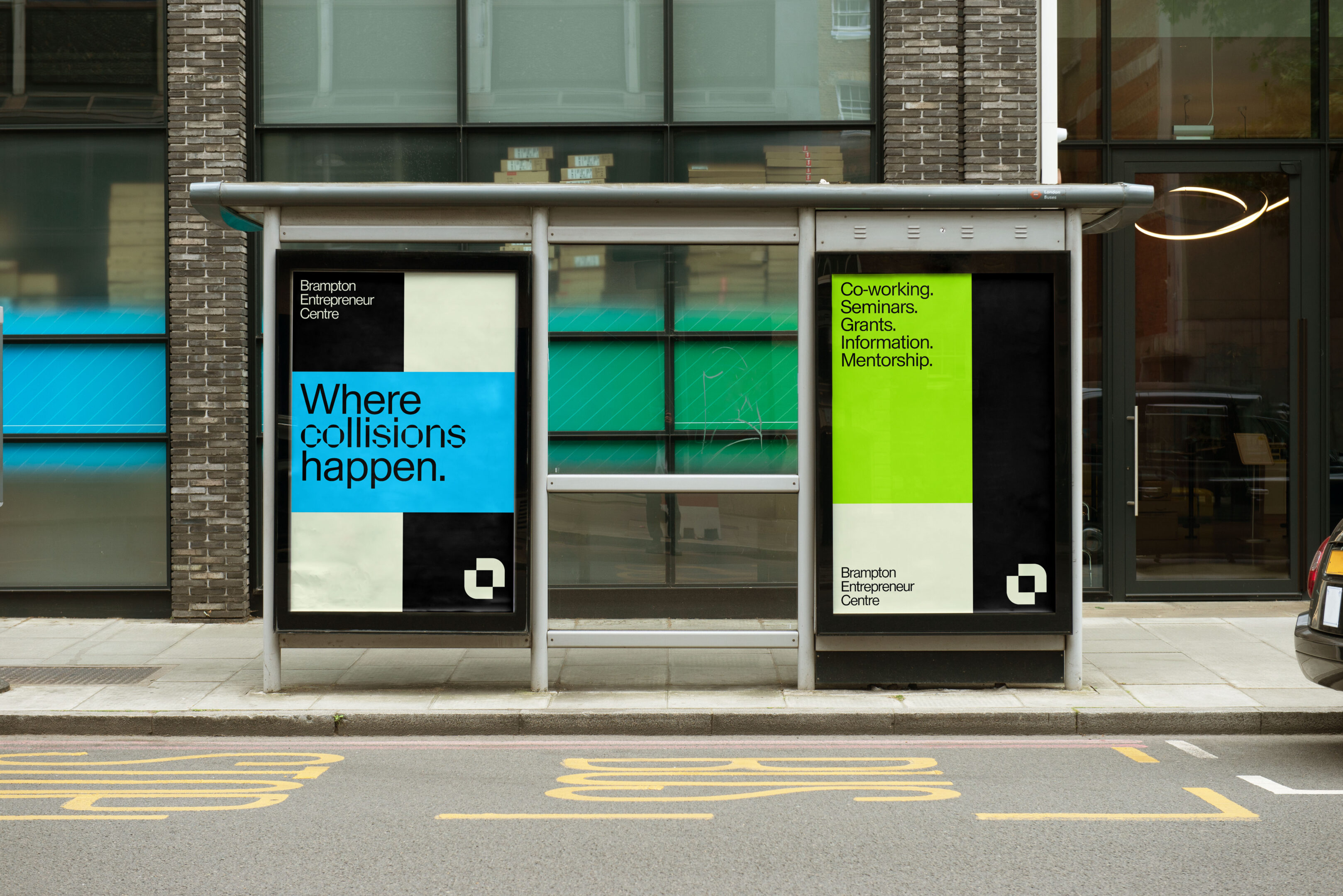
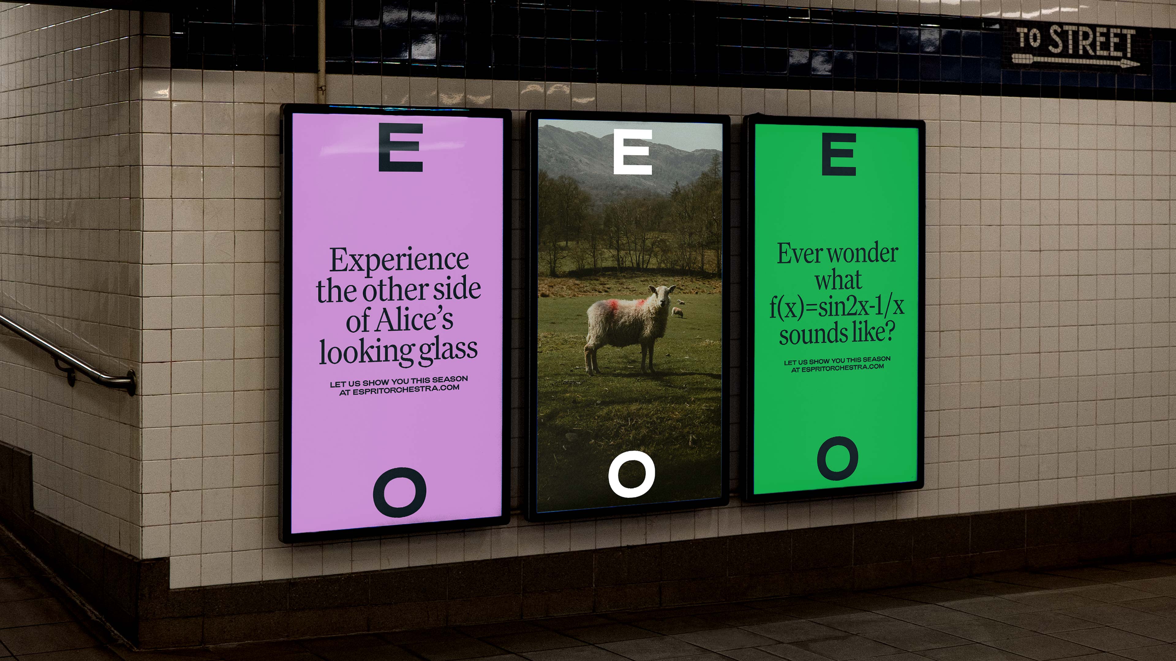
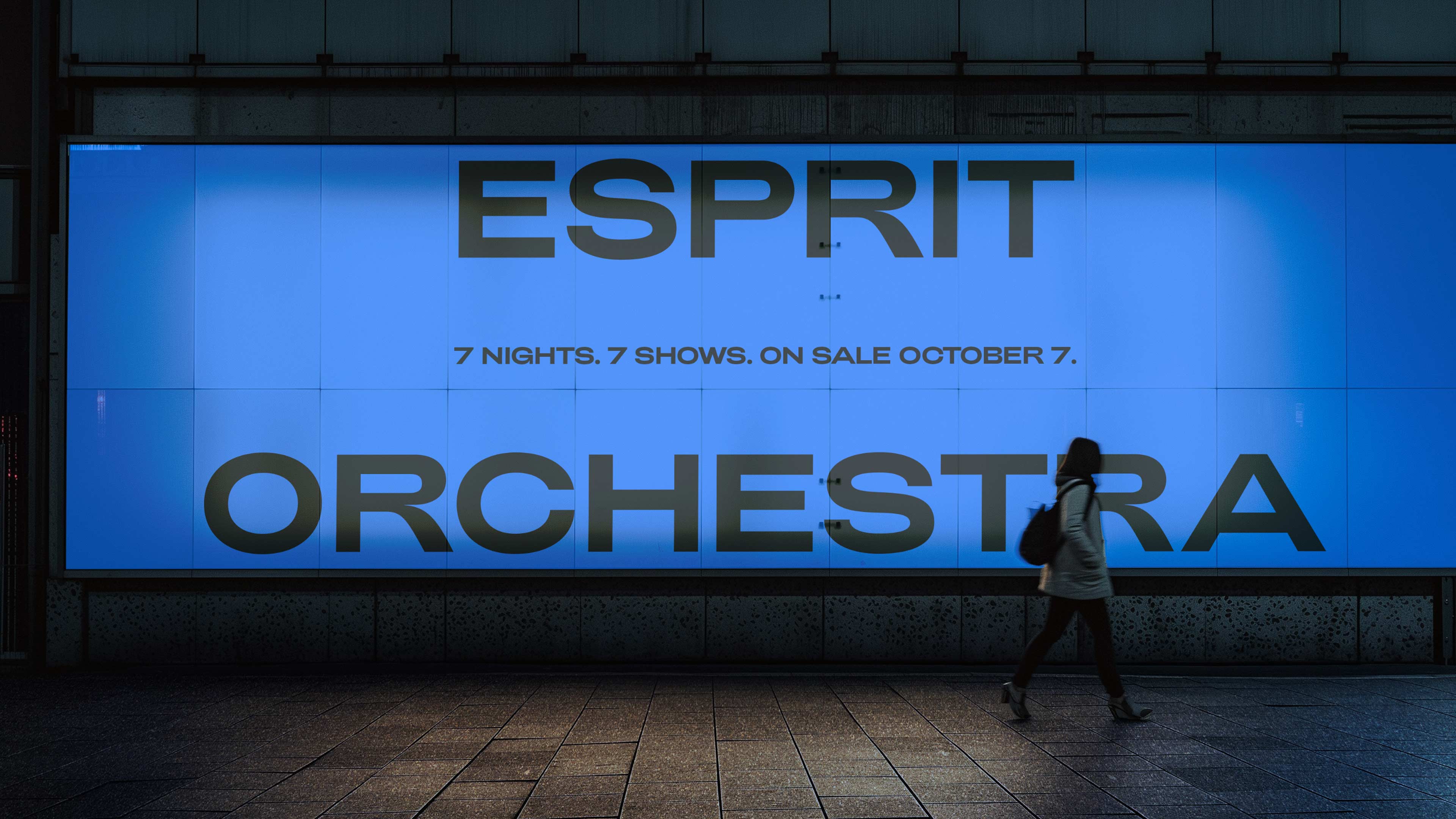
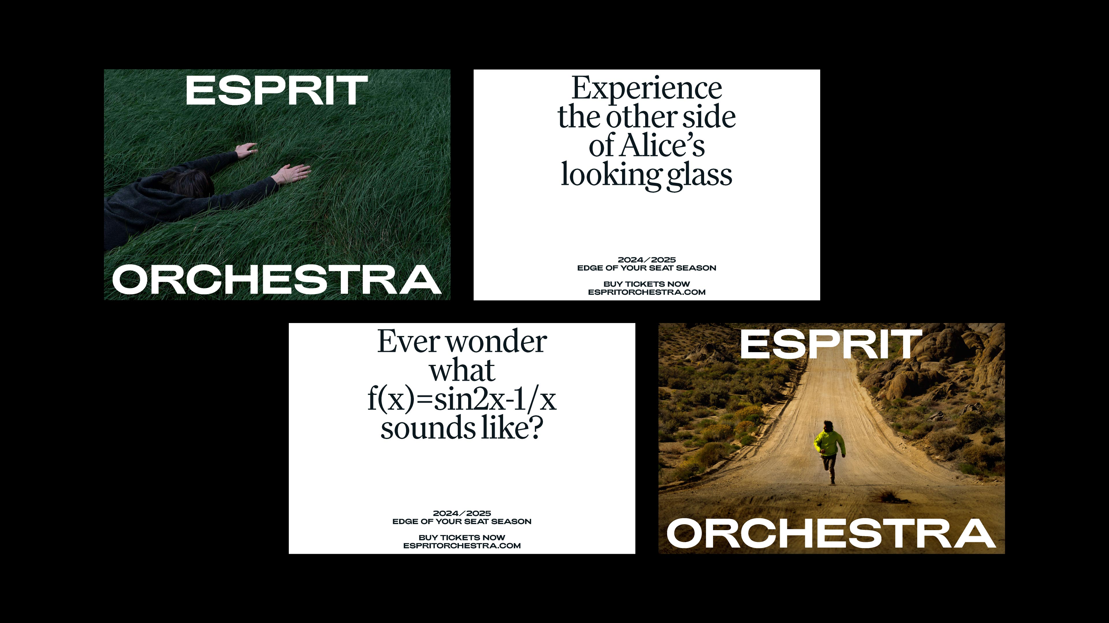
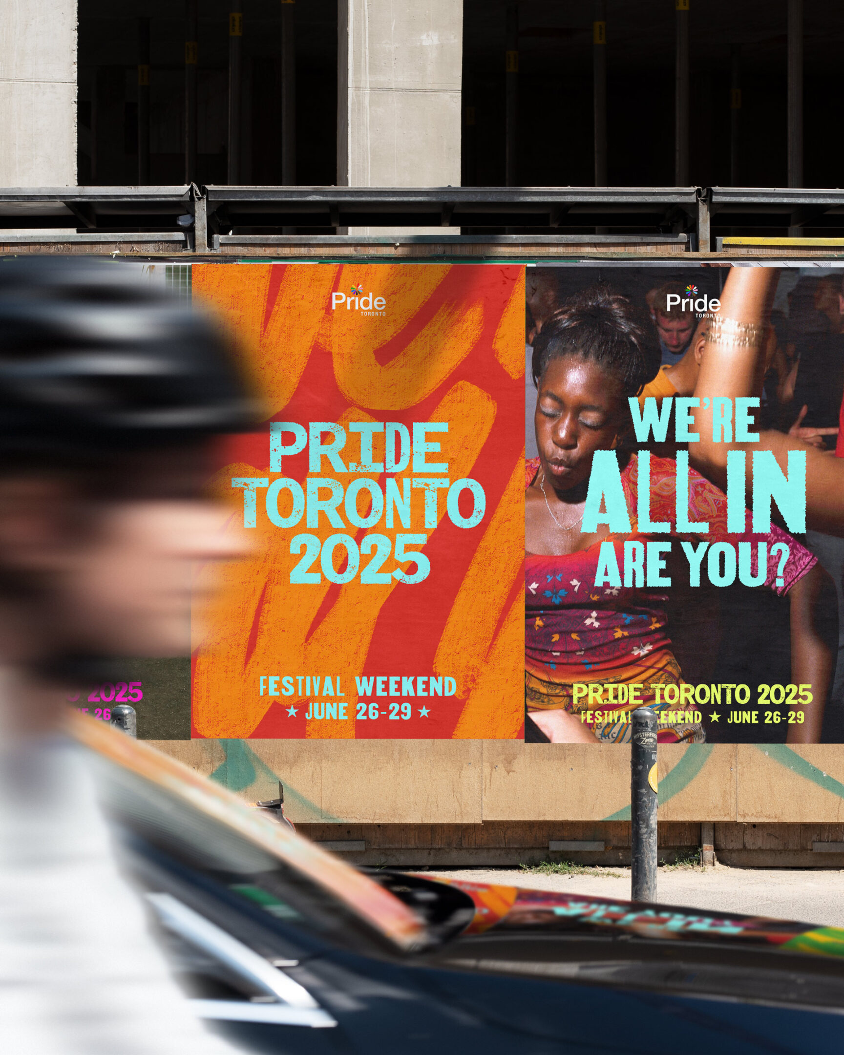
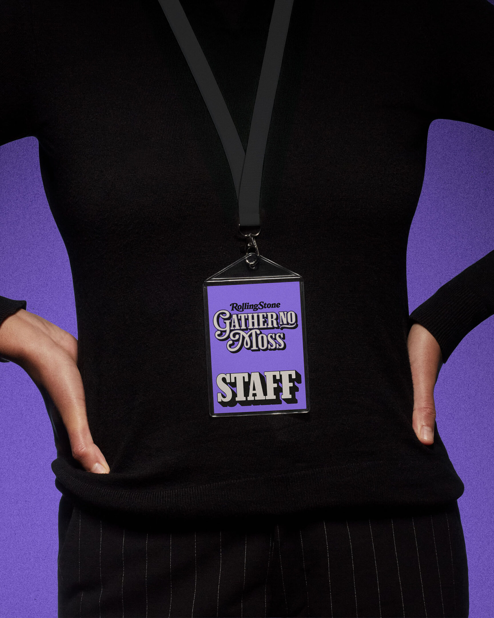
Visually, we developed an editorial identity rooted in Rolling Stone’s iconic design language. The system draws from the brand’s distinct wordmark, typography, layout principles, and image treatment, translating them into a cohesive, contemporary concert identity.

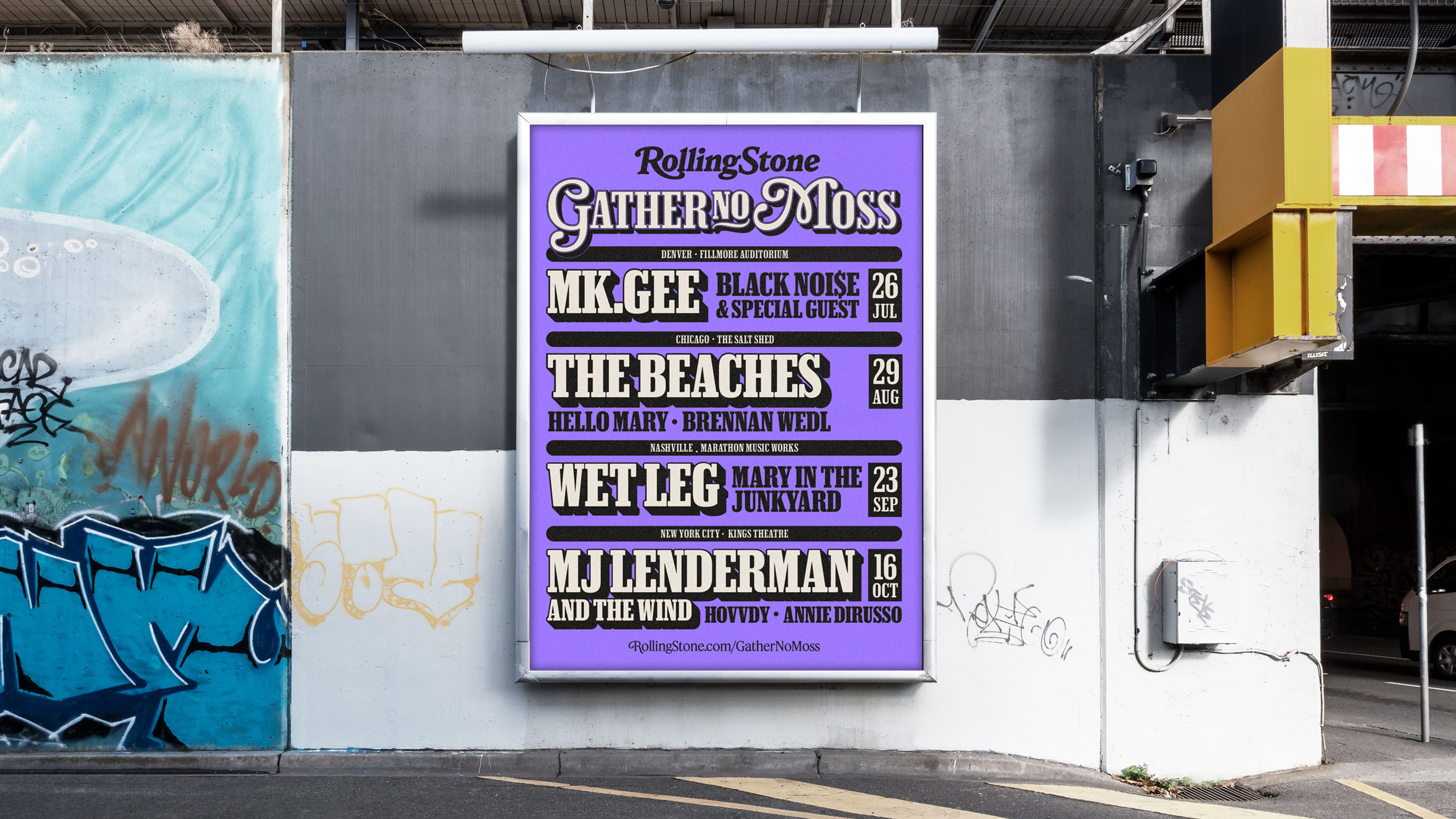
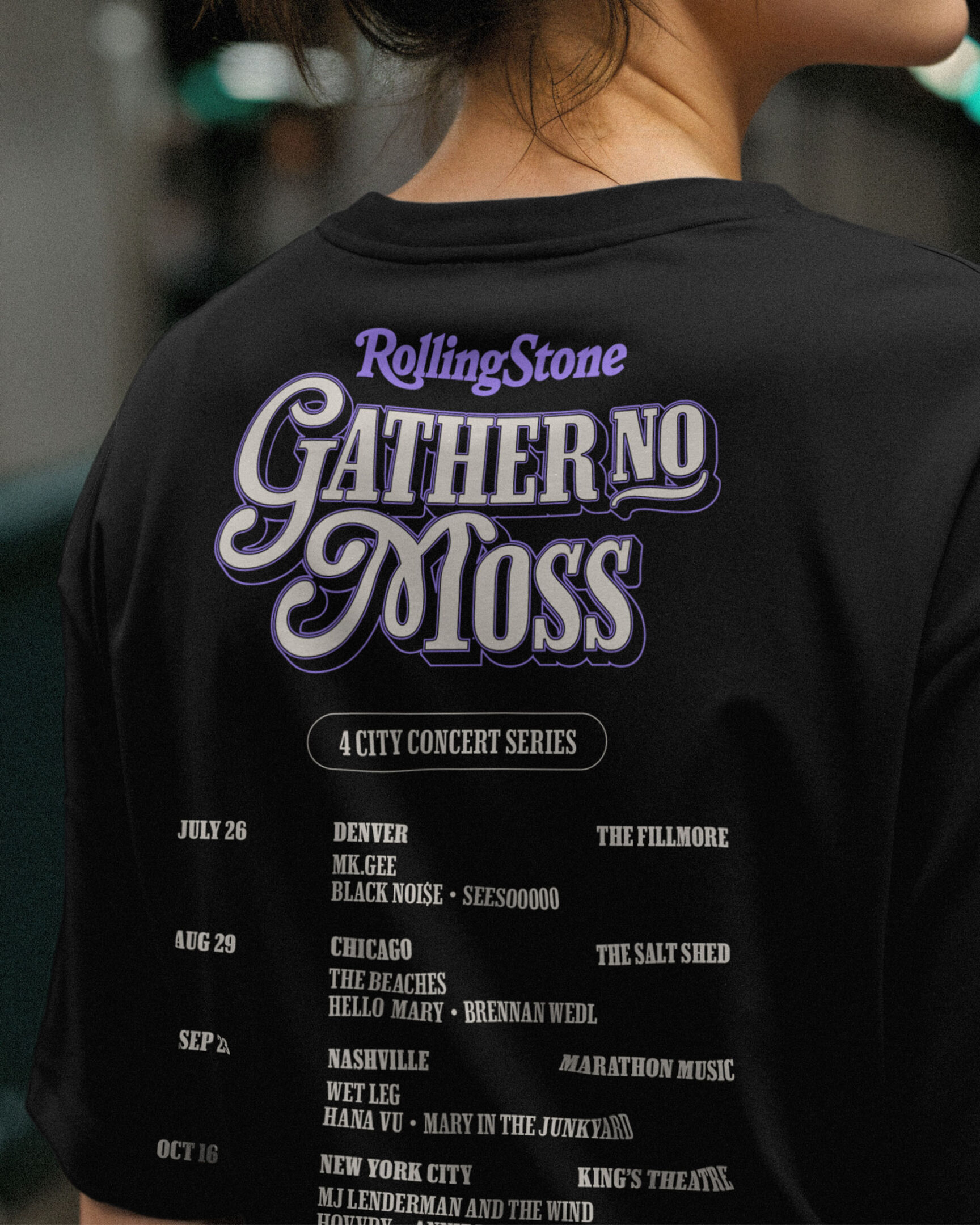

This four-city series—Chicago, Denver, Nashville, and New York—celebrates each city’s unique legacy in rock music. It brings together some of the most compelling voices in the industry, combining emerging and established talent with the raw authenticity that defines Rolling Stone’s journalism.
Despite being a new initiative, the first show sold out within its first week, with the remaining dates projected to follow suit. Rolling Stone successfully integrated this live event series into its broader platform and brand ecosystem, while allowing it to evolve as a distinct experience. The project laid the groundwork for engaging a new generation of music fans, all while honouring the legacy of the Rolling Stone name.
View more projects