EY Innovation Realized

Bringing EY’s Rethink philosophy to life through an engaging, interactive summit environment.

Industry
Corporate

Service
BrandingMotionPrint

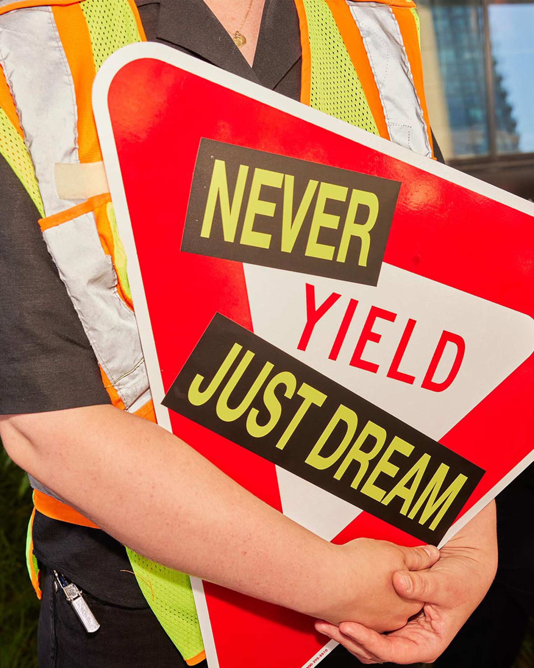
The EY Innovation Realized Summit is an exclusive, peer-to-peer event for C-suite and senior leaders designed to spark new ideas and foster creative collaboration on strategy, technology, and transformation. Each year, the summit encourages participants to rethink everything, exploring topics such as artificial intelligence, sustainability, and digital transformation, while providing a space to connect with peers and gain fresh perspectives on innovation and industry trends.

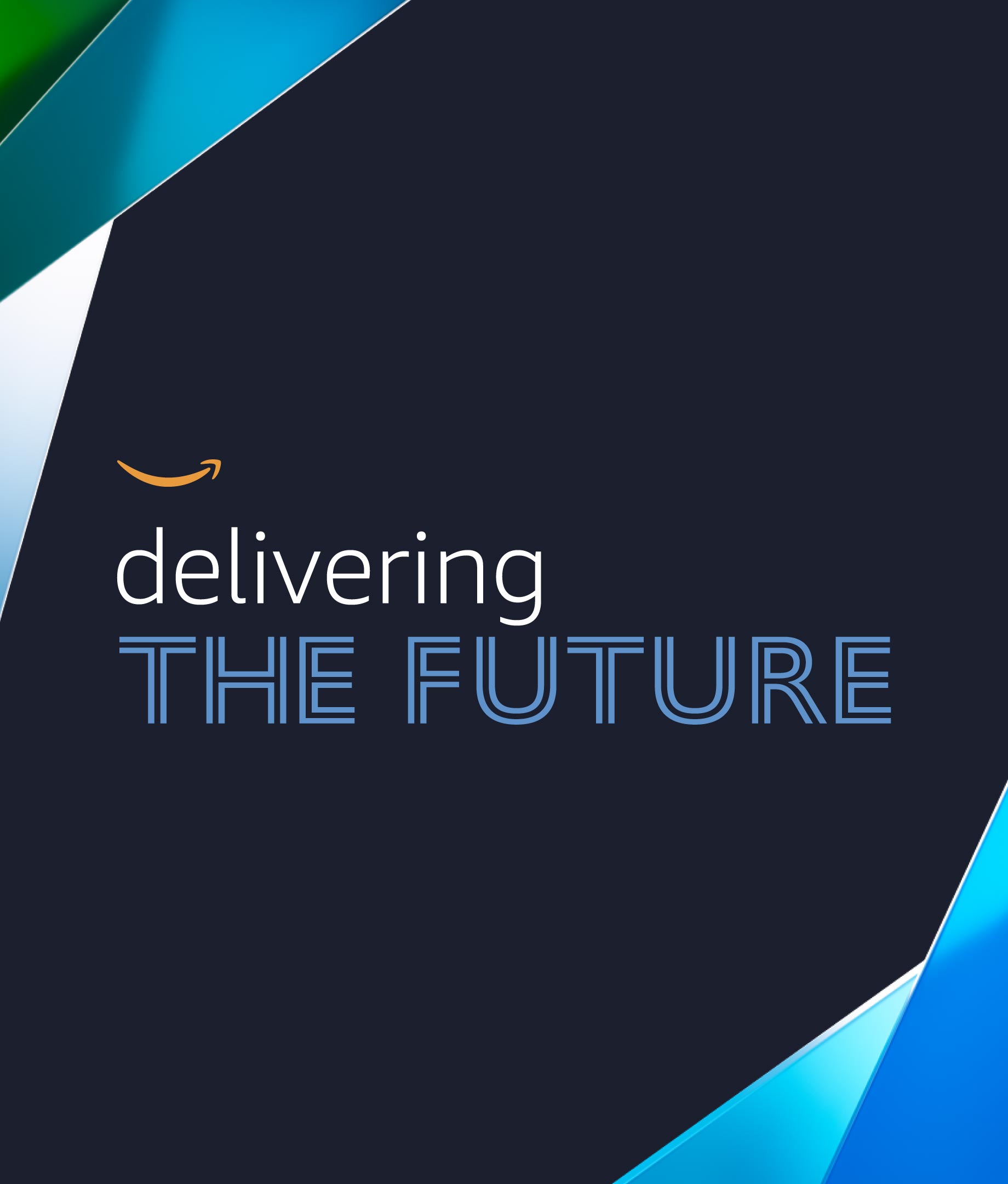
Our team supported EY’s annual summit through the creation of multimedia assets and the design of the Transformation Zone, an interactive environment that brings the event’s central theme, Rethink, to life. Through concept direction, digital installations ranging from informative booths to on-stage graphics, and cohesive visual storytelling, we helped translate complex global challenges into an experience that inspires leaders to reimagine business, technology, and the future itself.

Canadian Stage

Creating a dynamic and accessible visual identity; leading to sold-out performances and industry acclaim.

Canadian Stage’s mission is to be the leading contemporary performing arts organization in the country. They came to Puncture in 2021 to refresh their master brand; they wanted to move away from being seen as a “contemporary art/intellectual/elitist” organization, towards something that was more accessible, reflecting “the art of today.”

After an in-depth research and discovery phase, the master brand we created for the organization is punctuated by a straight bold line, representing a stage. This line underscores the logo and can be extended to make connections to programming, and can also twist and turn to become more expressive of movement and live performance. A bright yellow that is easily recognizable and welcoming ties the brand together.

Since 2021, we have worked with Canadian Stage annually to create marketing collateral for their seasons, including the season brochure, out-of-home print ads, digital and social ads, video and motion assets, and sub-branding for the Dream in High Park series. For the 2022/23 season we directed and produced a photo and video shoot featuring key actors from the season’s productions, to be featured in all of the marketing collateral.

Industry
Arts & Culture

Service
BrandingPrint

Canadian Stage is one of Canada’s leading non-profit, contemporary performing arts organizations based in Toronto, Ontario. Founded in 1988, the theatre company has since produced over 300 shows with a focus on multidisciplinary work, text adaptation, programming international contemporary theatre, and developing and producing new Canadian works. Canadian Stage also continues to promote theatre to younger audiences, running a series of artist development and education initiatives, as well as youth and community outreach programs.

Amazon Delivering the Future

Bringing Amazon’s spirit of innovation to life through The Amazon Time Machine immersive exhibit.

Industry
Corporate

Service
MotionPrint

Amazon’s Delivering the Future 2024 was a global innovation event that spotlighted the company’s advancements in AI, robotics, drones, sustainability, and more. The event brought together over 100 media representatives, third-party guests, and executive speakers to showcase how Amazon builds, tests, and scales innovations for the benefit of customers, employees, and communities.

Our team supported the creative rollout through concept direction, environmental design, and integrated video displays, creating a cohesive, educational experience that celebrates Amazon’s evolution and its vision for what’s next.

Lots of Play

Building a playful sub-brand for Choice Properties’ inaugural summer activation series, transforming parking lots into vibrant hubs of art, connection, and community pride.

The graphic system is inspired by the familiar lines of a parking lot, reimagining them as playful, dynamic forms that spark movement, creativity, and connection. Bending and twirling within the grid, these linear elements create a whimsical yet structured visual language, brought to life through a bright, summery palette grounded in Choice Properties’ signature purple and green.

Industry
Arts & CultureCorporate

Service
BrandingPrint

Lots of Play is an all-ages summer activation series that is part of the Choice Properties’ larger placemaking vision, transforming everyday sites into spaces where communities can gather, connect, and thrive. The activations spark joy, foster belonging, and build neighbourhood pride, positioning Choice as a thoughtful city-builder invested in the long-term vibrancy of its communities.

The identity is brought to life through a range of event applications from flyers and digital invites to social media templates and on-site signage. Designed to be flexible and evergreen, the system can adapt to a variety of programming year over year, while connecting the series to a larger, lasting placemaking initiative.

Pride Toronto 2024

Celebrating our right to Be.

Industry
Arts & CultureNon-Profit

Service
BrandingMotionPrint

Pride Toronto 2024 embraces the powerful theme of “Be”—a declaration of existence, authenticity, and the fundamental right to simply be. More than just a theme, “Be” is a manifesto—a rallying cry that unites the 2SLGBTQI+ community and its allies in a bold, unapologetic celebration of identity, diversity, and human expression.

Puncture supported Pride Toronto in bringing this vision to life through dynamic marketing and communication assets, ensuring that the festival’s message resonated across digital and physical spaces. From refreshing the festival’s theme identity to producing digital marketing materials, wayfinding, onsite signage, and the official Pride Guide, our work helped shape an inclusive experience.

Together, we made Pride Toronto 2024 an undeniable presence—one that invites everyone to be seen, be heard, and simply be.

Toronto Biennial of Art

Building a visual identity, communications toolkit and wayfinding strategy for Toronto’s first-ever biennial of contemporary art.

In 2019, prior to launching the inaugural Biennial to the public, TBA came to Puncture to define its visual identity. A key feature of the Biennial is that all of its exhibition sites are located near waterways that are significant to Toronto: Lake Ontario, the Humber River, Don River, and more. We came up with a vibrant brand that is inspired by nautical flags and symbols, these appear in the bold graphic devices we created. 

The system is bolstered by artwork treatments, a celebratory and accessible colour palette, and a custom wordmark to bring the importance of public and free art to the city’s consciousness. In addition to visual identity, we helped simplify the Biennial’s communication platform and got it to its most distilled form, “72 days of Free Art”.

Industry
Arts & Culture

Service
BrandingPrint

The Toronto Biennial of Art’s (TBA) mission is to make contemporary art accessible to everyone. For 10 weeks every two years, local, national, and international Biennial artists transform Toronto and its partner regions with free exhibitions, performances, and learning opportunities.

Since the inaugural year, we have worked with TBA on all aspects of their marketing materials including communications, digital production, graphic design, video production, motion graphic design, and environmental and experiential design.