Sidewalk Labs

A public workshop and creation of useful tools that promote digital transparency in the public realm.

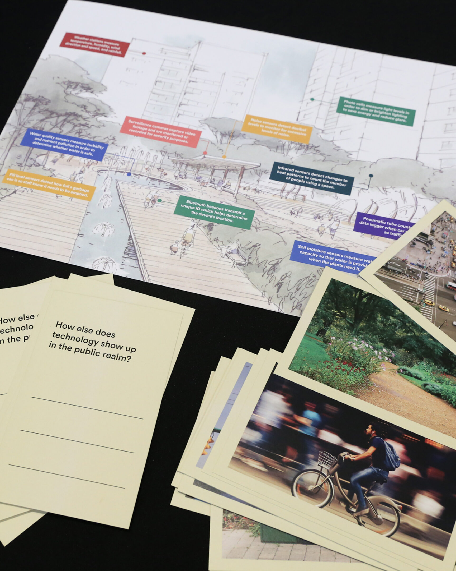
During Sidewalk Labs’ (SWL) time in Toronto on the Quayside project, the public discourse around data and digital transparency was of concern. SWL reached out to Puncture to help design and facilitate a public workshop focused on how to improve digital transparency in the public realm. Technology is all around us, but often invisible.

Industry
Corporate

Service
Branding

dtpr.io

The public engagement and consultation phase of the project was developed through an in-depth research phase with internal stakeholders and community members to get a sense of their concerns around digital transparency. Together with 100+ public participants from Toronto, New York, San Francisco, and London, we brainstormed, sketched, debated, iterated, and prototyped during several sessions we facilitated.

Based on this public engagement, we developed a series of simple signs and offloaded the complexities to the digital channel. Through this process, our purpose signage and icons came to life with simple and universally recognized symbols. Each icon was carefully crafted and selected to help users understand the most common questions around technology in the public realm: what’s the purpose? The project became known as Digital Transparency in the Public Realm (DTPR).

DTPR is now an open-source communication standard designed to increase transparency, legibility and accountability for digital technology in public places. The signage systems and DTPR are being piloted in the City of Boston, District of Columbia, Sydney Olympic Park, Angers-Loire Metropolitan Region in France, and the Town of Innisfil in Canada.

Fit4Less

Kinetic typography for Canada’s fitness brand.

Industry
Corporate

Service
Motion

In collaboration with John St. Agency, our goal was to breathe life into a robust campaign that aimed to transform the perception of working out. Our vision was to make exercise not only approachable but also enjoyable and engaging. To achieve this, we utilized kinetic typography and immersive sound design, infusing each workout session with vibrancy and energy.

This dynamic campaign reached audiences through television ads and social media platforms. By combining creativity with innovation, we succeeded in redefining the fitness experience, making it more accessible, friendly, and ultimately, fun.

Patel

Exploring Hindi letters to create a unique wordmark for an art gallery.

Industry
Arts & Culture

Service
Branding

Patel Gallery highlights alternative perspectives and encourages experimentation and innovation in both its programming and operations. Identifying gaps in representation and opportunities guided by collaboration and community; the gallery’s program will look to traditions in culture and identity, and how they are increasingly challenged by the globalized world.

In collaboration with owner Devan Patel, Puncture embarked on crafting a simple yet distinctive identity that encapsulated these principles. Drawing inspiration from the elegant forms of the Hindi alphabet, we designed a wordmark that unified these ideals, with a connecting bar at the top. This identity serves as a visual embodiment of Patel Gallery’s commitment to innovation and cultural dialogue.

JCCC

An intimate portrait of architect Bruce Kuwabara

Industry
Arts & CultureDesign & Architecture

Service
Video

Created for the 2026 Sakura Gala at the Japanese Canadian Cultural Centre, this 12-minute documentary offers an intimate portrait of Bruce Kuwabara — architect, cultural thinker, and founding partner of KPMB Architects. The film traces the personal history and cultural experiences that shaped Kuwabara’s worldview, exploring how identity, memory, and community became foundational to both his life and his architectural practice.

Through candid conversation, archival material, and cinematic storytelling, the documentary reflects on the experiences of Japanese-Canadians during and after the Second World War, the lasting effects of displacement and assimilation, and the evolving search for belonging across generations. Woven throughout is Kuwabara’s own journey into architecture and his longstanding relationship with the Japanese Canadian Cultural Centre, including the tensions, ambitions, and hopes surrounding the institution’s growth and evolution over time.

Rather than focusing solely on buildings or professional accolades, the film examines the human and philosophical ideas behind Kuwabara’s work. Themes of pluralism, diversity, public life, and collective identity emerge as central forces in his approach to architecture and his understanding of Canadian culture itself. The result is a deeply personal and reflective film about the ways history, community, and lived experience shape not only the spaces we build, but the society we aspire to become.

JCCC / Art Gallery of Ontario

Capturing the spirit of Naoko Matsubara in film.

Industry
Arts & CultureCorporate

Service
Video

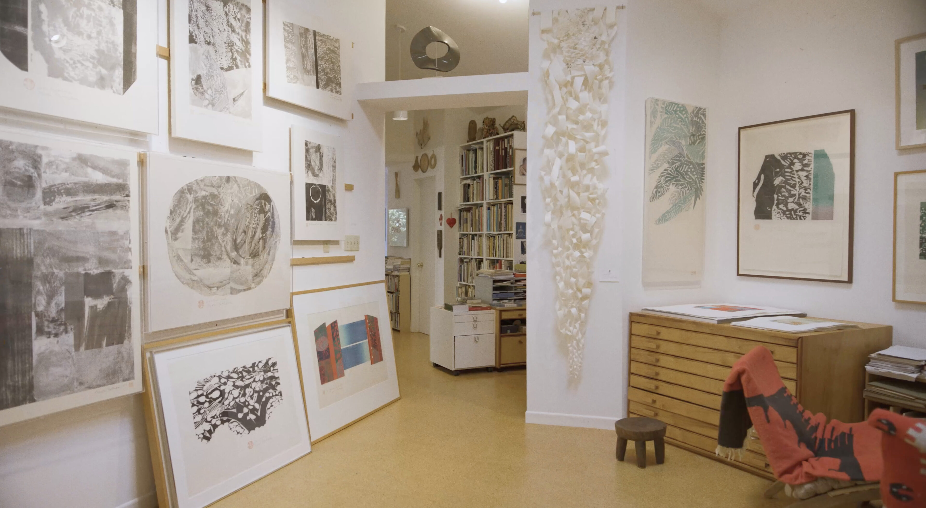
Naoko Matsubara, whose name poetically translates to “straightforward girl of the pine tree field,” is an artist whose life and work intertwine with profound simplicity and creative curiosity. Born in the ancient capital of Kyoto and the daughter of a Shinto priest, she discovered her passion for art early and cultivated a practice of woodcut artistry.

In this intimate portrait, Matsubara reflects on the delicate balance of creation—embracing the unexpected beauty of mistakes and the profound joy found in the tactile nature of woodcut printing. Her story reveals a personal and artistic journey shaped by cultural dualities, self-discovery, and the powerful interplay between intention and intuition.

View more projects

Fit4Less
WayHome
TAS
Tangerine

Motion design for the 2020 playoffs in partnership with the Toronto Raptors.

Industry
Corporate

Service
Motion

Collaborating with our friends at John St., Tangerine needed a set of motion videos to support their campaign during the Toronto Raptors 2020 season playoffs. Tangerine is a Canadian direct bank that offers no-fee chequing and savings accounts, GICs, mortgages and mutual funds. Based on their brief and Tangerine’s existing visual system, we created a series of simple but attention-grabbing typographic motion videos that promoted the bank’s partnership with the Raptors.

Herb

Redefining Cannabis Culture with a Bold Brand Makeover.

Industry
Corporate

Service
Branding

Herb is an online cannabis community that seeks to breakdown the stigma around weed by acting as a thoughtful curator of cannabis products, experiences and culture. They help their users discover the best products, new products, information on strains, how-to guides and experiences in their cities through content and community.

Puncture was tasked to refresh their brand identity to better align with their audacious goals. We created a new brand position, photographic guidelines, typography system and a colour palette. The system is simple, organized and built to suit the many moods and vibes associated with cannabis culture.

Waterfront Toronto

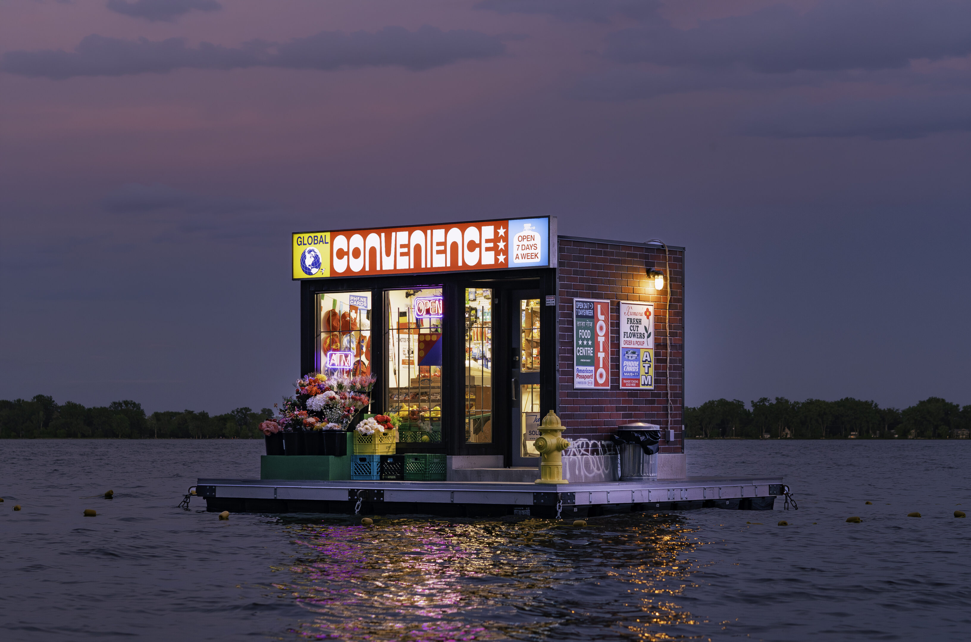
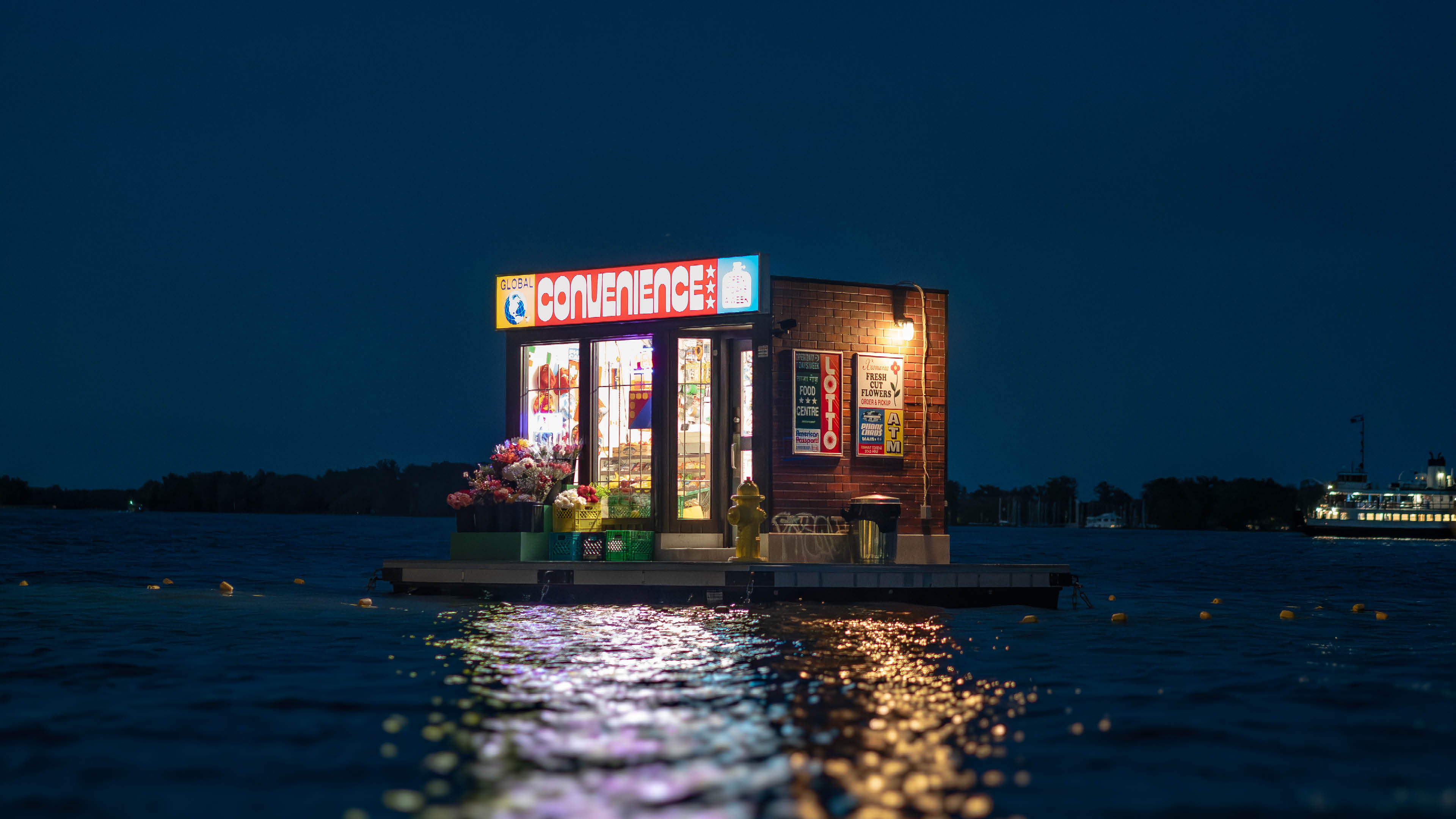
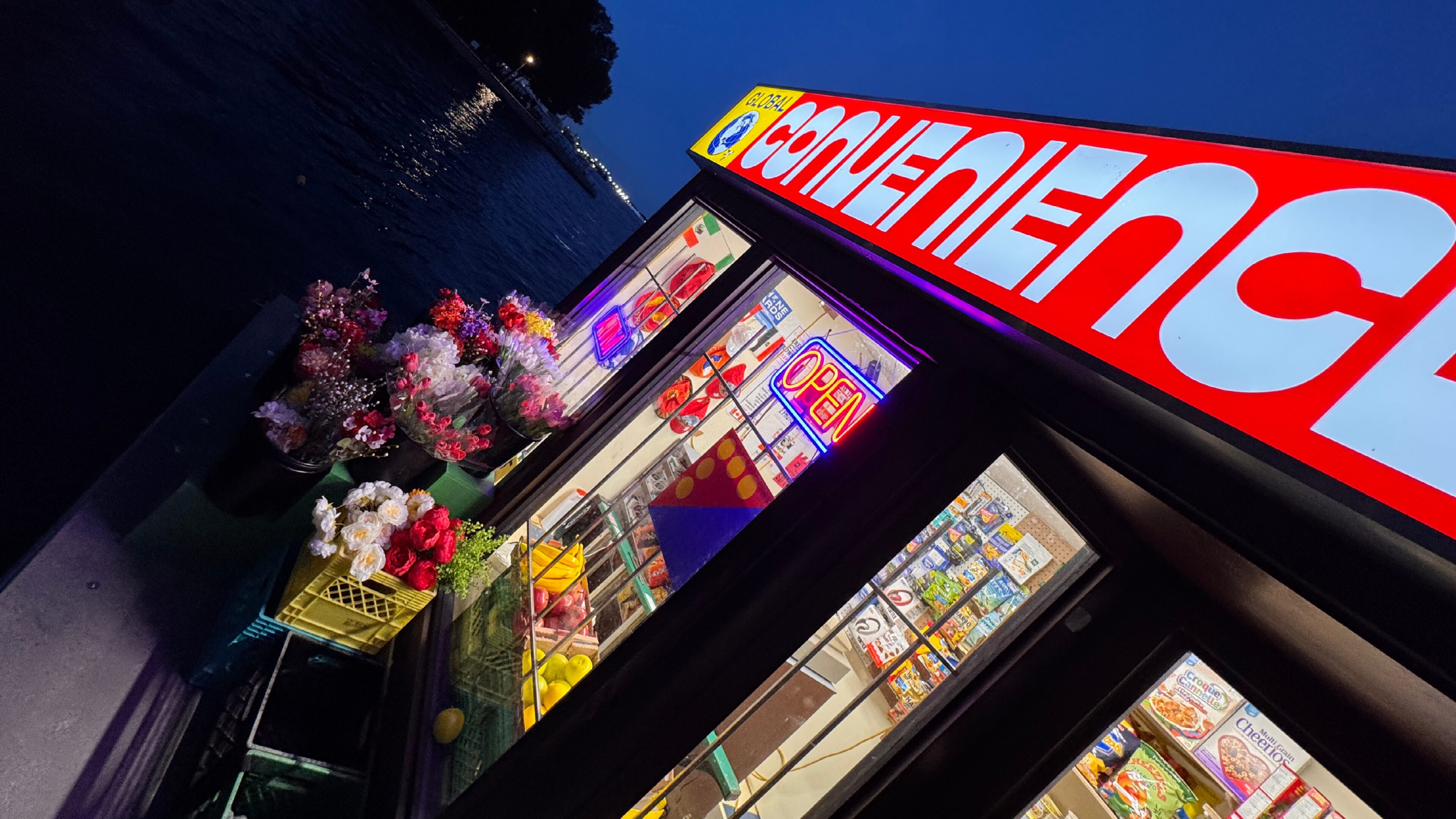
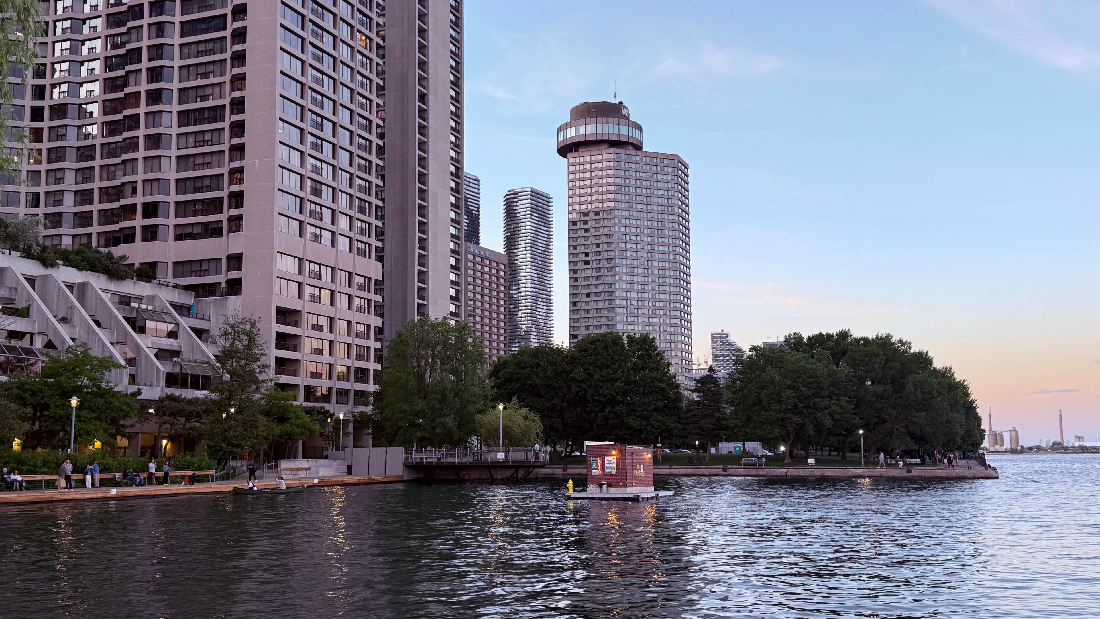
A floating neighbourhood market becomes a symbol of arrival, exchange and shared experience during a moment when the world gathers in Toronto.

When Waterfront Toronto released a call for proposals for a floating public artwork at Harbour Square Park Basin, we immediately thought of artists Trevor Wheatley and Cosmo Dean. We’ve collaborated with Trevor and Cosmo before and have long admired the way their work brings typography, sculpture and landscape together. Their installations often remove familiar words and symbols from the places where we expect to find them, allowing their meanings to shift and become spectacle.

For this project, we wanted to create something at the scale of the waterfront. Something immediately recognizable, but strange enough to stop people in their tracks.

During one of our first conversations, Trevor mentioned that he and Cosmo had always wanted to make a floating flower shop. That became our team’s starting point for Global Convenience.

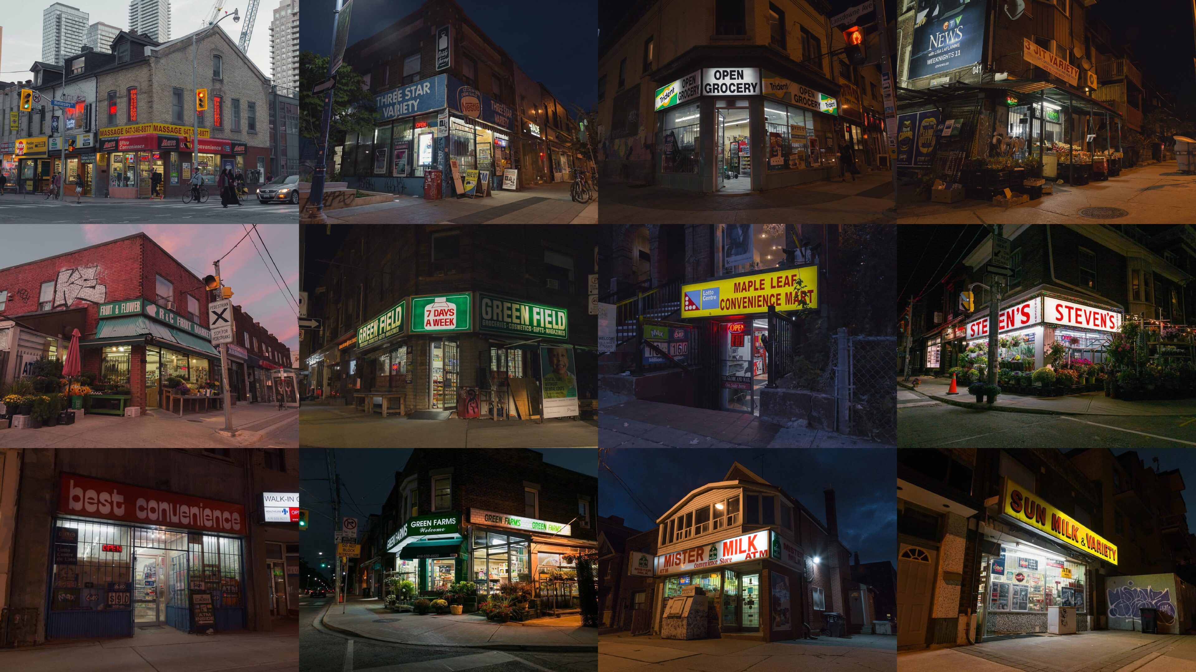
The convenience store is one of the most familiar spaces in the world. Its appearance changes from city to city, but its role remains remarkably consistent. These modest neighbourhood businesses are shaped by migration, labour, exchange and daily ritual.


They are also informal community spaces. You see the same person behind the counter. They begin to recognize you. Languages, products and traditions exist side by side. Over time, small repeated interactions become part of the social fabric of a neighbourhood. Both Rashad and Spencer’s families started convenience stores in Toronto after immigrating.
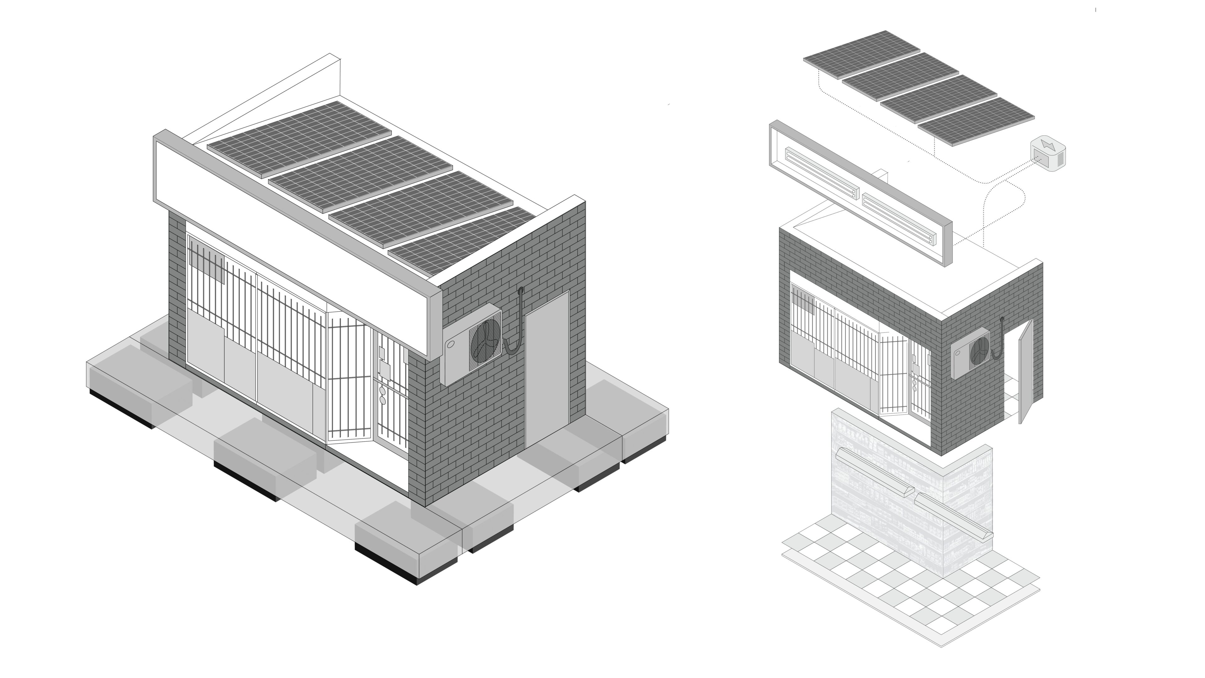
With Toronto preparing to welcome visitors from around the world for the FIFA World Cup, we began thinking about the convenience store as a cultural crossroads. It offered a way to reflect the city’s global identity through an everyday space rather than a grand civic symbol.

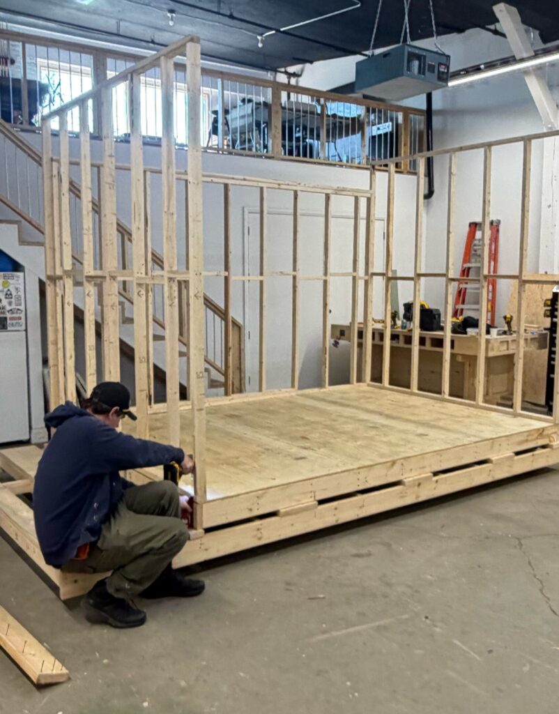
Following the schematic design phase, Trevor and Cosmo began fabricating the structure in their west-end Toronto studio. The build required a constant balance between appearance, weight, durability and safety. The store needed to look substantial while remaining light enough to float and move. Engineering became central to the process, with the team working through buoyancy, wind load, lifting points, anchoring and structural stability. Materials and details were adjusted continuously as the project moved between design, fabrication, engineering and logistics until the object finally worked as a whole.

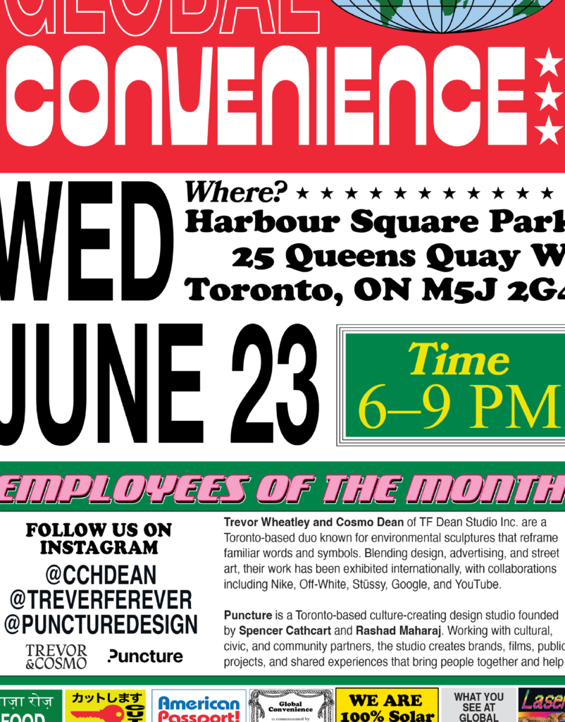
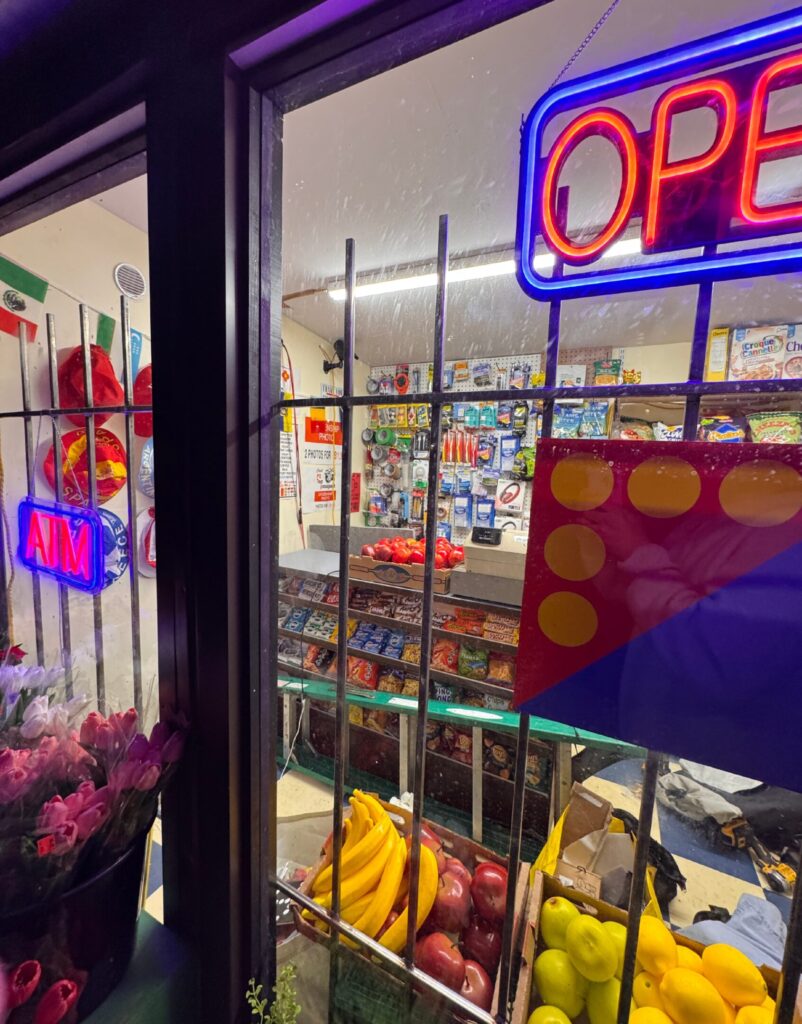
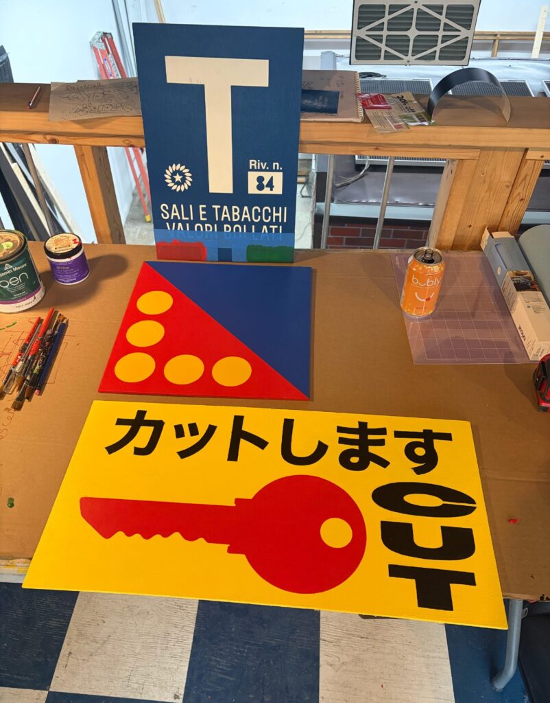
The store’s identity was built through accumulated details: barred windows, flowers, produce, decals, price signs and illuminated graphics. Drawing from the crowded visual language of neighbourhood convenience stores, we created an original mix of compressed typography, competing colours and printed and hand-painted signage. The inconsistencies were intentional, making the storefront feel accumulated over time rather than formally designed. Because the work is visible but inaccessible, we also created flyers and printed materials that extend its visual language onto land.
Industry
Arts & CultureDesign & Architecture
Service
Branding

Installing Global Convenience was a major undertaking. The completed structure had to be moved out of Trevor and Cosmo’s studio, loaded onto a flatbed and transported to the waterfront, where it was lifted by crane, lowered into the lake and secured to submerged anchors. Once installed, the work immediately began attracting attention. People stopped, pointed, photographed it and tried to determine whether it was real. During a moment when Toronto is presenting itself to the world, Global Convenience looks toward the smaller spaces through which a global city is actually made.