Waterfront Toronto
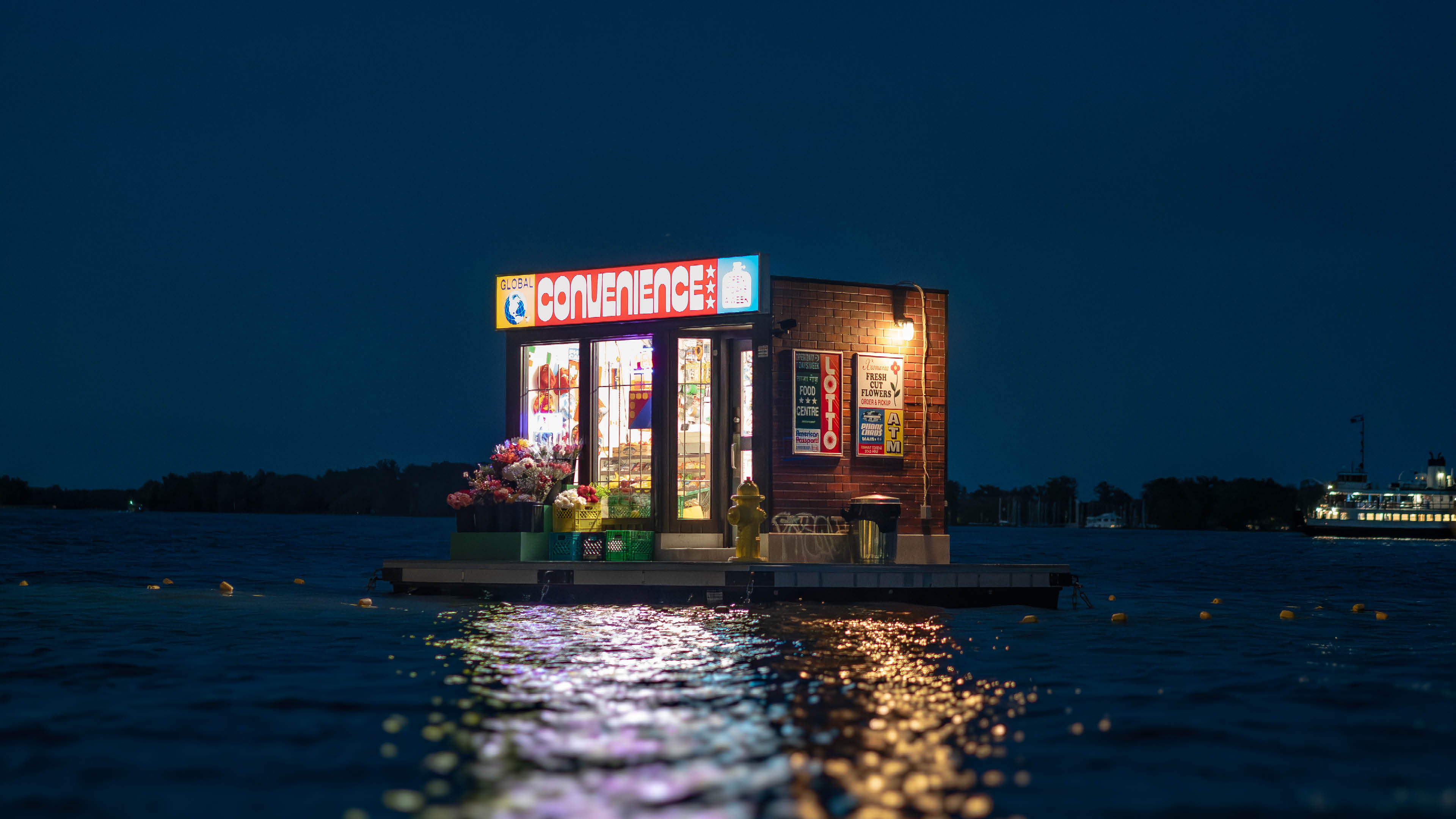
A floating neighbourhood market becomes a symbol of arrival, exchange and shared experience during a moment when the world gathers in Toronto.
When Waterfront Toronto released a call for proposals for a floating public artwork at Harbour Square Park Basin, we immediately thought of artists Trevor Wheatley and Cosmo Dean. We’ve collaborated with Trevor and Cosmo before and have long admired the way their work brings typography, sculpture and landscape together. Their installations often remove familiar words and symbols from the places where we expect to find them, allowing their meanings to shift and become spectacle.
For this project, we wanted to create something at the scale of the waterfront. Something immediately recognizable, but strange enough to stop people in their tracks.
During one of our first conversations, Trevor mentioned that he and Cosmo had always wanted to make a floating flower shop. That became our team’s starting point for Global Convenience.
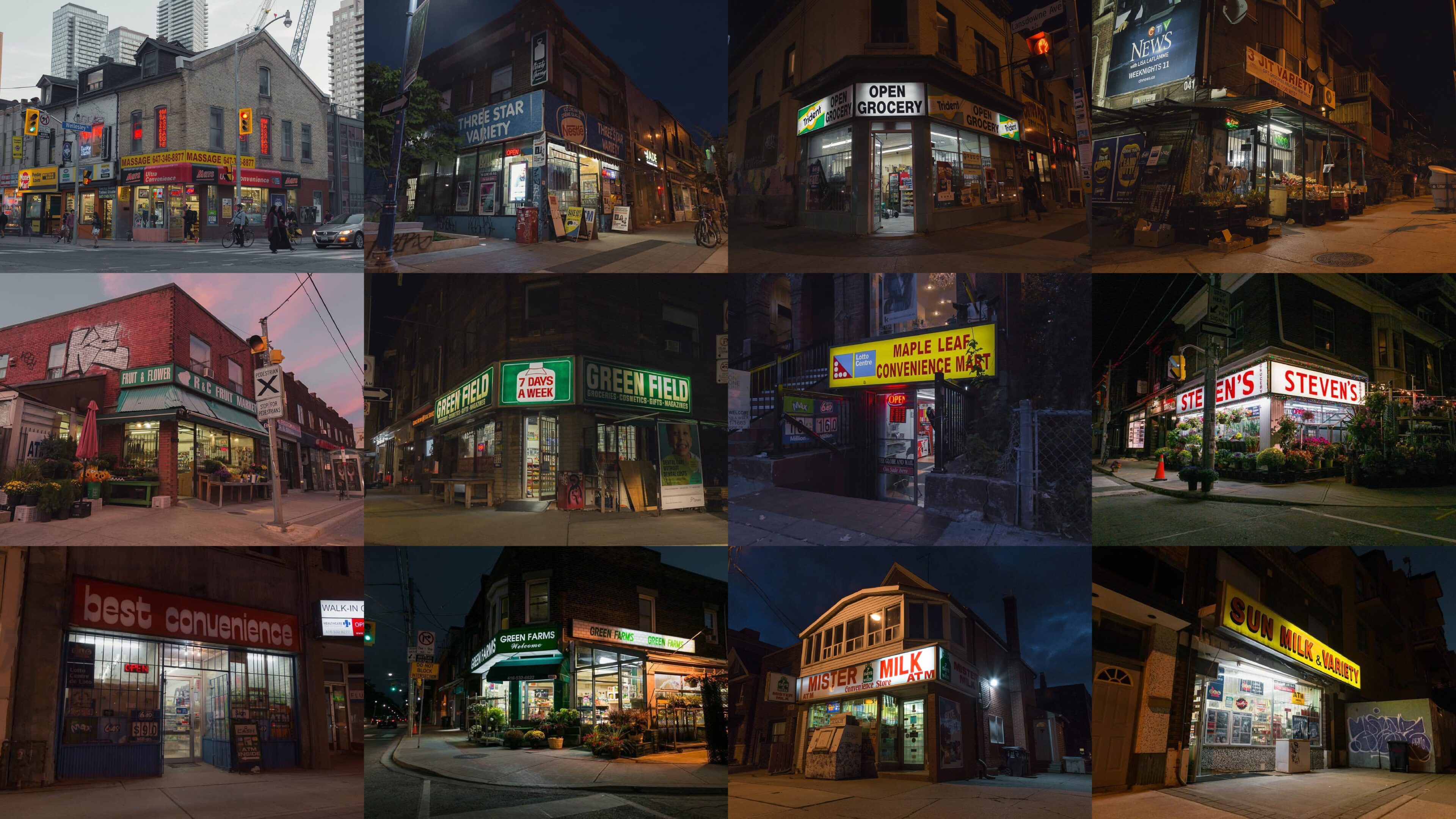
The convenience store is one of the most familiar spaces in the world. Its appearance changes from city to city, but its role remains remarkably consistent. These modest neighbourhood businesses are shaped by migration, labour, exchange and daily ritual.
They are also informal community spaces. You see the same person behind the counter. They begin to recognize you. Languages, products and traditions exist side by side. Over time, small repeated interactions become part of the social fabric of a neighbourhood. Both Rashad and Spencer’s families started convenience stores in Toronto after immigrating.
With Toronto preparing to welcome visitors from around the world for the FIFA World Cup, we began thinking about the convenience store as a cultural crossroads. It offered a way to reflect the city’s global identity through an everyday space rather than a grand civic symbol.
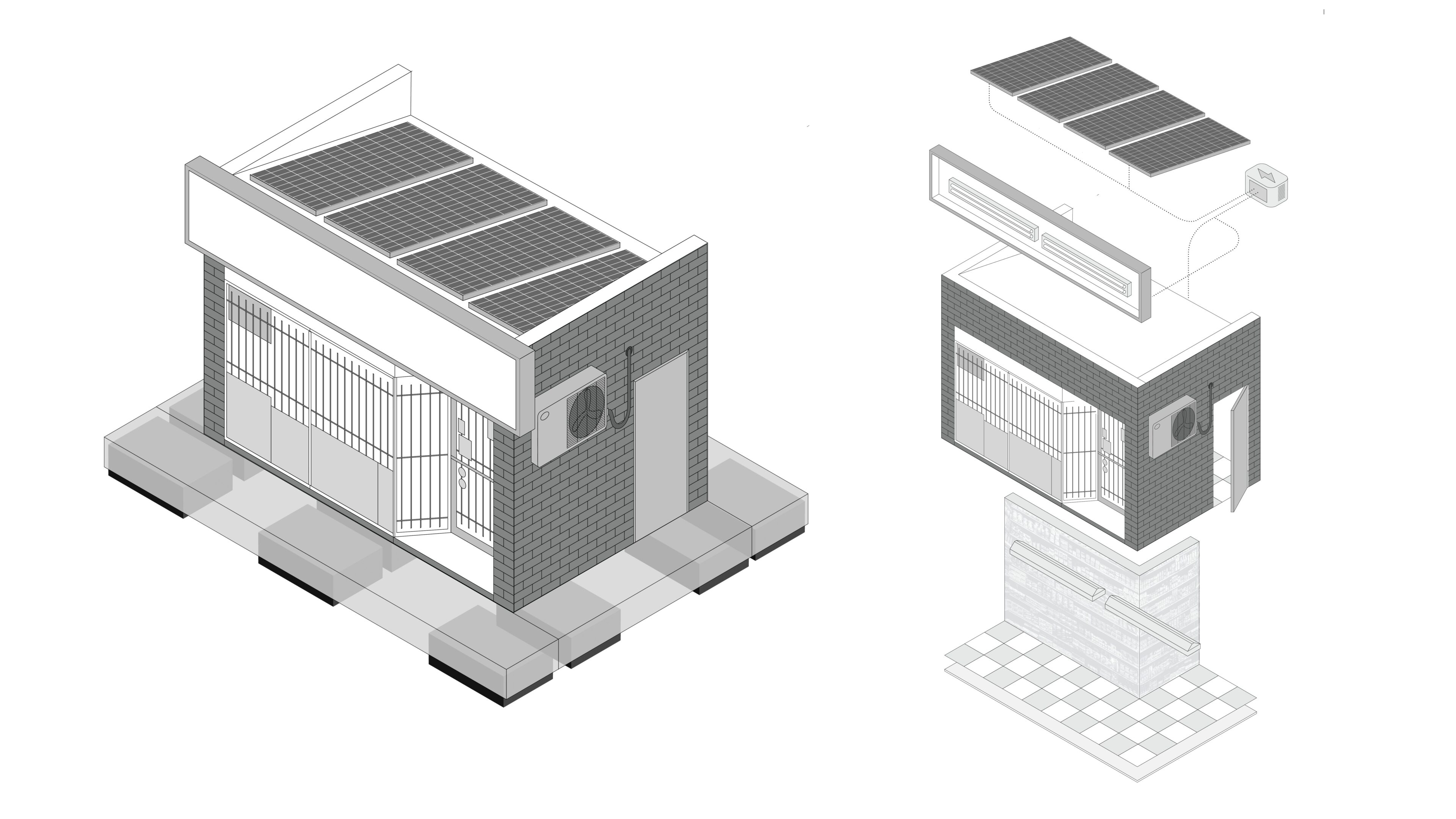
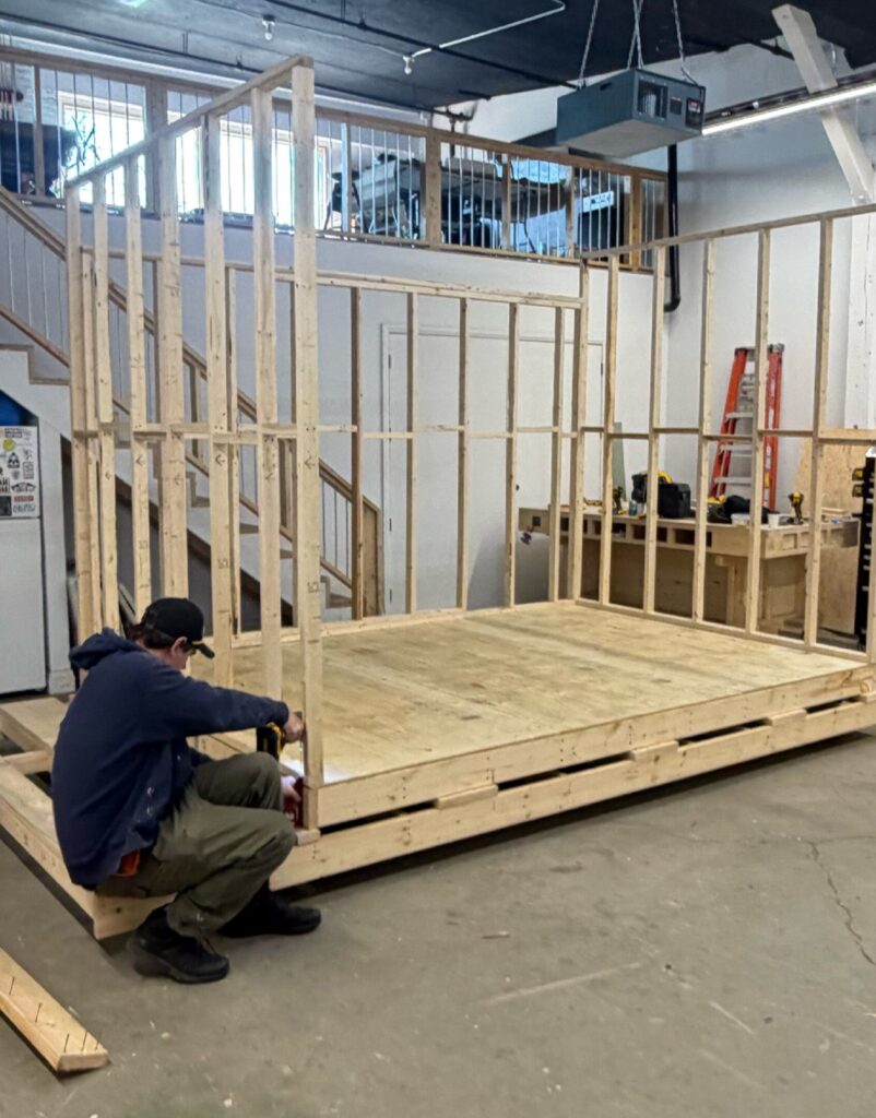
Following the schematic design phase, Trevor and Cosmo began fabricating the structure in their west-end Toronto studio. The build required a constant balance between appearance, weight, durability and safety. The store needed to look substantial while remaining light enough to float and move. Engineering became central to the process, with the team working through buoyancy, wind load, lifting points, anchoring and structural stability. Materials and details were adjusted continuously as the project moved between design, fabrication, engineering and logistics until the object finally worked as a whole.
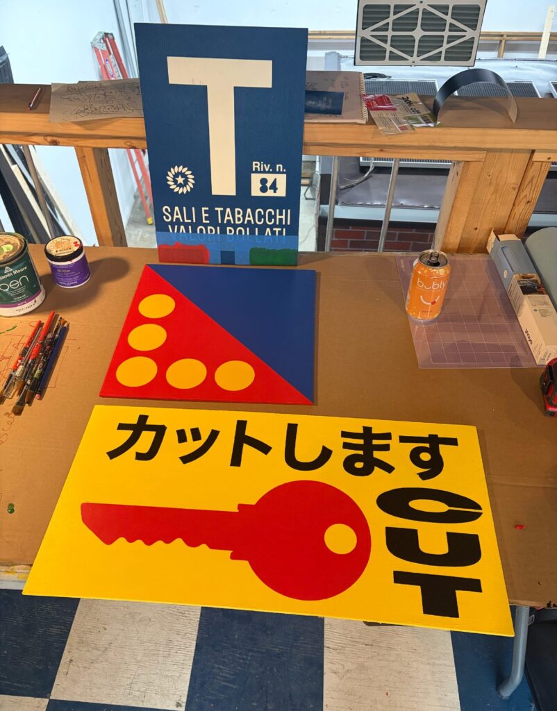
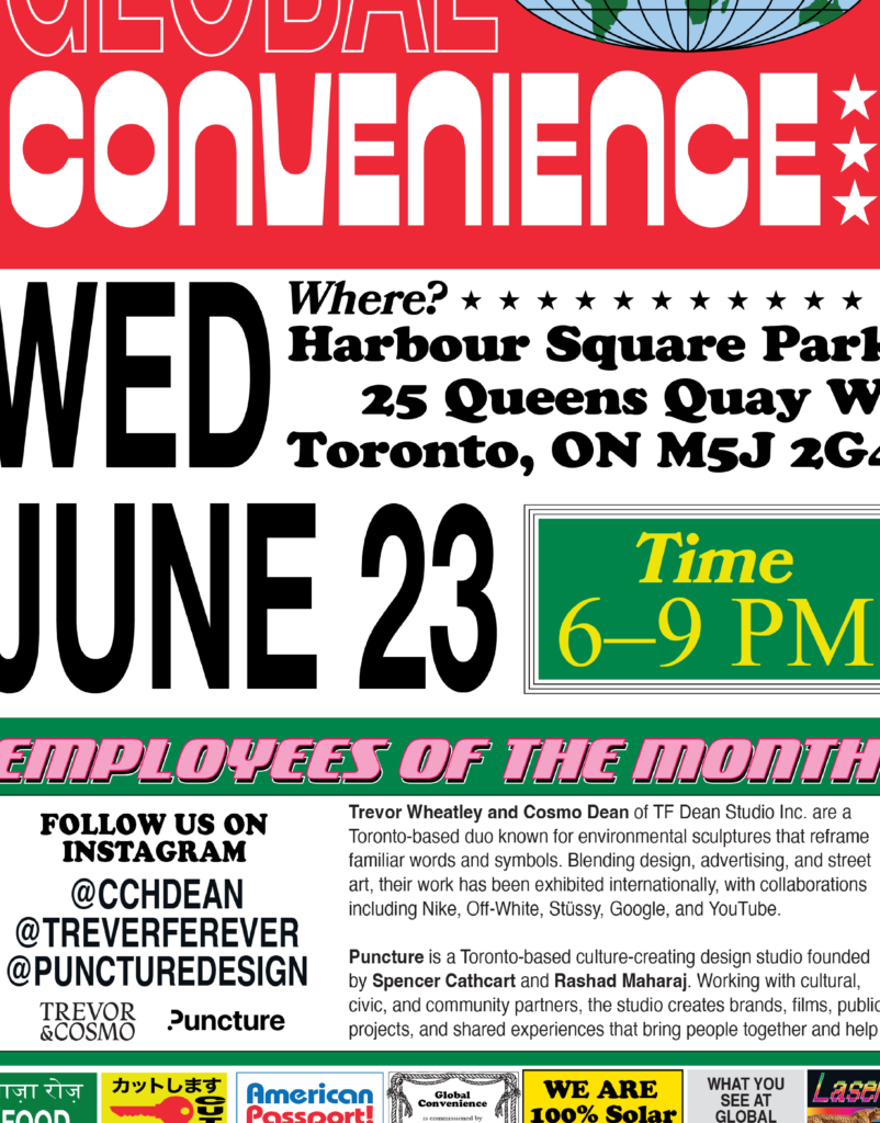
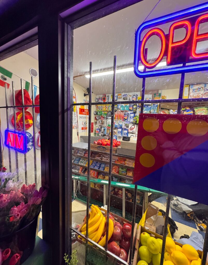
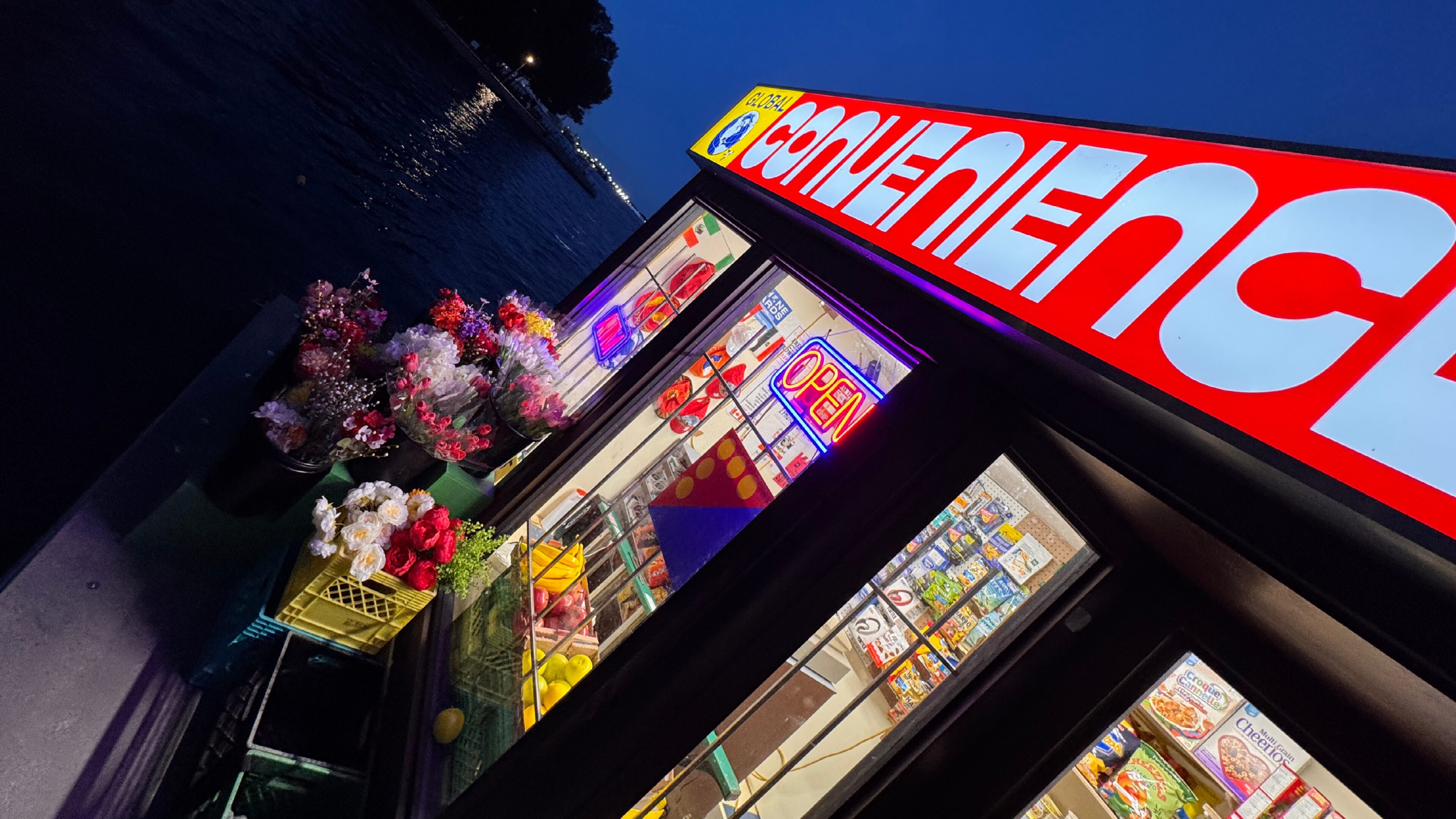
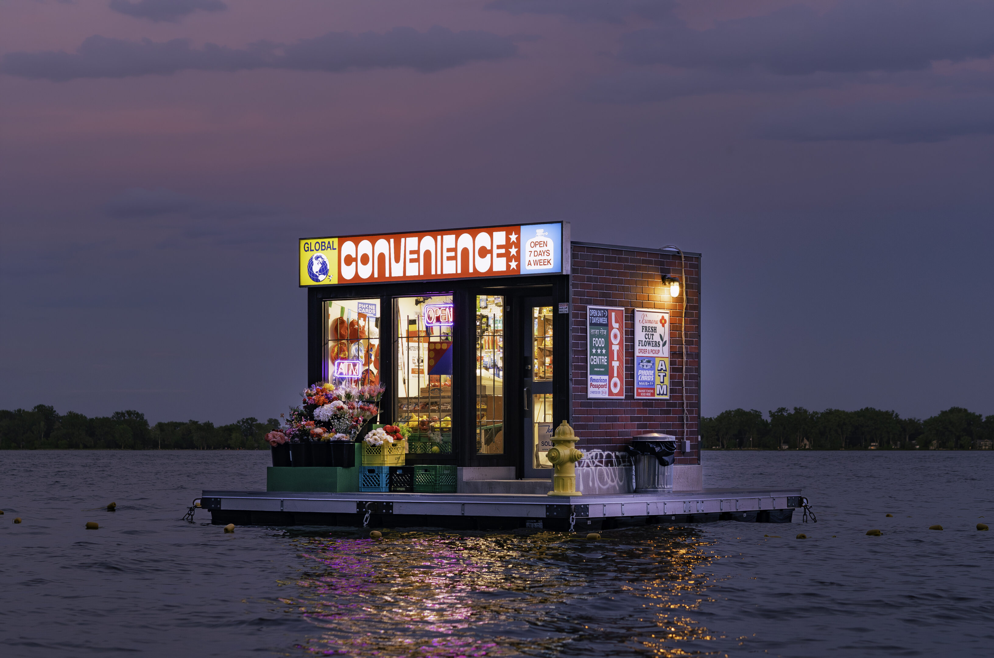
The store’s identity was built through accumulated details: barred windows, flowers, produce, decals, price signs and illuminated graphics. Drawing from the crowded visual language of neighbourhood convenience stores, we created an original mix of compressed typography, competing colours and printed and hand-painted signage. The inconsistencies were intentional, making the storefront feel accumulated over time rather than formally designed. Because the work is visible but inaccessible, we also created flyers and printed materials that extend its visual language onto land.
Industry
Arts & CultureDesign & Architecture
Service
Branding
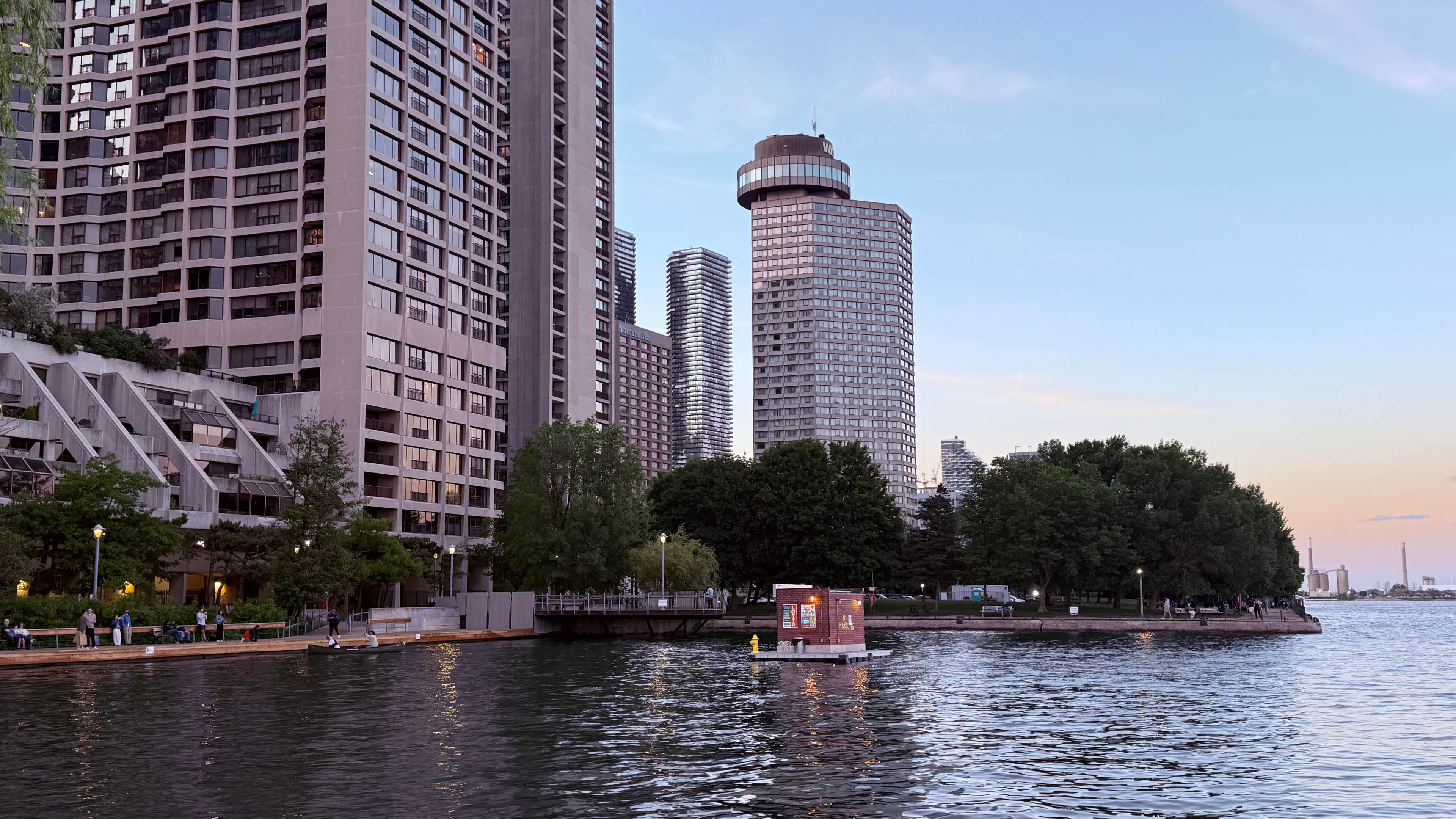
Installing Global Convenience was a major undertaking. The completed structure had to be moved out of Trevor and Cosmo’s studio, loaded onto a flatbed and transported to the waterfront, where it was lifted by crane, lowered into the lake and secured to submerged anchors. Once installed, the work immediately began attracting attention. People stopped, pointed, photographed it and tried to determine whether it was real. During a moment when Toronto is presenting itself to the world, Global Convenience looks toward the smaller spaces through which a global city is actually made.