SingularityU

Helping SingularityU launch their first Canadian conference with an innovative identity.

Industry
Corporate

Service
BrandingDigital

Global thought-leader SingularityU tasked Puncture with developing a brand concept and wayfinding system for their first-ever Canadian event. Utilizing motion graphics, experiential pieces, and bold colour and type, Puncture managed to implement a design system as innovative and exciting as the Summit itself.

Sidewalk Labs

A public workshop and creation of useful tools that promote digital transparency in the public realm.

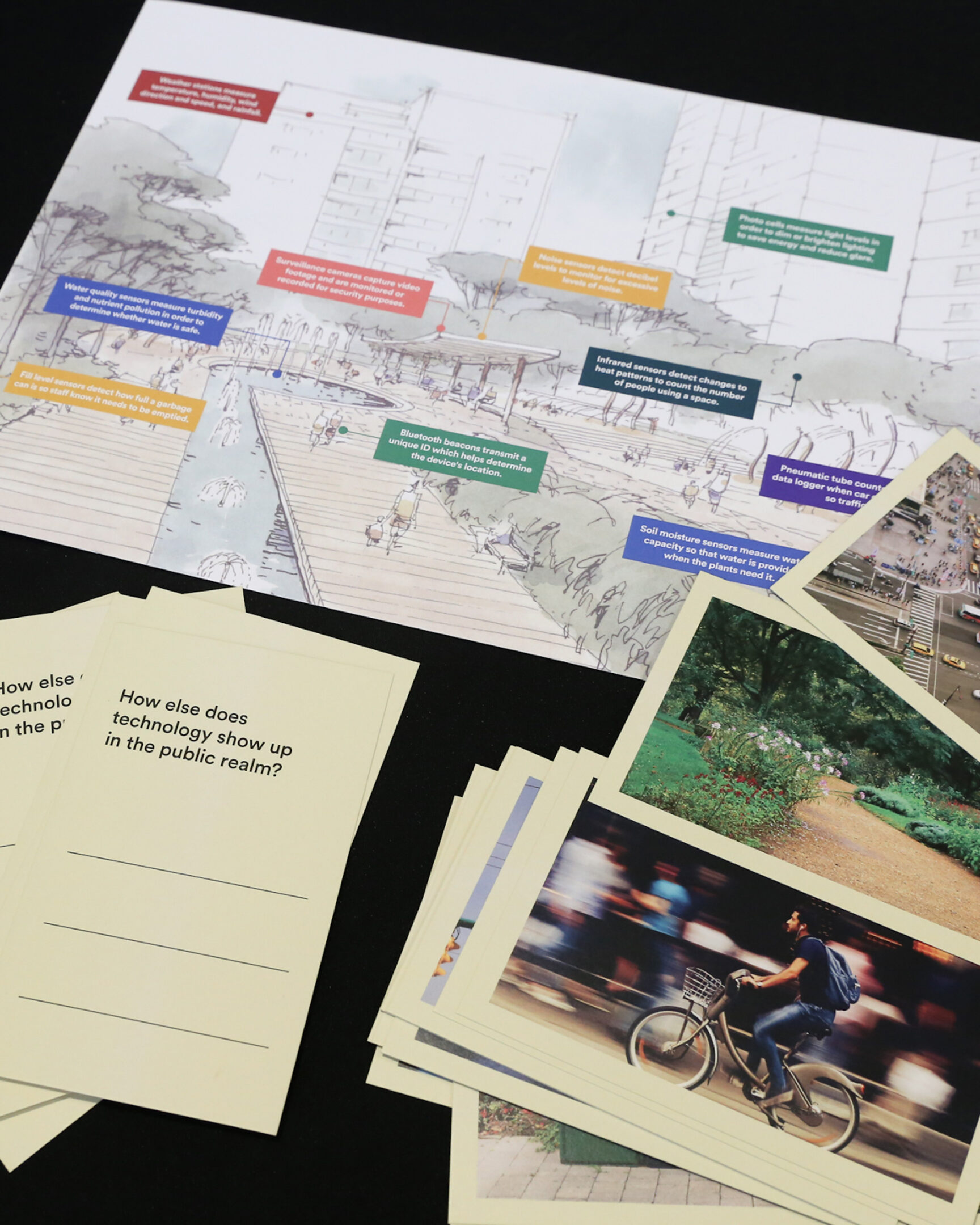
During Sidewalk Labs’ (SWL) time in Toronto on the Quayside project, the public discourse around data and digital transparency was of concern. SWL reached out to Puncture to help design and facilitate a public workshop focused on how to improve digital transparency in the public realm. Technology is all around us, but often invisible.

Industry
Corporate

Service
Branding

dtpr.io

The public engagement and consultation phase of the project was developed through an in-depth research phase with internal stakeholders and community members to get a sense of their concerns around digital transparency. Together with 100+ public participants from Toronto, New York, San Francisco, and London, we brainstormed, sketched, debated, iterated, and prototyped during several sessions we facilitated.

Based on this public engagement, we developed a series of simple signs and offloaded the complexities to the digital channel. Through this process, our purpose signage and icons came to life with simple and universally recognized symbols. Each icon was carefully crafted and selected to help users understand the most common questions around technology in the public realm: what’s the purpose? The project became known as Digital Transparency in the Public Realm (DTPR).

DTPR is now an open-source communication standard designed to increase transparency, legibility and accountability for digital technology in public places. The signage systems and DTPR are being piloted in the City of Boston, District of Columbia, Sydney Olympic Park, Angers-Loire Metropolitan Region in France, and the Town of Innisfil in Canada.

Fit4Less

Kinetic typography for Canada’s fitness brand.

Industry
Corporate

Service
Video

In collaboration with John St. Agency, our goal was to breathe life into a robust campaign that aimed to transform the perception of working out. Our vision was to make exercise not only approachable but also enjoyable and engaging. To achieve this, we utilized kinetic typography and immersive sound design, infusing each workout session with vibrancy and energy.

This dynamic campaign reached audiences through television ads and social media platforms. By combining creativity with innovation, we succeeded in redefining the fitness experience, making it more accessible, friendly, and ultimately, fun.

Tangerine

Motion design for the 2020 playoffs in partnership with the Toronto Raptors.

Industry
Corporate

Service
Video

Collaborating with our friends at John St., Tangerine needed a set of motion videos to support their campaign during the Toronto Raptors 2020 season playoffs. Tangerine is a Canadian direct bank that offers no-fee chequing and savings accounts, GICs, mortgages and mutual funds. Based on their brief and Tangerine’s existing visual system, we created a series of simple but attention-grabbing typographic motion videos that promoted the bank’s partnership with the Raptors.

Herb

Redefining Cannabis Culture with a Bold Brand Makeover.

Industry
Corporate

Service
Branding

Herb is an online cannabis community that seeks to breakdown the stigma around weed by acting as a thoughtful curator of cannabis products, experiences and culture. They help their users discover the best products, new products, information on strains, how-to guides and experiences in their cities through content and community.

Puncture was tasked to refresh their brand identity to better align with their audacious goals. We created a new brand position, photographic guidelines, typography system and a colour palette. The system is simple, organized and built to suit the many moods and vibes associated with cannabis culture.